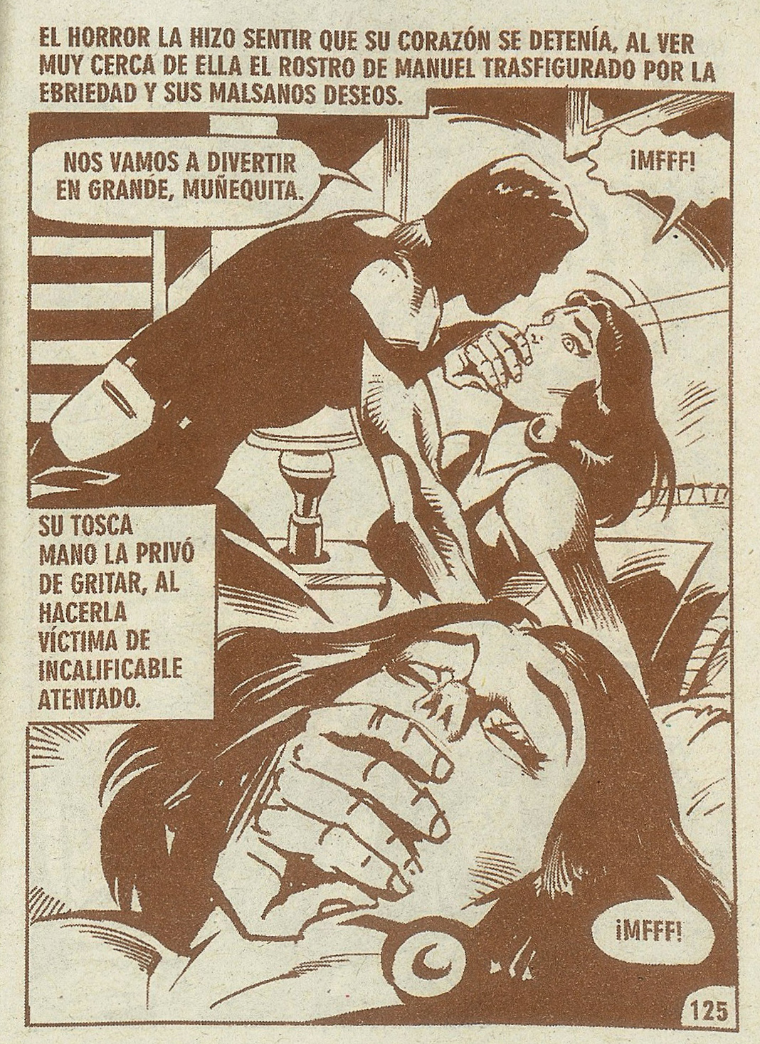
Hello everybody. I'm making a thesis research on a mexican popular comic called "El Libro Semanal".
For the editorial design of the final thesis I need a nice pair of cool fonts, and I'm thinking in "borrowing" the font this comic uses for the texts and dialogue ballons, though I still dont know wich one is it. Any ideas?
Many thanks in advance