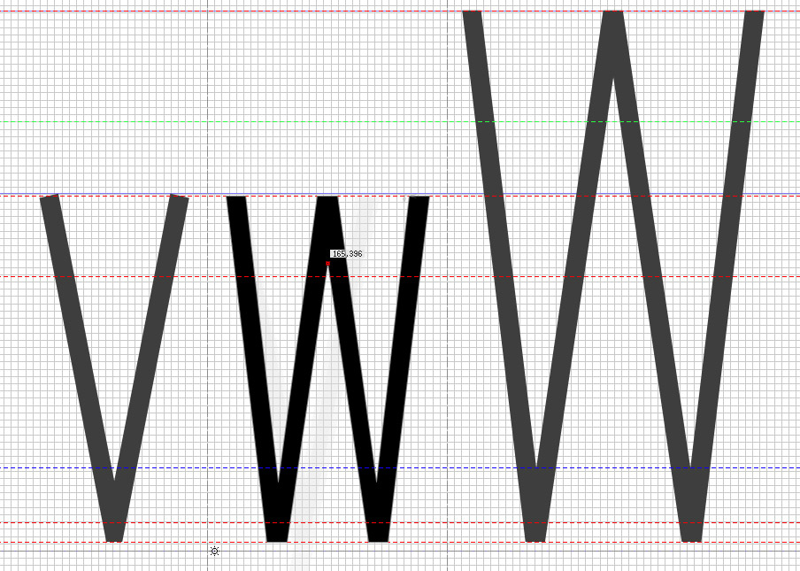
Hello again,
Are there any online resources that deal with character shapes and tips on designing them? I'm looking for something similar to "Designing Type" by Karen Cheng and the tips presented in http://typographica.org/on-typography/making-geometric-type-work/ (optical corrections, balance, and so on).
Besides of the general knowledge I'll get by reading that kind of material, I'm hoping to find info to deal with a problem I'm facing: character "w" in small sizes looks black, heavy, like a dot in a sea of grey lines. I guess there should be some info around regarding this.
Thanks