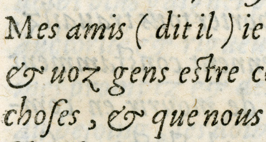
At the introduction of a book are a few select quotes relevant to its themes. These were originally set in italic with quotation marks. The effect of the double indicators (italic and quotation marks) to set the section apart from the rest of the text is perhaps a bit redundant; italics or quotations alone would have been adequate, not both. The effect of the italics here, however, seems intended to render the section with something of a handwritten script feel. Some of the quotes which are paraphrased, contain ellipsis in the original English edition. In the German edition we're now working with, German orthography requires brackets for ellipses used for paraphrasing. (I believe English does as well, and our source text was simply not following the conventional rule). The issue becomes, that the hard, angular brackets of Baskerville (MT) are an abrupt contrast to the intended use of italics in this case to evoke kind of a handwritten feel.
Perhaps it's a minor "type crime" to try to use italics in this sense, but I would like to stay with them as they were in the original, and simply address the hard brackets in other way. I'm not clear whether it might be acceptable to drop them in this case (the original English did not include them, though it's quite clearly a paraphrasing use of ellipsis) which might be a greater grammatical/orthographic error in German, or to perhaps substitute rounded parenthesis (again not orthographically correct) or to find another Baskerville or other typeface with less harsh brackets to blend in with the rounded flowing italics. The Baskerville MT italic brackets are extremely thin, and contain perfect hard edges. They look appropriate for mathematical notation, but much less so for a quote from Goethe's work.
Thoughts or suggestions? Many thanks in advance - Luca