
Typophile
Hand painted swashy typeface ID
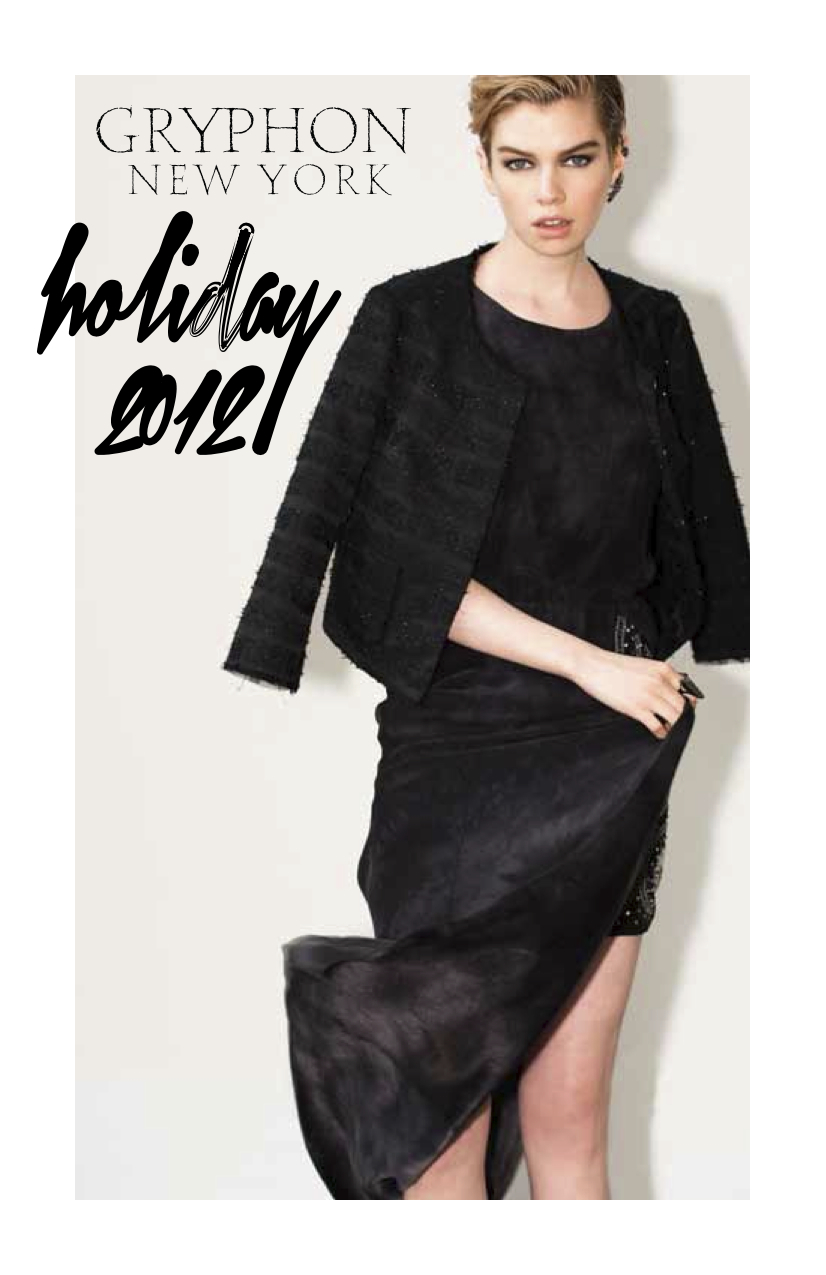


What's with the defective "d"?
hhp
hrant: Yes kind of strange, but oddly beautiful in a defective sort of way :)
I think it could have worked if not for the really weird stuff at the tops of the bowl and stem. With those it definitely looks like just a mistake.
And it would have been nice to make the "2"s different.
hhp

Found a web font called Xtreem that seems to be related, if not the culprit.
(the d looks quite ordinary; could have been a designer applying rogue vector effects every time he found a d...)
thanks Pica pusher, that's it.
Captured from commoncrawl.org on 25 Apr 2015. original URL