Typophile

Musician Logo

Hi all,
I'm designing a logo for a musician. The mark is combining the zodiac symbol for Pisces along with the idea of the guitar, though I didn't want any of those ideas to be too literal. I'm trying to express the idea of duality in music. Any thoughts would be appreciated. Thanks in advance!

AttachmentSize
Duality.jpg38.28 KB

And here is a black and white version

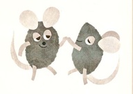
I really like it, but I keep seeing Leo Leonni's mice.


Maybe you're trying too hard to avoid having the guitars look literal?

Yeah looks like mice or tadpoles or something. (And those thin white lines will disappear when the logo is printed small.) But it's an interesting concept; keep working on it.

Hi Mojo,

thanks for the comment. Do you think that something looks "forced" when it comes to the guitar idea? Im not sure what you mean when you say "trying too hard to avoid having the guitars look literal"

thanks,
Justin

It appears you made the body of the guitar pointed to suggest a fish (Pisces) and drew the sound hole far away from the neck for the same reason. I think you've moved too far away from guitar, but not close enough to fish, so that it doesn't read as either--at least to my eyes.

Maybe if the guitar bodies didn't end in a point (some fish have rounded heads) it would work a little better. And if the tails ended in a shape that managed simultaneously to suggest a fish tail and the tuning pegs of a guitar, maybe my brain wouldn't be so quick to decode them as mice.

the line weight of the frame seems way too heavy compared to the artwork within.

"Tadpoles" are the PG 13 version of what they really look like. ;o)

Thanks everyone. I was a little concerned about the forms looking like rated "R" tadpoles. I'm going to keep plugging away at this one. Theres some potential but its not there yet.

I too see spermatozoids, sorry.

A couple of new possible directions...any thoughts?

Gotta side with Aluminum — I think the star-shaped frame is stealing the show.

Isn’t the sign for Pisces shaped differently? Like thus:

Try and play more with positive/negative space. What could represent duality better than that?

Your current versions aren't working. You're playing too much with colour and outer shapes. @picapusher+s right. duality is perfect for black and white, positive and negative space.

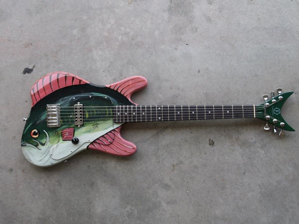
Eric Gill's guitar?

n.

Captured from commoncrawl.org on 26 Apr 2015. original URL