
Dear typophiles,
Half a year ago I wanted to make a logo for myself. After drawing the required letters, I thought: "Maybe I should complete the alphabet." It evolved into quite an obsession from there on. I am now at a point where I'd appreciate some honest feedback on where this got me and push me in the right direction concerning neccessary refinements.
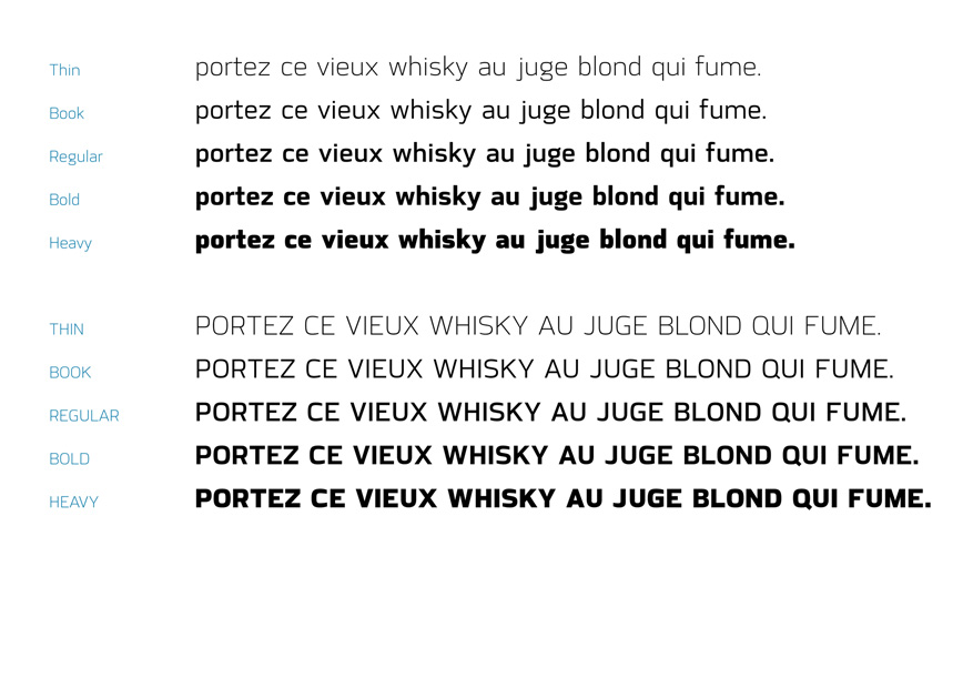
I would be very thankful if you could take a look at it and tell me what you think. I myself am quite happy with the Thin to Regular weights and not too shure about the Heavy one (the bold interpolates between Regular and Heavy). I plan to add matched Italics once I have finished (if possible) the upright versions. A (friend of mine told me that the contrast in character width from Thin to Heavy might be too big. I find it acceptable, because I wanted to preserve the form of the counters and I think it looks like a condensed if I reduce the characters' widths.
Also, only aside: Is the naming acceptable? I like to set body text in lighter weights myself so I called the lighter-than-regular weight "Book". Is this confusing? Also: Is the Heavy really Heavy or rather Black?
I have attached a specimen which is far from finalized (the typeface is NOT going to be called Handgloves, i have not found a proper name yet). The texts in it are not to be taken too seriously, I just filled the empty space with what came to my head. If you need additional samples I'd be happy to provide them.
I think my girlfriend thinks I am gone mad by now. She gives me a quite pitiful look when she sees me sunken in "my world of letters".
I also want to thank you guys on Typophile for the input you gave me without knowing. I have been reading here now for weeks and it is very rare to find a place where such intelligent folks talk about this kind of nerdy (in a good way!) matter in such a professional yet civilized and friendly tone. Always honest, never snobby. Keep up this spirit!
| Attachment | Size |
|---|---|
| Specimen.pdf | 568.78 KB |


