No problem in my view - although I am seeing a problem with relative widths. And you're making the "p" have flat sides even though the "o" is round?
hhp
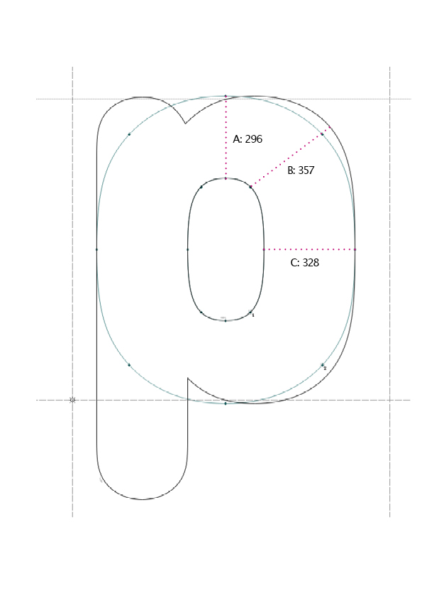
In black typefaces with low contrast, the weight distribution of the bowl of "p" and the likes often gets pushed outwards at 2 and 4 o´clock (see illustration), making the diagonal B a whole lot wider than the horizontal bowl width C. Would you regard this as a problem? "o" in mask layer for comparison.
| Attachment | Size |
|---|---|
| Untitled-1.jpg | 84.84 KB |
No problem in my view - although I am seeing a problem with relative widths. And you're making the "p" have flat sides even though the "o" is round?
hhp
They're both straight-sided as far as I can tell..
One could argue that the value of B should ideally be somewhere between A and C to not become a bump in a vertically stressed typeface like this..
Captured from commoncrawl.org on 19 Apr 2015. original URL