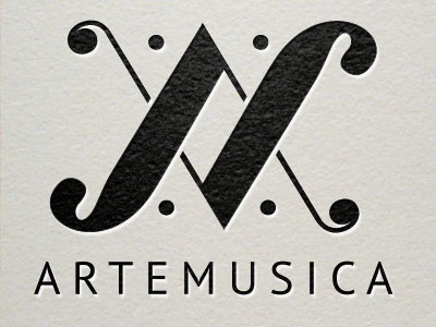
I recently designed a logo for the choir sing in. It's a Baroque choir, performing Baroque and classical pieces. A little background: The mark is based on a characteristic of Baroque music being a repetition of melodic themes. I used this idea of repetition by mirroring 2 shapes to form an /A/ and /M/ for Arte Musica (did I mention it's a mostly Italian choir). The four repeated dots represent the 4 voices soprano, alto, tenor, base. I wanted the over all form language to evoke musical notation. I think it might need some tweaks but I thought I'd put it out there. Any constructive feedback is welcomed.