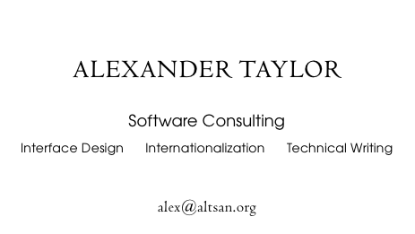
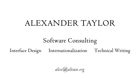
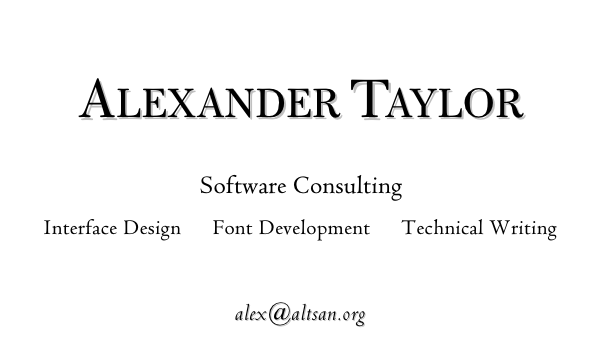
Sorry, yet another novice's business card question. :)
Last summer, I was leaving my job in Japan, and needed to give various acquaintances some kind of 'business' card with my name & email address (it's the done thing in Japan, you gotta have a business card!). I rather hastily put something together, based on the fonts I had on my laptop:
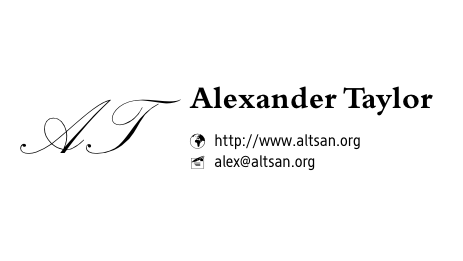
I don't pretend this is up to graphic design standards, but I hope it doesn't commit any truly egregious errors.
Since I got back I've also found the need to hand out personal contact info to people at various receptions, functions, and whatnot. So now I've been working on ways of improving the design a little.

Is the 'AT' logo an improvement? I'm worried it's too dark for proper balance (which is why I widened the text to try and compensate). It's a modified tracing of two letters from Goudy's original "Goudy Text" designs in The Alphabet & Elements of Lettering. (My sister subsequently pointed out that, quite unintentionally, it kind of forms all of my initials: AWLT.)
I'm also working on an actual business card for my current freelance consulting work, which I'll post in a followup.