Typophile

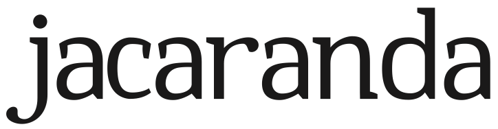
Jacaranda

I started this a long time ago, but had some time off over the last few days and decided to do a bit more work on it. As you can see, it's presently only lowercase, but I'm interested in hearing your thoughts on whether the design has merits and any changes that need to be made.
Many thanks!
http://typophile.com/files/header_2.png

AttachmentSize
Specimen 1.pdf111.56 KB
header.png23.23 KB

Here's a new specimen. Capital letters are now included. I would appreciate any feedback you could provide!

https://www.dropbox.com/s/kur3imq39vf392i/Jacaranda%20Specimen%202.pdf

Any comments at all?

Looking pretty nice. A couple of things that stand out to my eye: That lowercase r is looking a bit too wide. The m could be wider, the space between f and u in Beautiful looks too wide and the right leg on the capital R could be dropped a little lower.

Best of luck with the rest of it!

Thanks for your feedback, Tim. I've made some changes (see attached)

https://www.dropbox.com/s/psqzzbavwq9oc9s/Specimen%203.pdf

Captured from commoncrawl.org on 29 Mar 2015. original URL