
I'd appreciate your opinions of the Hebrew characters in Marapfhont and Squarish Sans.
I'd appreciate your opinions of the Hebrew characters in Marapfhont and Squarish Sans.

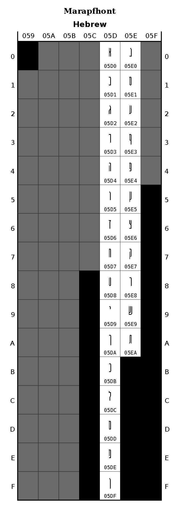

Both of the fonts (see above) have attractive, and matching Hebrew glyphs.
I have three suggestions.
1) The Feh/Peh of Marapfhat (05E4) has a left vertical bar that turns right at its lower extreme, turning right too low. Rather, it should turn right at the mid-point (height) of the letter. See the same form in the Squarish Sans font ()5E4).
2) The Tzaddi(k) of Marapfhat (05E6) has a left vertical bar that turns rightward at its mid-extreme, turning rightward too soon. Rather, it should turn rightward at a diagonal movement to the extreme left base of the letter, and then turn left at the baseline.
3) Again, the Tzaddi(k) of Squarish Sans (05E6) has a left vertical bar that turns rightward at its mid-extreme, turning rightward too soon. Rather, it should turn rightward at a diagonal movement to the extreme left base of the letter, and then turn left at the baseline.
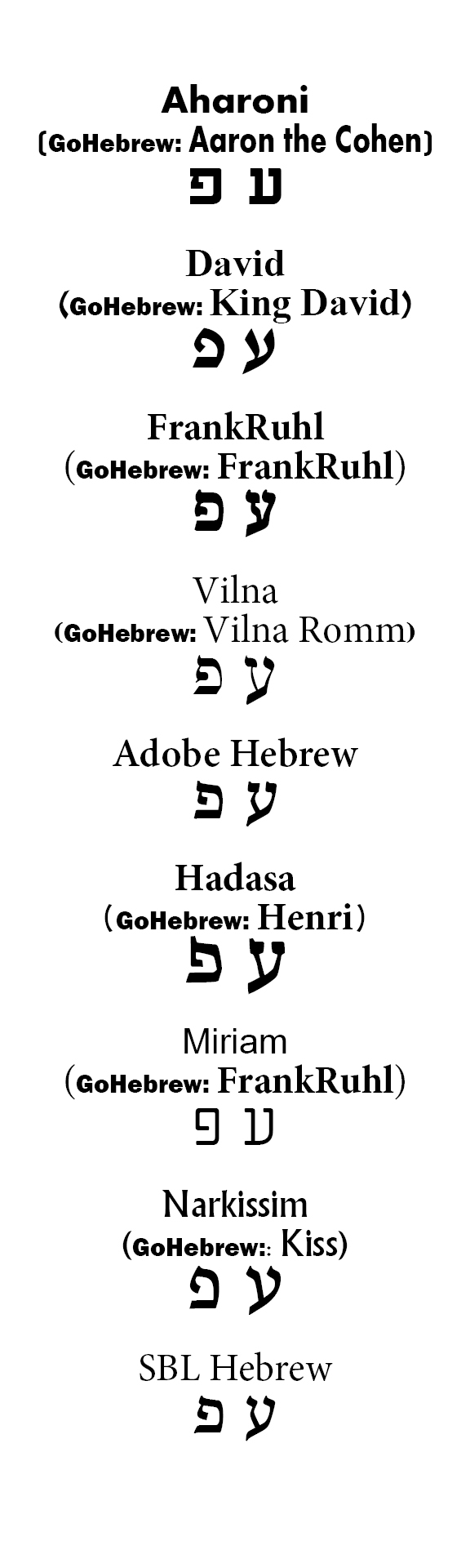
See examples from different classic Hebrew typefaces:
Thank you! I don't think anyone has called my attempts "attractive" before. ☺ From what I've read, it seems very unusual for typefaces to include matching or complementary Latin and Hebrew characters, but I appreciate it. It is a goal of mine in every face that I create. I believe that my SS is the only Bank Gothic-like face to include Hebrew.
The shape of peh in Marapfhont is idiosyncratic. You'll note that in most cases where there's a counter or bowl, it spans most of the height of the letter, with only a short stem outside it. It exaggerates the sense of thinness and height.
The challenge in both of the tsadis, as I recall it, was making them distinct enough from the ayins. (There are several glyph-pairs in Hebrew with relatively similar look.) Curves are under constraints in both faces, and diagonals very rare in Marapfhont. Not being a Hebrew reader (my education was very brief, and long enough ago that I've forgotten almost all of it) I'm not overly familiar with the "canonical" appearance. I see the point you're making. I'll have to revisit those. I probably had too few reference examples to spot what commonalities to preserve and what I could bend.
The shape of peh in Marapfhont is idiosyncratic. You'll note that in most cases where there's a counter or bowl, it spans most of the height of the letter, with only a short stem outside it. It exaggerates the sense of thinness and height.
As it was said long ago: "טעם וריח אין להתוכח". This means: "one can not argue about taste and smell". As we say in English: "Beauty is in the eye of the beholder".
How did great Hebrew type masters handle the distinction between the ayin ע aand the tzaddi(k)?
_4696.jpg)

Could you give us some text examples? The Marapfhont is extra-ordinarily condensed - is it practical? It might be hard to read the Hebrew.
Free download at the URL above. Give it a try and see what you think.
That said, Marapfhont was inspired by Modula Tall, and I expect it to be used similarly—i.e. primarily in large-size displays, not running text.

When you say "inspired" do you mean the actual outlines were re-used?
hhp

Pardon my mistake - wrong conversation.
I received an 'internal server error message and it repeated the post so, didn't mean to clog the pipes! I will have to be more patient with the uploads. And put them under the proper header...
Respectfully yours,
Manuel Colunga-Hernandez
rural Deer River, Minnesota USA
hrant— No, I developed Marapfhont independently, based upon visual inspection of the design of Modula Tall's uppercase Latin characters. I did not care for the lowercase, so those were completely redesigned, as well as the repertoire being expanded to Hebrew (and other) ranges. The source of the inspiration was the title font for the mid-90's computer game, Marathon. The name is a portmanteau of that and the in-game antagonist, the Pfhor.
Good to know - thanks!
hhp
I may not be very original, but I am not a thief. ☺

.
Captured from commoncrawl.org on 25 Apr 2015. original URL