Hello again,
it has been a pretty long time :)
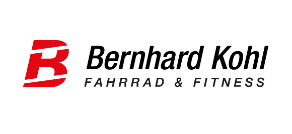
I was recently pretty busy designing a logo for Bernhard Kohl. He is a former professional cyclist who started his own bike and fitness shop 3 years ago. At the end of this year his franchise contract ends and so the shop needs a new name, new logo, new everything.
I will try to keep it short: We have already decided on the letters B and K to be represented in a logo. No real innovation but OK.
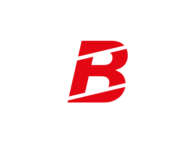
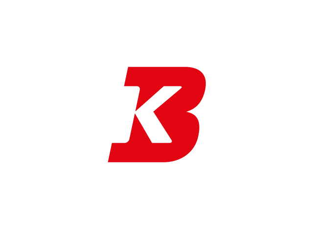
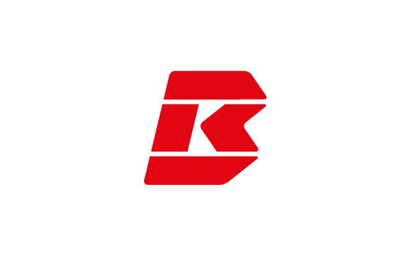
There are 2 versions I would like to get your expertise and your impression on. Version 1 is the one that has already been approved by our client. At first glance it is just a capital B with 2 diagonal strokes. At second glance you should be able to see a capital K. Everyone seems to like the concept (that is why it has been approved) but somehow I am not satisfied with it. I think the K looks strange.
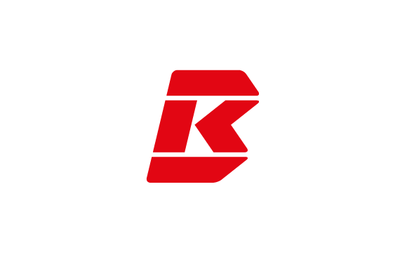
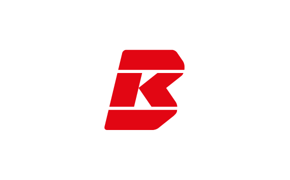
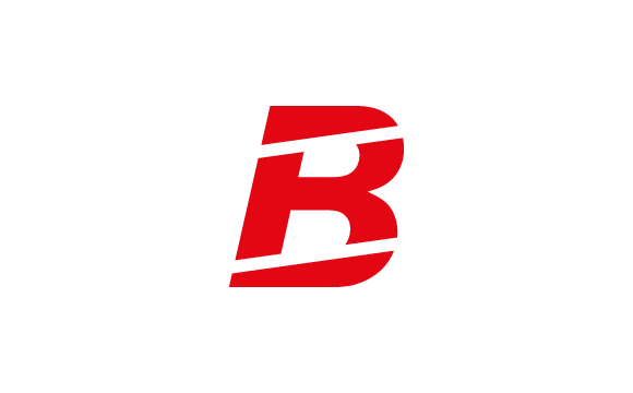
Version 2 is still fresh and so I am not really objective about it. I can only say that I think it is more iconic and clear-cut which makes it a better logo in my opinion.
If we had to decide for one of these two versions, which one would you pick?
Thanks in advance for your help.