
My eyes are telling me that there is something wrong with the N’s as well.
Am I the only one or they looks like that because it's Arial Bold hand painted?
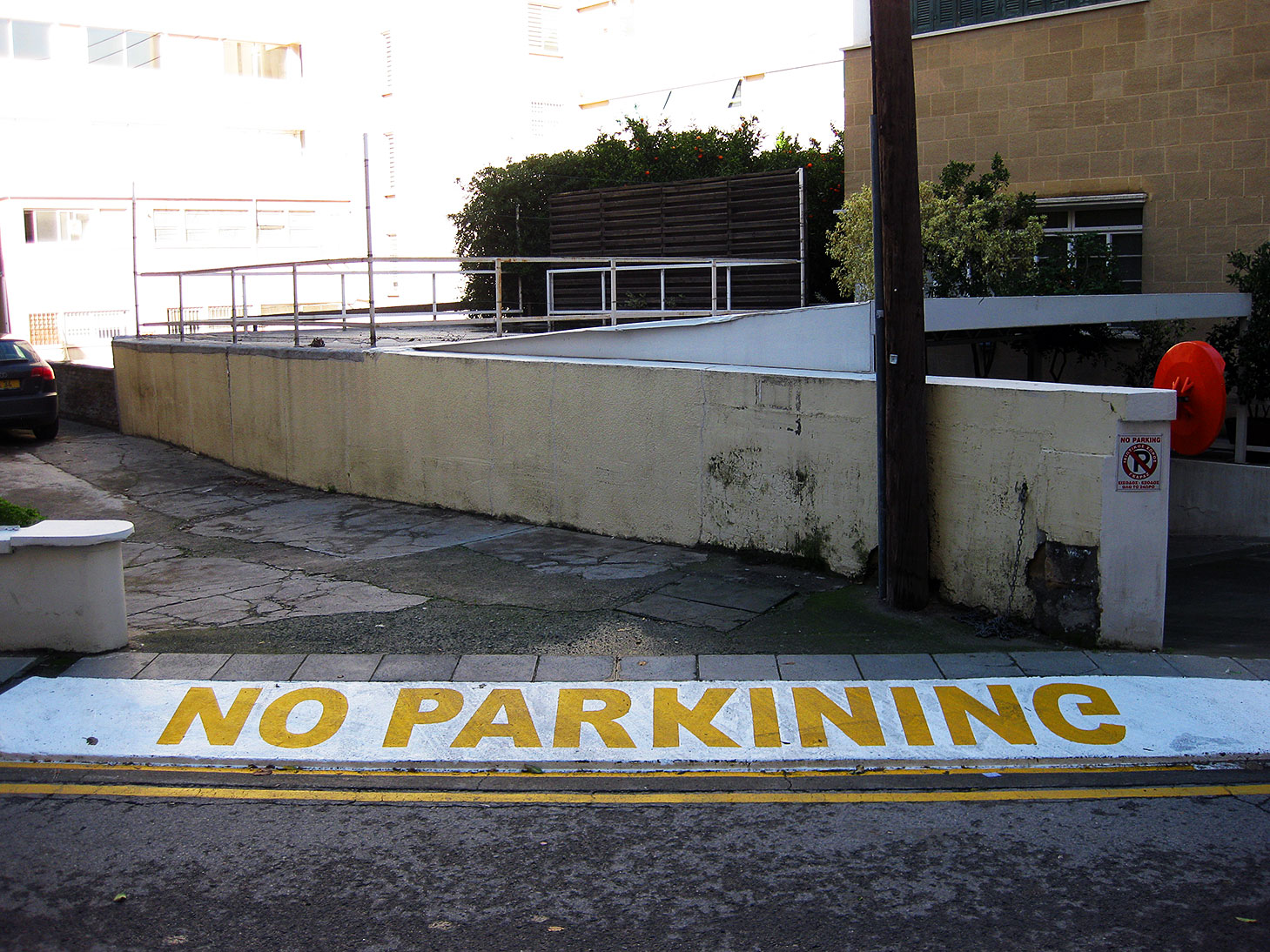
My eyes are telling me that there is something wrong with the N’s as well.
Am I the only one or they looks like that because it's Arial Bold hand painted?

lol what language is that?

Ah, an idiot-savant ambigram.
hhp

awesome.
n.

what language is that?
It should be some African one, since it uses capital eng (http://www.ww.typophile.com/node/64345 ;-)
hm, does 'PARKINING' really mean 'PARKING' in their language or this is kind of mistake by the painter?

Latin text must be all Greek to the painter. .. Except if it had been, he'd have gotten it right!
(The little No Parking sign on the far right is in Greek.)
The painter got it wrong.

- Herb

This kind of signage is typically spray painted using stencils. At the place I work for, we cut the entire message to save time for the road crews and to avoid this kind of mistake. Others use interlocking off-the-shelf stamped brass or plastic stencils. The letters slide or snap together – sometimes equally well upside-down, or backwards - or both, so you can get some interesting results from time to time.
This one, looks like it was made by painting the yellow strip then laying individual pre-cut letters down and painting over them. The spacing and kerning is not bad which suggests that back at the shop someone made up a spacing template for the road crew (typically no more than a strip of paper or some other disposable material with ticks for letter positioning), but then they forgot to write “this side up” on the letters. Not that it would have helped much. :o)
With some empathy for the guy who made the mistake, he was probably simultaneously over thinking and under thinking. Or still drunk from the previous night.
@ Herb... Hilarious!
This is how it looked yesterday afternoon.
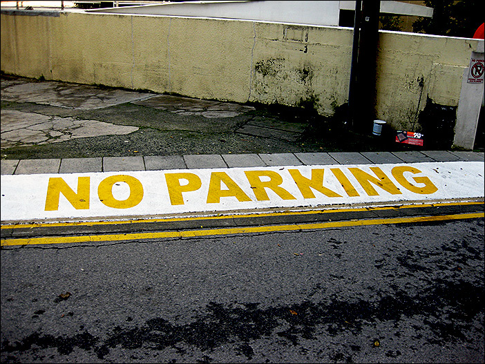
Hm, a lot less awesome.
n.
Municipal worker's lament: "Sigh. What, I have to paint over it again!?"
Captured from web.archive.org on 20 Aug 2013. view this capture