I know this topic is far from new here, but I'm trying to figure out what consensus there is on this issue, if any, amongst type designers and professional type consumers. As someone who is just trying to get started in the trade, I'm anxious to get a feel for the acceptable boundaries.
Where does one draw the line between a legitimate revival, and a deplorable knockoff? I know the legal rules, more or less - in North America at least, typeface design is not protected by copyright (but can be protected by design patent to a limited extent), whereas specific digital implementations are protected. But I've seen a lot of talk here on Typophile effectively equating cloning with piracy. If I can't judge the distinction based on legal terms, what are the generally accepted moral terms? Or is there no consensus at all?
Is the critical factor whether or not the original designer is still alive? Or is it my own motivation in creating the revival - an attempt to provide something which I feel is legitimately lacking, versus an opportunistic attempt to undercut an existing product on the cheap? The second point seems awfully subjective, since there's no sure-fire way somebody else's motivations.
I realize that these and other factors must probably be weighed together, but it does make things a bit difficult for me in deciding what I should consider off-limits.
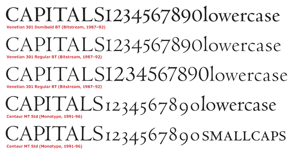
To provide a concrete example... earlier this year, I read in a text on type design that it can be a good learning exercise for a starting designer to try taking samples of a metal type and creating a digital font out of it. I was looking at some old twentieth-century samples of metal-type Centaur being used as a book face, and it occurred to me that I've never seen a digital version that comes close to it (they're all too thin and spidery, and oddly sterile to boot). So I picked up a copy of The Centaur Types and began trying to create a new implementation of Centaur that had something of the same flavour as found in the pages of that book - more substantial letters, more relaxed spacing, and less of a harsh "crispness" in print.
Well, it's come far enough that I can use it for my own printing tasks, and I'm actually pleasantly surprised at the results. The question is... what can I do with it, ethically speaking? (Oddly enough, I ran across Raph Levien's old thread on the same topic a few weeks ago...) Bruce Rogers, the designer, has been dead for more than 50 years, so even if design was copyrightable, it would have expired by now (at least in Canada where I live). It is also patently not an attempt to simply clone any of the existing digital Centaurs that I'm aware of. Would it be more ethically acceptable to (a) keep it as a purely personal trinket and not make it public at all; (b) Make it available free under the OFL or some other free license; or (c) Try and develop it to commercial quality and sell it?
As a different example, I've also been looking at a rather nice old Frederic Goudy design called "Goudy Lanston". This one doesn't seem to have any digital versions at all (that I've been able to find, at least)... but I do notice that P22 seems to hold a trademark on the name, which may imply that they're planning to make one eventually. Should I leave well alone, or play around with making my own digital version?