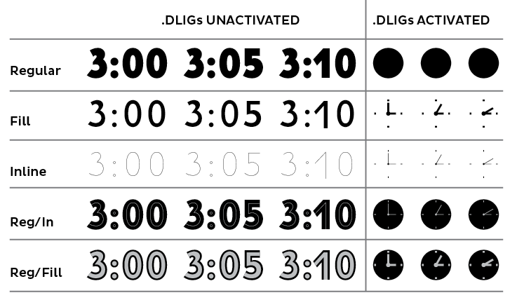
This has been my summer/fall fun font—an heavy, inline sans number font based on the numerals from a 1930s GE Strike clock. It’s proved a challenge working on a font so heavy that has two different inline versions, but it’s slowly coming together.
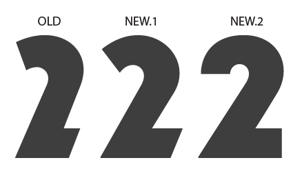
Here are the different versions of the basic numerals. The screenshot is of the Illustrator file, so it doesn't represent spacing/kerning.
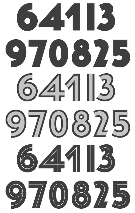
I think the 9, and therefore the 6, need some refinement, but other than that I'm pretty happy with the numerals.
I'll go ahead and attatch a .pdf of the complete character set, but it's of the “outline” version only.
I’ll also put up some screen shots in a different post of some of the trickier characters I'm not sure are entirely working, but for now, would love to hear any thoughts and suggestions!
| Attachment | Size |
|---|---|
| Numerals Test Sheet Sample.pdf | 31.58 KB |