
Hi everybody,
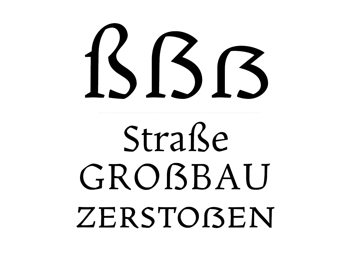
I am currently working on my Capital ß and need feedback on it's design. I welcome any and all suggestions and comments,
Thank you,
Daniel Sabino.
Hi everybody,
I am currently working on my Capital ß and need feedback on it's design. I welcome any and all suggestions and comments,
Thank you,
Daniel Sabino.

I like it.
The full-cap one seems a bit too tall. The smallcap one is too wide. And I would make that top-right diagonal not so rigidly straight.
hhp
Thanks Hrant.

.
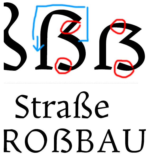
blue: shift a bit downwards
red: too heavy
apart from that, very nice :-)
Thanks a lot Andreas!
Captured from web.archive.org on 24 Jul 2014. view this capture