
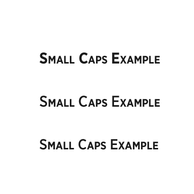
Referring to the image, which do you feel is the most pleasing treatment for small caps?
1: Caps and small caps using default weight & size settings.
2: Caps are dropped from bold to medium. Small caps unchanged.
3: Caps are dropped from bold to medium. Size is dropped from 16pt to 15pt. Small caps are unchanged.