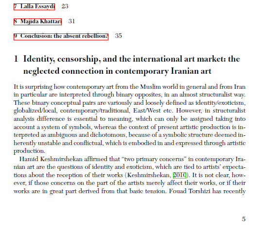
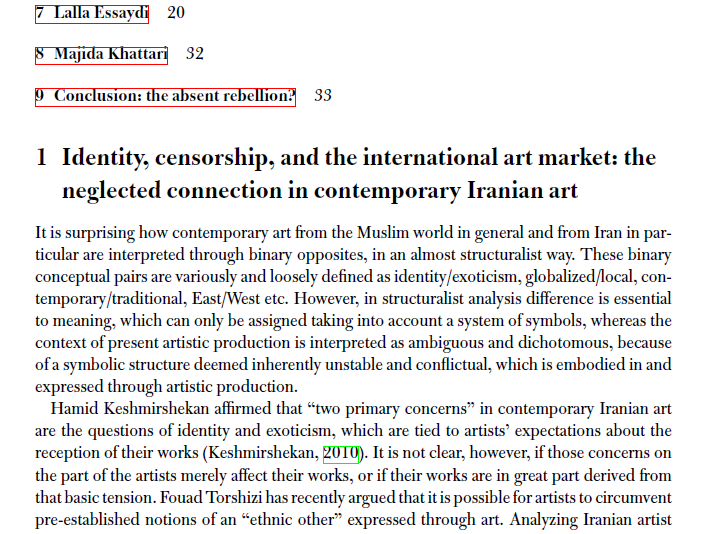
I have been working on some texts and found interesting the combination of Chaparral and New Caledonia as header and body typefaces:
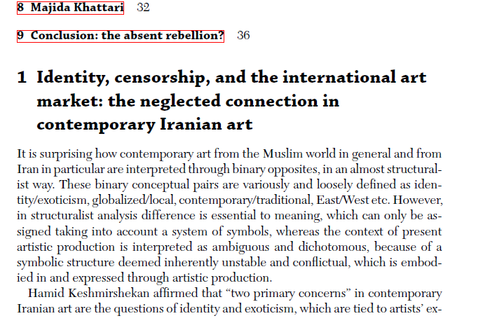
I know advice to this kind of question usually goes like, "Choose whatever suits you best or whatever combination pleases you", but although it pleases me (the contrast and feel), I feel a bit unsure as it is quite uncommon a match (and my primary job is writing, not design per se).
So, does this "work", or there are nicer options?