Hi!
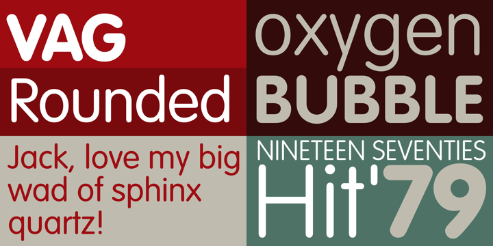
Six months ago I joined a tech startup as a User Interface Designer. They've been on the market since 2009 and at the time, they created a logo using VAG Rounded. The logo is still the same today... Five lowercase black letters in VAG Rounded regular, nothing else.
I'd like to know your opinion about this font. Do you find it efficient, fresh, or outdated?
http://www.myfonts.com/fonts/adobe/vag-rounded/
Thanks!
| Attachment | Size |
|---|---|
| 91361.png | 84.46 KB |