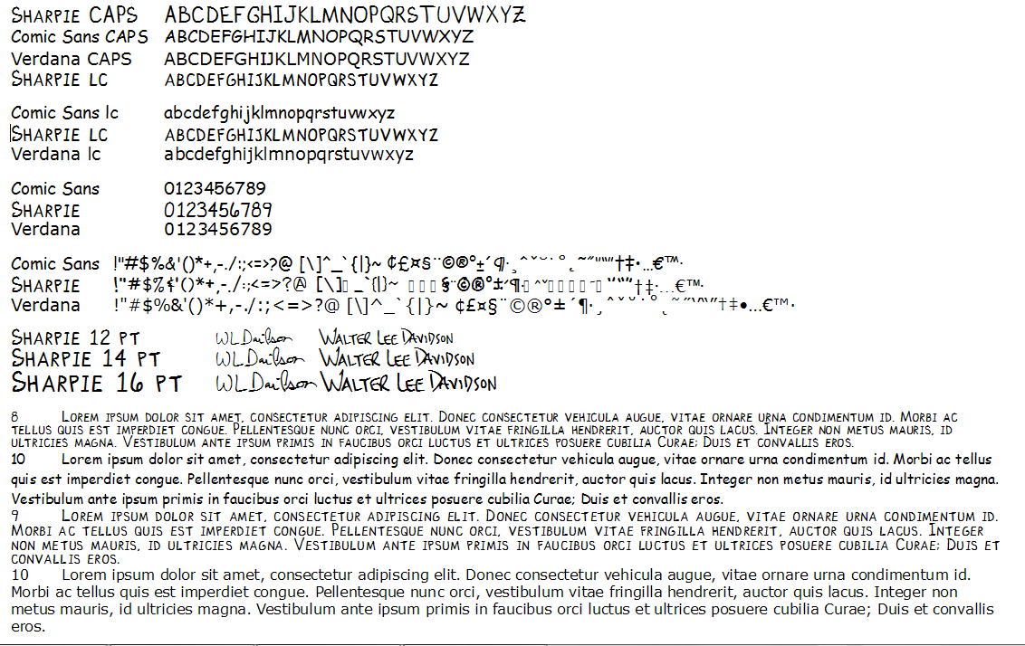
I did a sample print / write glyphs in the blocks on a sheet of paper and scan it, send it in, and get back a font. I think I paid a little for the service. Anyway, I've tried to clean it up, but it still looks like it's blotchy from a faulty fountain pen as the sizes change , and stroke thicknesses change out of proportion also. Any help on how to make this a useable font for personal correspondence is welcome.
Notes: I do intend to use small caps as lower case. That's how i print. And a few glyphs may be borrowed since they were not in the form to write - they can be ignored, since they are placeholders and will be removed.
Attached is a sample of a larger test file. Thanks for any help.
| Attachment | Size |
|---|---|
| Sharpie.png | 52.17 KB |