
http://www.typefacedesign.org/2012/
The balance of quality and diversity makes me smile. Physically.
hhp
http://www.typefacedesign.org/2012/
The balance of quality and diversity makes me smile. Physically.
hhp

Brasilica looks interesting.

Nari Black captures the current typographic zeitgeist. And the regular italic has the interesting idea of doing away with the serifs.
David

I like Dr Jeykll and Ms Hyde.
Kind of a serif interpretation of Excoffon’s “top heavy” idea, with a bit of Val Fullard’s “Science”.
(Sorry, but everything reminds me of something else, even in a quite original design like this.)
I’m pleasantly surprised there are no readability claims for this top-heaviness!
My only criticism is that its upright Greek looks like italic, when on the same page as Latin Roman.

Nick: Isn't that a basic description of "Classical"? Roman and Greek ...
- Herb
Nick, I'm glad you like Dr Jeykll and Ms Hyde because I do too except I can't be too objective about it since I was fortunate to consult on its Armenian component.
its upright Greek looks like italic, when on the same page as Latin Roman.
Only if you look at it through Latin eyes. And the alternative is worse. The Armenian for example might seem even more "Italic" than the Greek, but to me it's exactly right, and making it upright would ruin it.
hhp

My favorite is Martha. In the regular weight it seems to be a very clear and readable typeface.
Quadrat, Can you offer a few words of explanation about the "current typographic zeitgeist" for the unhip? Thank you.
Yes: Chunky slab serifs and egyptians are trendy right now (actually all new takes on slabs are) kind of in counterpoint to skinny sans serifs which are also way in but may be outstaying their welcome. (Work on my own slab serif is languishing and I probably won’t be able to release it until after the current trend has passed!)
David

I agree with Hrant.
Also, I would like to leave a comment. Regal is interesting, but I don't think it's a model to be blindly followed for the Greek, as there are other ways of doing it upright.
Regal: I enthusiastically cast a vote for it in the Display category of Granshan 2010* but I can't say I think much of the text cut. For one thing it's much easier to find occasions to use Latinized type for display than it is for text.
* http://www.granshan.org/index.php?lang=eng&mode=competition_2010
Rafael, nice to see you here!
hhp
The Greek of Dr & Ms is rather self-indulgently lively (if this is the designer’s idea, rather than faculty’s), when the Latin is so much more disciplined.
There should be greater consistency between Latin and Greek, if one is going to follow the “Latin” principle of Regular and Italic styles—and Arabic numerals.
If the Latin of a face is going to have Roman and Italic of markedly different construction, then so too should the Greek. In for a penny, in for a pound.
This means that the traditional Greek “scriptyness” must be deployed to the Italic, because if it’s used in the Regular, unless it’s simply a slanted version of the Regular, the Italic is painted into a corner—and that’s exactly what’s happened in Dr & Ms, for despite alternate forms of beta, theta, phi and (somewhat) kappa, it’s basically a slightly condensed, more evenly slanted version of the Regular. There isn’t the amount of distinction between styles that exists in the Latin.
There’s no need to have the Greek Regular characters with such varied inclination, some leaning forward (omicron?!), some back. Even in the archetypically Greek Plain (Monotype 90), the diversely stressed letters have balance, and some, such as gamma, are dead upright. So there is no Greek imperative for gamma and nu in Dr & Ms to be leaning to the right.
Even if the intention was to avoid Vassiliou-style modernism/internationalism/latinism, it would have been possible to maintain traditionally “scripty” Greek letter forms and stress, without being quite so baroquely slanted.
Either that, or Hellenize the Latin according to the same principle!
It’s really, really hard to accomodate the traditional authenticity of Latin, Cyrillic, and Greek in the same typeface with a strong measure of formal consistency between the scripts. To fall back on traditional conventions for the separate scripts is ultimately to shirk the design challenge.
Nonetheless, this is a minor quibble—it’s an awesome fun face with beautifully drawn glyphs.
The perception of text depends on context; letterforms don't exist in some formal vacuum, especially for a text face. So the Greek might not be disproportionately lively if the basic nature of Greek -and what readers of Greek are used to seeing- is more lively than Latin (which in fact it is).
My favorite example is serifs in Armenian: if you put them where they would be in a Latin font you end up with something ugly and harder to read.
A more accessible example is Trajan: making a formally congruent Cyrillic version cannot result in the same flavor because readers of Cyrillic don't have the same background.
If the Latin of a face is going to have Roman and Italic of markedly different construction, then so too should the Greek.
It's not so simple - it depends again on context. Just because you make a style of type for a writing system (Italic) doesn't mean it's used identically. Again using Armenian as an example: we have a floating emphasis mark that's placed on a vowel to emphasis a word, so we don't use Italic the same way as Latin does, which means making an Italic for Armenian the way you make one for Latin is just bad design.
Now, if Greek does use Italic very similarly to the way it's used in Latin then I agree that the degree (or more accurately, the flavor) of divergence should be comparable.
Hellenize the Latin according to the same principle!
Ideally you go both ways, like in my Nour&Patria. :-)
To fall back on traditional conventions for the separate scripts is ultimately to shirk the design challenge.
Actually I think Latinizing is much easier than doing what Papassissa has attempted. Latinization is like a parlor game, devoid of insight and sensitivity. And I don't consider myself a traditionalist - I just believe in using ideas that work no matter where they come from.
hhp
Sure, Latinizing is easy if you make nu = /v and eta = /n.
But I’m not talking about that.
The quaint scripty treatmentment of gamma and nu in Dr & Ms is too much about making each letter a nice Greek glyph, not about the typeface as a whole. That doesn’t mean I’m advocating they should look like /y and /n.
Why, in this day and age of stylistic diversity and internationalism, should new Greek typefaces be chained to an historic pen-driven model? I would have thought you would support that position Hrant, based on your criticisms of chirography in type design!

No disrespect to Papassissa (the design is indeed lively and well done), but my first thought when I saw Dr Jekyll and Miss Hyde was “František Štorm does Bonsai.”
But, like Nick, the older I get the more everything reminds me of something else.
Nice job.
You want close?
http://www.myfonts.com/fonts/pampatype/arlt/
But when I pointed that out to Elena she said she'd never heard of it - and Lo Celso is a Reading grad! Apparently at Reading they try to reduce exposure to specific precedents; I guess that makes sense educationally.
hhp
If it’s forbidden to “Latinize” Greek by straightening it out and adding serifs, then why not, if one is starting with a Greek design and adding Latin, and wants to create a harmonious multi-script serifed typeface, “Hellenize” the Latin component by removing serifs and loosening it up?
While not the archetypal antiqua model, it would be quite acceptable to conservative taste.
There are several semi-serif designs like this, such as Puyfoulhoux’ Cicero.
Why don't you try it yourself?
Nick, your last two posts elevate the discussion nicely... More soon.
hhp
Maybe the Greek is the "Dr. Jekyll"?
Also, FWIW, I was pretty unimpressed with it on the page Hrant linked to, but upon opening up the specimen I got a whole other impression of it. Maybe the designer could change the name to make it look more appealing, although Dr. Jekyll and Ms. Hyde is such a specific name (not to mention a good description of the font's ideas) its hard to think what other names it could be changed to.
Why don’t you try it yourself?
I have no plans for any new Greek types at the moment.
Those I’ve produced so far started out as extensions to Latin designs.
Unless I get a commission to produce a Pan-European typeface, it’s unlikely I will do any more Greek fonts in the near future.

I'm quite intrigued by the cursive devanagari in Pooja Saxena's Cawnpore. Has there been an attempt before to design a cursive companion to a regular devanagari text face, not as a display face on its own?
One of the MATD typefaces in 2011, Aaron Bell's Saja, included an attempt at a hangul (Korean alphabet) italic. I actually tried to talk Aaron out of it since there is no tradition of pairing a slanted (or indeed any type of) cursive hangul with the regular, and I wasn't convinced that one could be successful. Seeing the result hasn't changed my mind, though I applaud the willingness to experiment.

It was interesting for me to read Nick's comments on the DrJ*MsH before actually looking at the specimen. I think there is a matter of perception here, in which I know my own is influenced by the fact that almost all the Greek text I encounter is either written or typeset in traditional minuscule-derived styles. When I look at Elena's Latin and Greek side by side, I don't get the same sense as Nick of the Greek being too lively by comparison. Rather, I think there is a tension within both scripts between very lively letters (Latin a and Greek lambda) and much more constrained letters (Latin g and Greek pi). The Greek looks to me simply like a fairly conventionally structured type, and its problems are not of style but of proportion: several letters are noticeably narrow and disturb the (sorry, Hrant) rhythm. The beta, gamma, pi and upsilon stand out in this regard.
My first impression, before I had a chance to read any of the text, was of the whole page.
It seemed obvious to me that the ductus is quite different between the two “upright” DrJ*MsH scripts, and that the Greek is far busier.
Here’s a comparison of the DrJ*MsH specimen with the same text set in the typeface I’m working on at the moment, which I’d like to think demonstrates that it is possible to achieve some measure of ductus consistency between scripts, without horrendously Latinizing the Greek. The Greek could be slightly heavier en masse, despite the same stem widths, perhaps it could be tightened up a little. (Apologies for showing my own work, I would have liked to have used one of Panos Vassiliou’s faces, but don’t have a licence for any of them.)
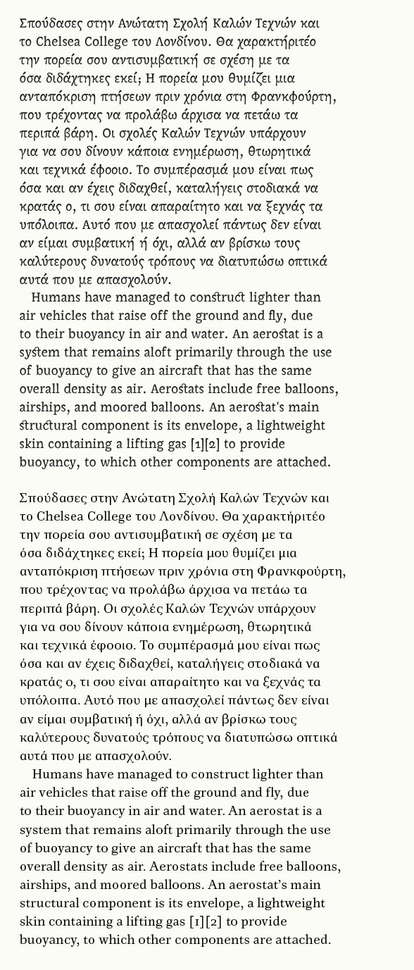
Saying that the ductus is different and that the Greek looks busier than the Latin seems to me different than saying that one is livelier than the other. To me the statements 'is has a different ductus' and 'is busier' are simply descriptions of the Greek script vis à vis Latin.
As I said, this is a matter of perception and hence also of experience.
It is also a matter of history, philosophy, and where Greece is concerned, politics.
As I reason, scripts are not ductus-specific.
When Futura was introduced in 1929, it introduced a new ductus—the geometric—into the world.
This was taken up by both Greek and Latin script foundries.
It was even occasionally used in Little England!
Olympia, from 1939:
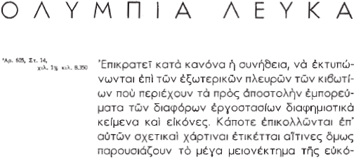
As I reason, scripts are not ductus-specific.
No, but styles are, and scripts develop distinct styles that, in particular cases, inform the normative shapes of letters in ways that make them difficult or simply unconvincing to produce in styles borrowed from other scripts and characterised by different ductus.
_____
Looking at the comparison images you post, I find the relative colour of the DrJ*MsH Greek and Latin to be better harmonised that your design, which to my eye is too Latinised, although not 'horrendously' so.
Nick, how did you get the font?
I didn’t, I did a screen grab from the specimen pdf, and matched the setting.
…scripts develop distinct styles that, in particular cases, inform the normative shapes of letters …
How does one determine the norm?
Is it the statistical norm in number of published typefaces, or in published usage?
And in publications, which ones? In academia or commerce? Advertising or design? High or low end of the market? Per publication, or per sales volume? And why should the norm be immutable?
Styles don’t just happen, people make them.
Gerry Leonidas has done a spectacular job, through his work in consultation to Western foundries, speaking and writing, and through pedagogy at Reading, in establishing a certain kind of ductus as the norm for new Greek-script typeface designs.
However, to me that norm appears to be a conservative, somewhat academic stereotype, and not something that I, as a progressive, indie-foundry, non-Greek type designer, feel comfortable in appropriating.
In these days of a plurality of type producers and an emergent culture of indigenous Greek and Cyrillic type designers, Latinization is not the issue it once was. Once, it may have been possible to consider it as a form of asymmetric internationalism—i.e. industrial neo-colonialism, but now there are plenty of diverse resources, including indigenous, to enable non-Latin-script art directors and designers to determine the shape of their own culture’s typography. That makes for some interesting options: for example, in a contemporary sans serif do they opt for the “latinized” (e.g. eta=/n, nu=/v) PF DIN by Panos Vassiliou for his Athens foundry Parachute, or Hoefler and Frere-Jones’ Whitney, with its Leonidas-attested authenticity (eta with descender etc.), for a New York foundry?
The normative shapes of letters are those that reflect consistent practice by competent writers over time. Normative doesn't mean fixed, but it does mean that when you see a lowercase alpha you know that it is a lowercase alpha, regardless of the particularities of style, weight, size, etc. I'm not talking about statistical norms in published typefaces, but about these basic recognisable shapes of letters that evolve in the maturation of the written script. There is, to be sure, a statistical element to this: a coalescing of practice such that the normative shape of the uppercase A can be said to be two diagonals meeting at an apex with a horizontal crossbar despite the variety of forms in writing and type that violate that norm. If you look at old Byzantine coins and seals -- as I've had a lot of opportunity to do over the past couple of years -- you'll see the Greek script in a state of flux, including situations in which uncial alpha cannot be distinguished visually from lambda, and in which the H glyph might represent either the vowel eta or the consonant nu, but we've long since established norms for the individual letters, and avoiding confusion is a strong motivator in the development of such norms.
My point with regard to the relationship of distinct styles to the normative shapes of letters is not that certain ductus patterns are norms in themselves but that the application of these patterns within specific styles at particularly historical moments influence what shapes become norms. The lowercase lambda is a good example: this is a shape that historically developed in styles employing a ductus that resulted in a short heavy diagonal from the lower left and a longer thin diagonal on the right with heavy terminals. That is the shape of the letter, and if you change the ductus while producing the same strokes, you end up with what I consider an unconvincing shape: simply put, it doesn't look like a lambda to me.
I note that in your new Greek you maintain the traditional ductus of the gamma and lambda, even though it violates what you are doing elsewhere in the design. Why? I presume it is because you recognise that the normative shapes of these letters are strongly influenced by how they were written by Byzantine scribes, and such is the nature of those shapes that they look wrong if you apply a different ductus. That is my point.
So Nick, did you actually type all that greek out? Seems like that would have taken forever with a latin keyboard and operating system.
Ryan, you can easily switch between keyboard layouts on most modern systems. The standard Greek keyboard layout is mostly modelled on the Latin one -- A = Alpha, B = Beta, etc. --, so is very easy to learn to use.

> Gerry Leonidas has done a spectacular job, through his work in consultation to Western foundries, speaking and writing, and through pedagogy at Reading, in establishing a certain kind of ductus as the norm for new Greek-script typeface designs.
That's an odd view. I wouldn't say Gerry has 'established' the ductus. Say rather his breadth and depth of study of historic sources demonstrates that an authentically Greek idiom does not have to imitate a Latin pen angle or writing speed and should probably not appropriate typically Latin styling. Gerry fosters an awareness of that idiom but students' design choices are respected without any hint of conservatism on Gerry's part. My unresolved attempts at Greek were aiming at some kind of middle ground, something I hope to explore further some day.
No Ryan, I copied the text from the specimen PDF and pasted into an InDesign document.
John: I presume it is because you recognise that the normative shapes of these letters are strongly influenced by how they were written by Byzantine scribes, and such is the nature of those shapes that they look wrong if you apply a different ductus.
If by ductus we’re referring to the angle of a broad-nibbed pen, certainly I followed the conventional lambda and chi, however, not because of the scribes who started the convention, but because I’m familiar with it from fonts. I wasn’t trying to produce a pointedly unconventional face in that respect.
I find it strange that pen writing plays such a strong role in the rationale for the conservative Greek idiom, Ben mentions it too.
The “certain kind of ductus” I’m talking about is perhaps easier to see in sans types, more about shape than stress.
I provided optional forms of many characters in Figgins Sans, via a Stylistic Set.
I don’t see why the “proper” form has to be busy and fussy, why it can’t be simplified, without losing its orthographic integrity.

Ben: I wouldn't say Gerry has 'established' the ductus.
Gerry has been a tireless advocate of proper Greek, across the type industry. You can see that not just in MATD students’ work and his TDC seminar, but also in the foundry faces he has consulted on, including the ClearType fonts and Whitney. He has been the go-to guy for Western type designers who want to do Greek right, highly influential.
Nick: I don’t see why the “proper” form has to be busy and fussy, why it can’t be simplified, without losing its orthographic integrity.
If course letters can be simplified, and the result will be a simplified style of typeface. At its extreme, one ends up with Gridnik, and I'd argue that there is a continuum of 'orthographic integrity' that ends up in something that may be decipherable but is in effect a new orthography. Your simplified Greek forms in Figgins Sans are somewhere along that continuum, and my objection to them isn't an objection to simplification per se but that they are wrong for the typeface style. You didn't simplify the Latin. The Figgins Sans lowercase a has its exit stroke, the g has its curved ear and nicely swung oldstyle form, the y has its hook. Figgins Sans is not a simplified typeface style, so the Greek simplifications simply look out of place to me.
You’re overstating the simplicity of Figgins Sans’ Greek, and understating the simplicity of its Latin.
Here is what a much more simplified Greek looks like (above, with Figgins below).

And here is the Latin of Figgins compared with a busier sans, Benton Sans. Figgins Sans is quite calm, due to the roundness of its curved letters, and the fact that most of its terminals are vertical or horizontal.

Certainly, Figgins Sans has an elaborate /a, but it matches alpha; and its binocular /g matches similar shapes in beta, delta and xi.
I disagree with your method of assessing the busyness of a typeface in a particular script according to its relationship with the “normative” style of that script. A straight line is a straight line, whatever script it’s in.
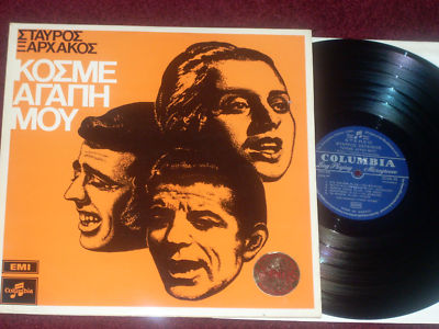
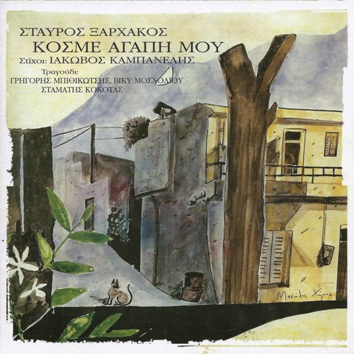
One reason for the popularity of Olympia and similar Futura derivatives was that art directors looking for a consistent reductive geometric effect in a modernist layout appreciated that that quality appeared in both its upper and lower case. If the Futurization of U&lc text was as acceptable in the middle of the previous century to Greek readers as it was to Western readers, why is it such an issue now?
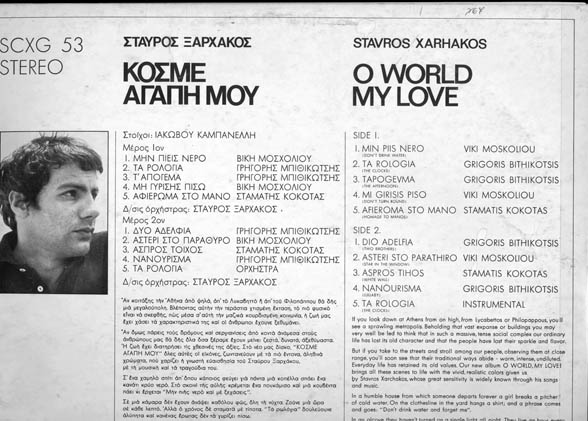
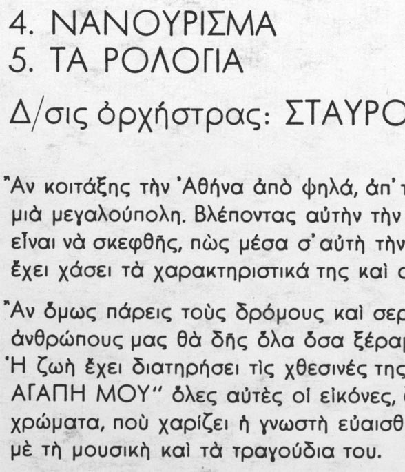
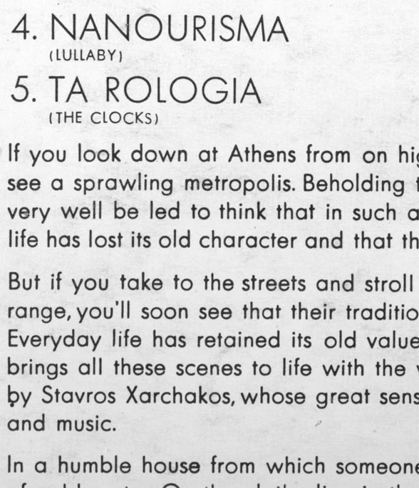
Fight! Fight! Fight!
It’s a discussion.
It’s not about winning, but resolving important issues.
Nick, I'm familiar with examples of Greek modernist design, and my opinion that this design was ill-served by mostly clumsy, Latinised types isn't something to which I've come lately. While the layout of the older record sleeve you show is better than the re-release in every respect, I think the type used was inept, not only stylistically but also technically. There are major problems with relative proportions, spacing and even basic legibility when it comes to the diacritics.
As I wrote early in the thread, perception is at play. I actually find more traditionally structured Greek letters to be much more restful and less busy in blocks of text than these simplified forms, which don't seem to knit together so well. I think this is demonstrated in your last two images, in which the Greek completely lacks the calm neutrality of the English text.
I spent a lot of time considering this back in 2000-2001, when I was designing the new Greek for Linotype's Helvetica World. What I sought in that design was a comparable feel to blocks of text in both scripts, which I didn't find was served by the original Helvetica Greek design of the 1970s, even though that made free use of many borrowed shapes from the Latin. It's a project that taught me a great deal about harmonising different scripts, and one of the key lessons was that, contra your assertion that 'a straight line is a straight line, whatever script it’s in', a particular arrangement of straight lines in one script has an entirely different impact on text than a similar arrangement in another script, and a result of different frequencies and different combinations of shapes arising from the letter forms.
Writing systems tend to produce, over time, forms that are pleasing to the eye as well as being easily readable, simply because readers respond positively to these things. And since the reader encounters letters in text, it is in text that this pleasantness and readability expresses itself. So I think it is always worthwhile to look at blocks of text and ask what makes them pleasing, or not, and take on board what generations of scribes, typographers and readers have come up with. So when I am harmonising different scripts, even within the context of styles of type associated, through their use, with modernism, this is the basis from which I proceed.
Or, to put it another way, I find the ideas of modernism unhelpful in designing successful modernist types.
… these simplified forms, which don't seem to knit together so well.
I agree with you there; but the problem is that enough of the forms are not simplified—the execution, not the principle is at fault.
However, I was not holding up this particular cut as a typographic examplar, but citing an indigenous normative form of typeface quite different from the stereotype followed by western foundries today.
Your taste may lead you in a certain direction, but you can’t justify it by saying that it’s what the people are used to, when that is not the case.
Writing systems tend to produce, over time, forms that are pleasing to the eye as well as being easily readable, simply because readers respond positively to these things.
That has not often been the subsequent consensus about 19th century typography.
It is tempting to believe that at this point in history we now know best, but that’s hubris (a good Greek word!)
Don't punk out on me now, Shinn... lol...
citing an indigenous normative form of typeface
Normative? Idiosyncratic is the adjective I would use. It may have been trying to achieve something worthwhile, but my point is that it fails. And while I'm not denying that some form of simplified yet convincing Greek is possible, I'm saying that there are common problems in all the attempts I've seen. So while I'd agree that the fault is evident in the execution, I'm suspicious of a principle that produces so many problem children.
Normative? Idiosyncratic is the adjective I would use. It may have been trying to achieve something worthwhile, but my point is that it fails.
But it didn’t fail to be normative.
Greek versions were made of the major 20th century European sans typefaces, from Germany (Futura), Switzerland (Helvetica) and England (Gill Sans), and these were the norm in mid-century Greek typography when a sans was required, just as they were elsewhere throughout Europe. Scholderer’s New Hellenic couldn’t carry all the load.
And, just as Gill was localized for Germany, so too was Futura adapted to Greece.
There was dialogue and development; the example I just posted does not have the truly idiosyncratic “beta=theta flipped” of Olympia, for instance. Such variants demonstrate that the Futura style was a norm.
I think we're working with different notions of normative. I described the process by which normative letter shapes evolve and are regularised over long periods of maturing written culture. You are talking about accepted styles of typefaces within particular periods of graphic design history. It is perfectly possible for typefaces to be successful while straying from or directly contravening normative letter shapes, but that doesn't make them normative in terms of the writing system.
How can normative letter shapes have any shape at all, if not expressed in a widely used genre of typeface?
For instance, the binocular /g is not handwritten, and its shape is too complex for simple verbal or mathematical definition. It has been primarily a typographic form for a long period of time.
The letter /y has at least three topologically distinct normative shapes, which correlate broadly with genres of type—geometric, humanist, and techno:

In focusing on the Futura or geometric style, I am identifying a genre not just of type, but of a stylistic norm which constitutes a categoric subdivision of the diversity of letter shapes within writing systems, because many individual letter shapes do not regularize down to one standard form. Futura/Olympia is not an aberration.

> He has been the go-to guy for Western type designers who want to do Greek right
I always distrusted this guru-ism (though I appreciate Gerry L. very much, of course).
I *did* want to do my Greek right, yet did not go to Gerry. Deliberately.
The binocular g is the normative shape that evolved in the Italian humanist formal book hand.
I didn't say that there was only a single normative shape for each letter; indeed, I specifically said that orthographic integrity is a continuum. Your example of the three letter y shapes actually makes my point, I think: these are recognised normative shapes in which one can see the relationship of each to each as well as their stylistic distinctions, and we know how each evolved. My point is that you can't simply invent a new shape and proclaim it normative, without in the process throwing out any useful application of that term. So, for example, the lowercase pi in the album lettering is an innovation that I would say is counter-normative for the lowercase Greek alphabet. That doesn't imply that it is a failure in itself or within the particular mini-system of the type style in which it occurs, but to call it normative of the writing system is meaningless. If a genre of type styles develops in which this shape is typical, then one can say it is normative of the genre, but as I said, this is a different use of the term.
The binocular g originated in handwriting, but its presence as a norm has been entirely typographic since we stopped writing g that way.
If a genre of type styles develops in which this shape [three-sides-of-a-rectangle pi] is typical, then one can say it is normative of the genre, but as I said, this is a different use of the term.
Not really. It’s the same degree of distinction that exists between the different /y’s.


"Why, in this day and age of stylistic diversity and internationalism, should new Greek typefaces be chained to an historic pen-driven model? "
I am very much interested in what is western and what is modern. If something looks western is it modern? The best example modernizing a typeface without latinizig would be Nyala Ethiopic font designed by Our John Hudson. He can tell us more but to my eyes. He added modern principles of type Design to Ethiopic
(Better proportion,good balance,warmth to individual characters wich works well as a text block etc..,) most of all very legible.
Recently I design a 400 page book using Nyala.
I also have seen Droid sans Ethiopic designed for google which can be a good example of latinaizing non Latin font to the point it is not useable by native users.
I think it is good to to discuss what modern means exactly.
Thanks
Aleme
Again, Nick, we're talking about different notions or contexts of normative. I'm talking about writing systems and you're talking about typefaces. I don't agree that the set of pi shapes you show parallels the set of y shapes, except superficially, because the latter all evolved in the normal maturation of a writing system, but only the right-most of your pi forms did. The other two are uppercase forms that are alien to the normative Greek lowercase alphabet. That doesn't mean they're not normative within some styles of typeface, nor that such typefaces cannot be popularly or commercially successful. But when you and are use the word normative, our signifier has different signifieds. :)
I too am talking about writing systems.
Perhaps the difference is that your concept of the “normal maturation” of a writing system does not extend into the typographic era, whereas I consider that writing systems continue to evolve—just like spoken language, which they represent.
Warning, extended metaphor ahead.
I think what happens to writing systems that have been reduced to type (borrowing a construction frequently used of oral traditions when they are 'reduced to writing') is that they cease to evolve in ways that affect the whole genome of the script. Rather, like human evolution in the civilisational period, what you get are relatively minor mutations that don't spread in the population and only express themselves in fragmented gene pools, in this case genres of type. I think this is quite different from what is observed during the evolution of a writing system in the context of scribal cultures, in which periods of intense creativity produce system-wide paradigm changes that then dominate across multiple languages using the script sometimes for centuries.
To engage your metaphor:
Not much biological evolution of humanity has occurred during the civilizational period.
But writing systems are entirely cultural, and evolve with culture.
There is no reason for them not to continue to evolve, as writing technology changes from clay tablet to pen and paper to foundry type to digital fonts and pixel media.
Reading is an important part of writing systems, and for the past hundred years there has been near universal literacy in the West, with most of the reading being of type, and within this century most adult writing being done on a keyboard with digital fonts. That is a system-wide paradigm change as great as any that ever occurred in a scribal culture, so it is reasonable to assume that it has had a profound effect on the normative shapes of letters.
Yes, it has narrowed and mostly frozen them, such that change now only occurs within fragmentary stylistic avenues: mutations that do not spread to the general population of normative forms. I'm not describing what might happen, or proposing counterfactuals, I'm describing what has happened. The evolutionary analogy is actually very apt, because what we see in contemporary type design is an explosion of stylistic mutations that do not take hold on the writing system in anything like the way, to take this back to the original topic, the Byzantine scribal cursive took hold of the Greek writing system, or the naskh and nastaliq styles took hold of the Arabic and Persian writing systems. I don't think it is sufficient to say that writing is cultural and that it evolves with culture without examining what evolution means in this context and acknowledging that what happens in the maturation of writing systems is akin to biological evolution, whereas what happens in typography is actually akin to evolutionary failure, exciting though it may be to watch happening in the petri dish.
… what happens in typography is actually akin to evolutionary failure …
I can’t share such a pessimisitic view.
The ecosystem that thrives is not the monoculture, but one where there is diversity to accomodate whatever manner of change it may encounter.
The three-sides-of-a-rectangle pi has in fact spread to the general population of letter forms and become a norm in the Greek writing system, because writing systems in the 21st century are primarily typographic and allographic, with multiple norms of many letters, of which pi is one. This variety does not mean that the variants are trivial and the pre-typographic singularity (if there ever was such a thing) is the only real norm; it just means that there is variety, existing in forms that may be categorized according to typographic style.
Despite the fact that the three-sides-of-a-rectangle pi can never achieve complete hegemony, it is not a worthless mutant but an old species of shape (capital Pi) that now thrives in the lower case sans—ecological succession, if you will.
Hey, no changing the referants mid-metaphor! We were talking about writing systems as if they were species (the level at which the evolution metaphor applies), not ecosystems.
Who said anything about pessimism? Is it a matter of pessimism that mutations in human genetics are now all evolutionary failures, i.e. that they do not propagate to the species? It is simply the observable state of the species in its present situation, and I'd say that the same is true of writing systems in a typographic situation. Writing systems no longer evolve as they used to. This doesn't mean that change doesn't happen, or that the change isn't interesting or even fruitful in a limited way, only that it doesn't propagate at the 'species' level and hence isn't really evolution.
And I still think you are overstating the case for something like the three-sides-of-a-rectangle pi as being in any sense a norm in the Greek writing system. It is a feature of a small sub-genre of typefaces, and that not a writing system norm constitute. And I think it looks rubbish, unconvincing and disruptive of the normal rhythms of the Greek minuscule.
We were talking about writing systems as if they were species (the level at which the evolution metaphor applies), not ecosystems.
Looks like the conversation evolved!
It is a feature of a small sub-genre of typefaces, and that [does] not a writing system norm constitute.
There are many norms; a norm is a convention of letter form which exists in different genres of typeface.
Futura, DIN and Verdana/Tahoma aren’t a sub-genre, but a variety of much-used sans faces, ranging from humanist to geometric.
I could have mentioned more sans serifs, such as PF Centro.
It is also designed by a Greek and published by a (very successful) Greek foundry, which is enough to convince me that it is authentic.
Perhaps they have decided it’s time to disrupt the old rhythms.
Furthermore, those serifed types where the extension of the crossbar is nothing more than serifs, such as Rockwell, may also be considered members of the “three sides of a rectangle pi” norm.
As I said earlier, we're using the concept of normative in reference to different things: you're talking about 'different genres of typeface', and I'm talking about writing systems; you're considering typefaces as representing the evolution of writing systems in a typographic ecosystem, while I consider typefaces to be essentially arbitrary stylistic mutations that, due to the nature of the ecosystem, do not represent evolution of the writing system. Both perspectives seem to me valid. I prefer mine because it seems to provide a more systemic and less general sense of evolution -- something other than just a synonym for 'change' --, and because it provides criteria other than fashionable success to make judgements about individual typefaces and genres and, indeed, to make design decisions. The problem of taking typefaces as constituting new norms is that, as with the so-called experimentation of the 1990s, there are no failed experiments.
… I consider typefaces to be essentially arbitrary stylistic mutations that, due to the nature of the ecosystem, do not represent evolution of the writing system.
How do you account for the extinction of the long s?
… The problem of taking typefaces as constituting new norms is that, as with the so-called experimentation of the 1990s, there are no failed experiments.…
That’s not the case with the Greek geometrics. The experimental “theta = beta flipped” of Olympia was not adopted by any other typefaces, AFAIK. However, its three-sides-of-a-rectangle pi has become a norm in sans typography, because it has been implemented in a variety of widely-used faces.
Two more faces, serifed, in which this norm exists (note that the Upper and Lower Case forms of Pi/pi are identical): Century Schoolbook and Courier.
Even if those past defaults are to be outmoded by ClearType revisionism, there are sufficient new “rectangular pi” fonts coming online to maintain it as a norm — at least until December 21st when we revert to a pre-typographic civilization.

John:
I'm going to number some ideas for ease of reference. :) Perhaps I'm misunderstanding something in your discussion. But you wrote:
(1) "you're considering typefaces as representing the evolution of writing systems in a typographic ecosystem,"
(2) "while I consider typefaces to be essentially arbitrary stylistic mutations that, due to the nature of the ecosystem, do not represent evolution of the writing system."
For my part,
(3) I consider handwriting and even hand-printed lettering to be dying out. Certainly, I don't see how they can continue to be significant factors in the evolution of written languages for very long. In the case of English, the time is probably ending with the current generation.
It seems to me that if one accepts all the above premises, that writing systems will stop evolving as hand-written glyphs cease to be a major force.
Personally, I see (3) as being a statement that the nature of the "ecosystem" from (2) is changing. I don't think writing will stop evolving. Indeed, modern digital distribution and relative ease of type design means that changes can occur much more quickly.
(I'm not sure whether the rise of the smiley face and emoticons counts among such changes, since they work with plain ASCII and any existing typeface. But they certainly show rapid change....)
Tom: I don't think writing will stop evolving. Indeed, modern digital distribution and relative ease of type design means that changes can occur much more quickly.
Change does not constitute evolution. I know there is a common usage that treats evolution as a synonym for change, but it is imprecise and doesn't allow one to say much of interest about change other than that it happens and, as you note, may happen quickly or slowly. In order for this metaphor to be interesting, let alone enlightening, I think one should first identify the functional synonym of change in the evolutionary model, which is mutation. Change = mutation. Evolution is one possible outcome of mutation: propagation of the mutation through a population, such that one can say that the species has evolved. Individuals mutate; species evolve.
In order for evolution to occur, there must be a mechanism by which a mutation can propagate through a population. In biology, the mechanism is sexual reproduction. Such a mechanism is necessary but not sufficient: in order for evolution to occur the circumstances must also be conducive. It may strike one as ironic, but the more successful a species is in terms of the size and spread of its population, the less conducive its circumstances are to evolution.
[This is the situation that human beings arrived at something more than 65,000 years ago. Simply put, our population is too large and widespread for any mutation to propagate to the species level; evolution is statistically impossible. This is not to say that change, i.e. mutations, do not occur, and might not even spread in some limited local way, especially in populations that live separate from their neighbours, but that as a species homo sapiens is as it was in the palaeolithic period, and isn't expected to change.]
Now, if we're going to apply the metaphor to writing systems as the species-level phenomenon, which I think makes most sense in terms of a parallel to biological classification, then one should ask 'What is the mechanism of propagation of a mutation through the population?' And I think the obvious answer is pedagogical reproduction as practised by professional scribes. The notion of 'hand-writing', as something an individual does, isn't important. What is important in the evolution of a writing system is a profession of scribes, of people whose job is to manufacture texts. And it is a profession that one sees wherever one sees mature writing systems, very often existing as a specialised caste, with reproduction of existing styles being a core activity and pedagogical focus (propagation), and invention of new styles (mutation) occurring within and feeding into that activity and teaching. The Islamic ijazah system of certification in individual styles is a good example of such pedagogical reproduction, which enabled naskh an 8th Century mutation of thuluth by an individual scribe, to propagate to the writing system as a whole and become the dominant text style for a large part of the Islamic world for more than a thousand years. In that context, it makes sense to talk about the evolution of the writing system at the species level, and not just a synonym for change. Similarly, if one looks at the scribal culture of 18th Century England, as I have been doing for the past couple of years, one sees the same active pedagogical reproduction: the teaching of a 'body of penmanship' consisting of a repertoire of existing styles that the professional scribe is expected to master, which simultaneously provides the conducive circumstance for a new mutation, John Seddon's roman of 1695, to propagate and become one of the standard hands within forty years. That strikes me as evolution of a writing system properly understood, with visible propagation to the species-level and a recognisable mechanism by which this happens.
With the decline of a professional scribal class, the mechanism of propagation degrades -- one by product of which is that handwriting becomes a personal, expressive form instead of a mastery of a body of styles --, and I believe the development of graphic design in the 20th Century further produced circumstances unconducive to such propagation. Instead, one sees fragmentation into an ever increasing number and variety of new styles, which is akin to something like a population explosion, resulting in a situation in which, as we all agree, change (mutation) happens very quickly and frequently, but no longer propagates to the species level.
____
Now, having written all that. I'm going to reverse tack somewhat and see if I can find a way to synthesise my view and Nick's, and come up with a way to accommodate the kind of design developments he observes within this evolutionary metaphor. The key, I think, is to introduce sub-species taxonomic ranks, i.e. genera, which enable us to acknowledge that the limited propagation of mutations can result in distinctive, and hence classifiable, styles that belong to the (no-longer-evolving) writing systems. That is, a limited evolution can be said to occur -- in writing and typography -- at the level of the genus, which does not significantly affect the species as a whole, but produces novel plumage, if you'll excuse the pun.
Nick: How do you account for the extinction of the long s?
Lazy compositors. The typeface makers didn't stop including them; the compositors stopped using them. They persisted in writing, though, like most else, until the typewriter came along.
I don't know whether I'd classify this as evolution of the writing system. The long s is still there in the system considered in toto, just something like the appendix or the atavistic bone structure that I have in my ankles.

I'm enjoying this discussion, gents. Thanks.
There were certainly economic benefits to dropping the long s—especially all the italic ligatures—but printer-publishers would not have exploited the productivity opportunity without aesthetic justification. That it was expressive of a larger movement can be seen in this page from Wordsworth’s Lyrical Ballads, 1802 edition, which is the sort of thing that would have given cachet to the practice.

Compare this process of the normal form of /s changing to one used elsewhere (at the end of words) to that of the traditional π with “overshooting” crossbar being changed to the majuscule form in various typefaces. In both cases, typography has been the driving force in rationalizing the writing system.
That is, assuming that reduction is rational.
to introduce sub-species taxonomic ranks, i.e. genera,
Just a small nitpick here, John: Genera are super-species, taxonomically speaking. As I’m sure you know, Genus species is the standard format for scientific names. The sub-species rank is, well, subspecies.
Kids prefer cheese over fried green spinach.
Thanks for the correction, Kent.
Nick, I see the decline of the long s as orthographic reform. I think you are entirely right with regard to the influence of a publication such as Lyrical Ballads: it was actually exactly the same book that came to my mind as an example from the transition period. But the fact that such a reform takes place in publishing, i.e. in a typographic environment, does not mean that it is 'driven by typography'. It is driven by reformist publishers, editors and authors. As I said, the fonts they were using still included the long s, they just opted not to use it.
Many of the world's writing systems contain historical letters that have fallen out of use in modern orthographies. So? Most orthographies are only subsets of a writing system.
…the fonts they were using still included the long s, they just opted not to use it.
That’s doubtful—it’s more likely they would have recycled the metal to cast more short s’s.
Captured from web.archive.org on 26 Apr 2015. view this capture