Typophile

Customised Logotype Critique

manyaldesign

I'm not a typographer. This is my first attempt to create a customized logotype for a fashion brand.
All work done in illustrator.
Hope to hear comments & critiques from all Professionals here!
Thanks in advance.
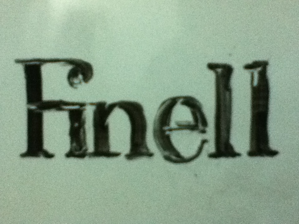
#sketch on whiteboard
#1
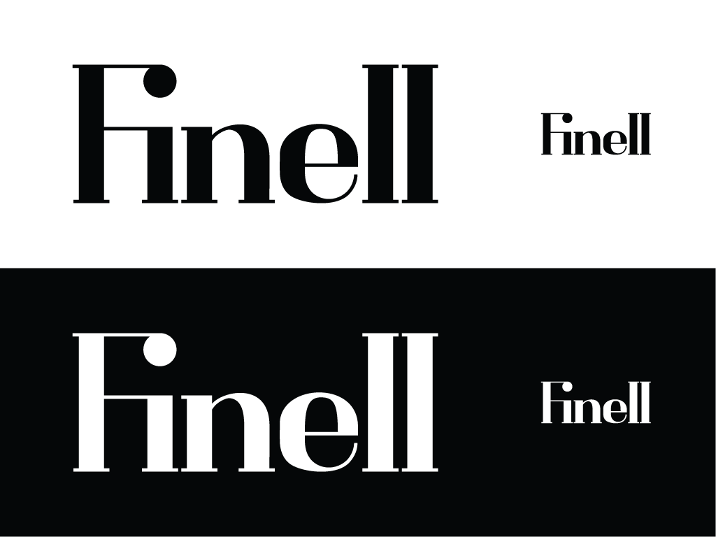
#2
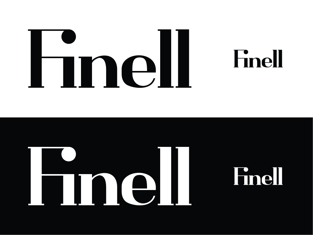
#3
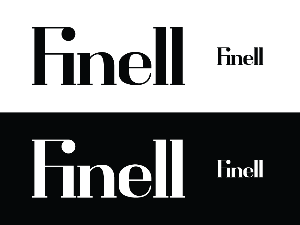
Three things that I noticed:
– I am not sure about the legibility of the ‘Fi’ ligature. In any case I think the combination is too wide. Try to match the counter with that of ‘n’.
– The serifs seem short to me. And if this is the display version of the wordmark, I would expect a more spectacular thick/thin contrast.
– ‘e’ seems wobbly on the lower and upper left.

To me the "Fi" is OK, and it looks nice too. But the curves in "n" and "e" need a lot of work. And the spacing is uneven.

First things first though: what kind of fashion brand? Who are the current -and desired- customers?

hhp

I too think the ligature is fine. /e/ needs to sit lower and be taller to optically compensate for curved top and bottom.

Thanks for all of the comments!

I would probably go for the more century like serif in your initial sketch instead of the bodoni style serif in your digital draft.

As said before the curves need some work.

A bit higher x-height might help bring the tittle into place.

Captured from web.archive.org on 5 Aug 2014. view this capture