Typophile

Font Aid VI: Aster Affects

Grant Hutchinson

The Society of Typographic Aficionados is organizing Font Aid VI: Aster Affects — a project uniting the typographic and design communities to raise funds for Red Cross relief efforts after the events of Hurricane Sandy.

The project theme will be represented in a typeface consisting entirely of asterisks.

Why the asterisk?

An asterisk can denote something that requires attention — and an event of this magnitude and impact certainly deserves some attention. The asterisk can also provide *emphasis* to important information amidst fields of plain text. The root of the word comes from the Greek astēr or “star” - signifying hope and light. In computer terms, it’s a wildcard character … and hurricanes are certainly wild and unpredictable.

This submission deadline is Saturday, November 17th, 2012.

See the submission guidelines for more information.

Thanks in advance for your help.

— Grant

Ashton Kutcher Affects?

Awesome! I'll try to have something done...

n.

So, you want the asterisks to descend and fill the em, as opposed to a normal asterisk sized and aligned for cap/ascenders, with a normal proportion (25% of the em), below the baseline.

Have I got that right?

In practice they [have to] scale everybody's work anyway.

Great idea BTW - I'm on it too!

hhp

This glyph from an unfinished typeface immediately came to mind; from my typically abundant artboard flotsam...

how does making an all asterisk font help Sandy victims exactly?

Did you read the history?

The money from sales of the font goes to help the victims.

hhp

Nice one Brock!

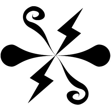
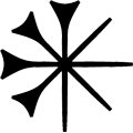
Here's mine (although still in tweakage mode), I hope my lighting bolt theme is acceptable...

n.

brockfrench, that's a sweet asterisk! I particularly like the way that there are two implied rotated squares sitting on top of each other, creating tension between the rigidity of the squares and the fluidness of the arms.
5star, I like the lightning bolts in your design. I also picked up on the storm theme, using raindrops in my asterisk. I also made a version where one of the "petals" is an extra big raindrop pouring out. Which do people like better?


Thanks Neil, Stephen; looking good.
It's going to be interesting to see the variations in the number of points on all of these asterisks.

Stephen (sgh), the asymmetrical one is more interesting, and in my opinion the better idea too. It would need a bit of tweaking, though. Maybe you can make a progression in size of the drops.

I like the top one just fine... Maybe submit both and let them sort it out.

Chris Lozos posted his contribution on Flickr: http://www.flickr.com/photos/dezcom/8173484241

“Ashton Kutcher Affects?”

@ryan — Good lord, I hope not.

“So, you want the asterisks to descend and fill the em […] Have I got that right?”

@david — Yes, that’s correct. We’ll be treating the asterisks more like dingbats than their typographically correct parents. However, since we’re producing the final face as OpenType, we could provide a stylistic set which sizes and positions the glyphs as per usual … I kind of like that idea, actually.

To everyone else, thanks for participating.

The examples you’ve shown so far are wonderful.

Keep it up!

Hi all, this is my first post.
I saw some submissions on twitter and I'd like to contribute.

I made this for my twitter and forum avatars, would this be acceptable?

It's very pretty, and meaningful.

The narrow gaps might suffer at small sizes.

hhp

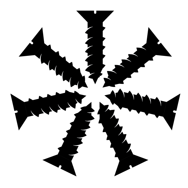
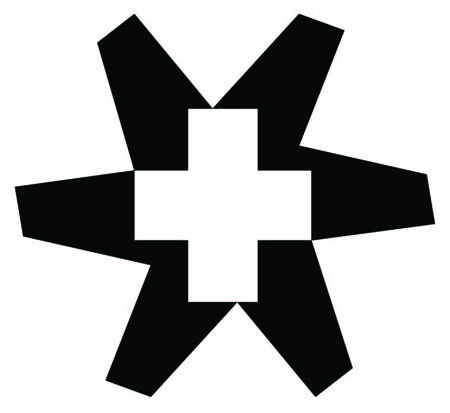
I submitted this one to SoTA. I read a note on Wikipedia that said the original asterisk had seven arms. Citation is apparently needed to back up that claim, but it got me wondering how a seven-armed glyph would look.

Here's what I submitted:

And here's what I said:
I had the great fortune of living in New York City this past summer while I studied type at Cooper Union's Type@Cooper program. Like many people, the city is full of my friends and family. When I think about Hurricane Sandy, I am brought to the idea of 'balance.' It has affected the balance of so many people's lives and daily routines. And, the hurricane itself was brought on by a great imbalance in our climate. Many of those affected will return to their 'normal' quickly, while others will have to find a completely new balance. My asterisk was based off of an 'unbalanced' rectangle, repeated 6 times.

Thanks for noticing, Riccardo!
Here are the two variations:

vortex

It started off as an asterisk. Then it was sucked up and spit back out by this great big gritty giant vortex.

@ This Machine Floats;

nice!

I see Fleurons of Hope has gone from Myfonts, which is a shame.

Still, keep up the good work.

Tim

Russel,
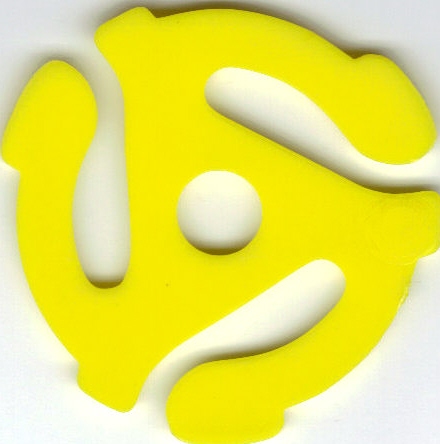
I know you are WAY too young to have ever seen one of these but your design above brought back warm memories of my teenage record collection:
http://en.wikipedia.org/wiki/45_rpm_adapter

:-)

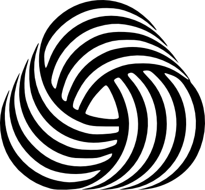
…with a touch of Woolmark, one of my all time favourites.

Tim

~ :)

I certainly am not way to young to remember playing stax-o-45 RPM wax on the hi-fi with the funny plastic thingies in the middle.

I just act that way, Chris.

:o)

You are young at heart then, Russell :-)

hhp

Here’s what I will contribute: one six-pointed and one-eight pointed asterisk based on a wood type star found in the »Morgan Press Specimen Book 1964«!

Tim

Good one, Tim!


Here's mine.
Please bear with me, so little time, so incompetent at Illustrator.

The rough for my asterisk design. I wanted to play on the idea of rebuilding. Thoughts?

Hi everyone - happy to participate in my 3rd Font Aid. Here's what i'm submitting tonight. Seen some interesting stuff. Look forward to seeing all of them.. Ed [Ziss Design]

I'm taking votes on which of my three attempts is best. Not really very themed, though. :/

http://blog.extensis.com/fonts/asterisk-font-aid-vi-hurricane-sandy-reli...

The one on the left.

hhp

Middle one.

The one on the right.

n.

Here's my other...

n.

Neil... maybe a bit too on the nose...

Ya perhaps so Brock, more cathartic than anything really.

n.

@Thomas Phinney .. the one on the right! – Why don’t you submit all of them?

Chris, thank you.

Cole, I enjoy the discord and simplicity.

Thomas, centre – (axe head over spear).

Tim

After this can we do a Font Aid to have Israel leave Palestine the hell alone?

Thomas - the one on the right :)


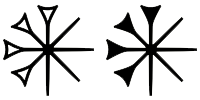
I'm basing my submission on the Sumerian cuneiform sign dingir. Should I pick the outline or the filled version?

Here's what I submitted...
Abstracted frangipani asterisk:
Like Hurricane Sandy, the Frangipani (Plumeria) originates from tropical and subtropical Americas. When you twirl a single Frangipani flower into the air, it will whirl off like a flying spinning top until it hits land.

Brian, nice. The filled one.

hhp

Thomas, these all look like shuriken to me.

Top 3 for me so far is:

dezcom
timd
the_adventure

(in no particular order)

I like the filled one; how would it look rotated clockwise by one position.

Jongseong, I'm diggin'the Sumerian cuneiform sign asterisk.

After finally getting to the heart of the matter I submitted this one...

...except in all black of course.

n.


Thanks for your opinions. I'm submitting the filled version (with some tweaks on the curves) as it seems to be the consensus.

Brock, some rotation may help balance this from a purely aesthetic point of view, but the intention was to have a glyph that functions both as an asterisk and the Sumerian cuneiform glyph dingir. So even though I regularized it with perfect 45-degree angles, I wanted to obey the well-established stroke order for the cuneiform glyph.

Nice to see all the works here before being released, I tried to create some whirlwind of aid to counter the one of destruction:

The 3dness is only a bonus. It could have been more finetuned, but sadly other work and deadlines reared their ugly heads.

Arthus, nice concept you've got going on there...

n.

My contribution:

*DisAsterRisk*

Right-wing ideology and its aggressive defence of capitalist modes of production are complicit in the systemic cause of climate change. Indeed, these regimes are not only contributing to the increase and amplification of natural disasters, but seek to profit from them also. However, these actions have made explicit the hierarchical structures, and so provide an opportunity to challenge and transform their destructive modes of production and distribution.

My contribution represents the manner in which certain forces tear structures apart but in so doing enable new allegiances to form. That is, a situation which is presented as singular is shown to be multiple. However, this multiplicity is a series of differences that share certain commonalities. A duality is revealed. Arrows can be discerned in the design – a clash between a collectivised left and a individualistic right that confront each other in an agonistic struggle over how society is governed.

In their abstraction, the dots can also be understood as representations of communication technologies, and computational ones in particular. For the binary background presents a dramatic change in how politics is practiced and introduces new techniques for profiteering (e.g. high-frequency trading).

By the way, you still have time to submit a glyph. We’ve extended the submission deadline to the end of today — Sunday, November 18th

@Vertex: Only one glyph submission per designer! I submitted the rightmost of my three.

There are some very cool asterisks here. I especially like joro’s.

What's going on? How's it coming along? How many do we have? Did the submissions come in from all around the world? Like from where? Wazzup???????????

Huh???

Just wondering...

n.

Taps on computer screen ...hello? ...hello?

Sup G. ???

n.

It seems that there will be at least 240 glyphs from 40 countries (https://twitter.com/typesociety/status/270260549223325696).
SOTA promised a “a sneak peek soon” (https://twitter.com/typesociety/status/273813481764040705).
Judging by past editions, the work needed to make a font from all submissions is pretty time consuming.

n.

Ouch.

Judging by past editions, the work needed to make a font from all submissions is pretty time consuming.
Indeed.

@ Grant, I'd be happy to lend a hand if you need it.

I didn't mean any offense to the good folks over at The Society of Typographic Aficionados, I did mean to prod those goof ball Republicans who are obviously trying piss off Republican Governor Christie for coming out just before the election in favor of not supporting Romney ...sad stuff indeed.

I am looking forward to grabbing a license of this font tho. I hope our collective efforts can bring some form of relief. I'm sure we will have plenty of time to contribute in what is turning out to be a calamity of a rebuild.

Perhaps we could also do a poster showing all the submissions?

n.

What up Grant?

n.

I see that the font has been posted for sale on the SoTA site store. I clicked through and purchased it but there was no place to download the font. Did I miss something?

Thanks for the update Dez ...sorry to read of the glitch tho. I'll pick up a licence as soon as possible.

WOW, lots of people contributed!!

http://www.typesociety.org/fontaid/vi/

That's just awesome!!

I wonder if the powers that be could put a banner link up under the Typophile Twitter link in the right side column?

http://www.typesociety.org/fontaid/banners/

Will this be exclusively through SoTA or will it be on MyFonts? I’d be interested to see the glyph palette.

Grant kindly emailed the font to me so all is now well.

Just bought it!
Thanks everybody, especially Grant, Dave and Neil.

So what are the chances we can get a list of who did which? :-)

hhp

Mine is uppercase Q.

I don’t know who did the one in the lowercase g position, but it is hypnotic if you zoom in too far.

Tim

I purchased a licensed copy of Aster Affects from SOTA yesterday and put a screen shot of the glyphs in my Flickr photostream and in the Font Aid Flickr group. Grant Hutchinson (aka Splorp) tagged himself and me. He suggested that others who designed glyphs could tag themselves, too.

http://www.flickr.com/photos/johnlyttle/8654902307/

Thanks John! (And done.)

hhp

Thanks John!

Thanks John!

Captured from web.archive.org on 12 Aug 2014. view this capture