
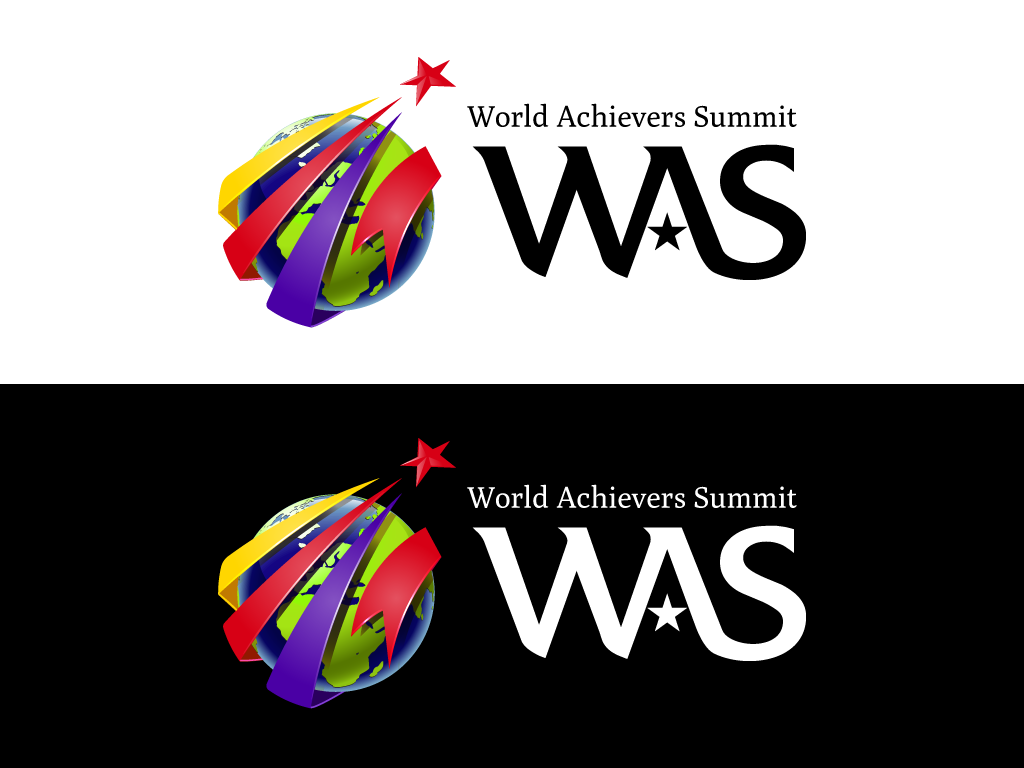
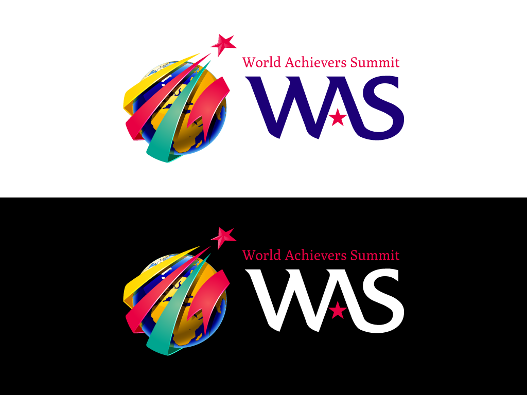
Something is wrong with the typography and colors, any remarks and suggestion?

The "AS" connection is very wobbly.
hhp
thanks for the comment hrant. Any alternative font suggestion for both? something modern and it need to look better than this:
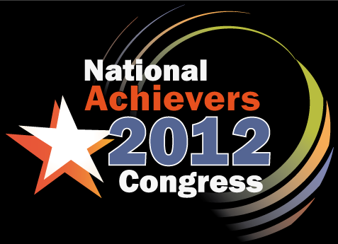
The stars bug me; they are drawn with different styles (one flat, one dimensional) and they seem redundant. Might be better if there was a way to make it work with just one star.
Also I don't particularly care for the swashes (or whatever you'd call them), but if you're going to use them a curve would fit the globe better, right now they seem to have a fold.
how about this one
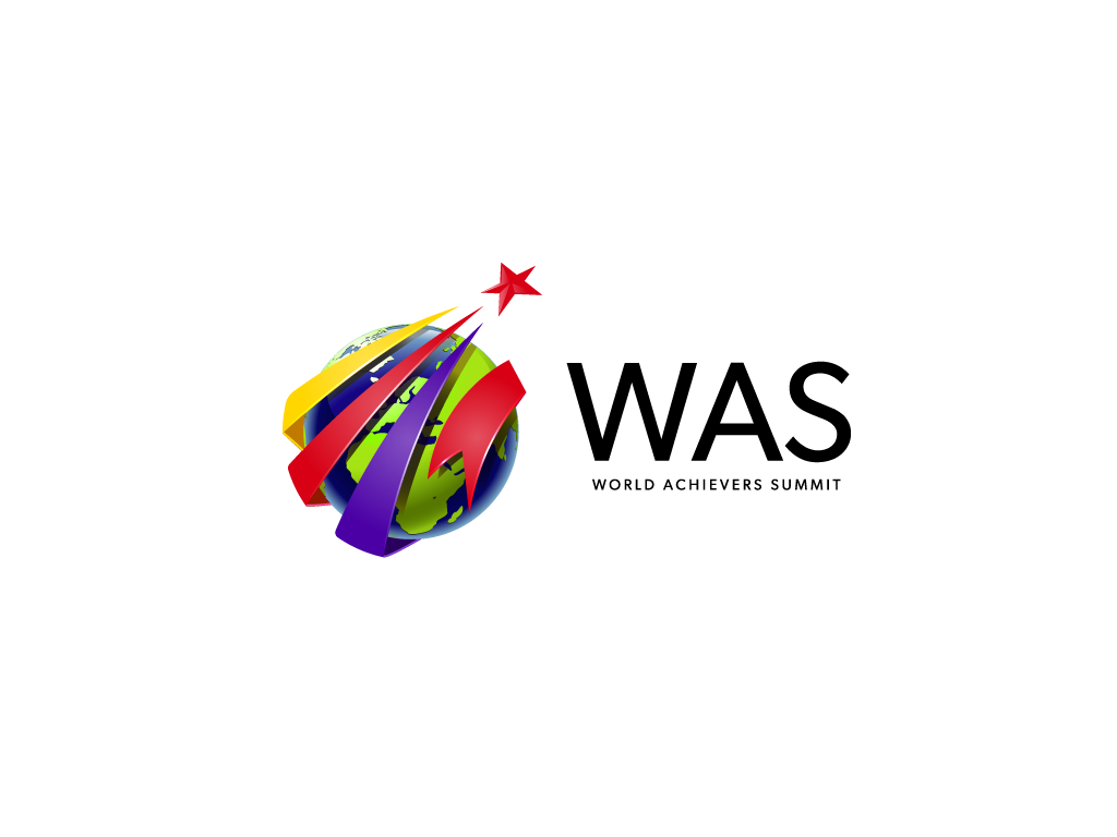
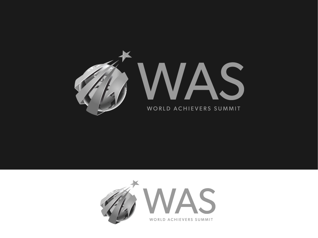
about looking folded, I don't intent to change it as for right now. I'm more concern about the color combination. Thanks for the critiques!

Feedback on your concept.
Clipart overkill! Suggestion: you could make it a lot simpler by sticking to the rising star concept.
Do people often refer to the summit as WAS? Or do you want them to? Because if not, why not just stick with the full name. (No more scaling problems either.)
Captured from web.archive.org on 5 Aug 2014. view this capture