Typophile

A faithful sans version of Garamond?

Christian Thalmann0 votes

I've recently developed the urge to doodle a monolinear sans-serif rendition of Garamond that tries to stay as faithful to the character of the serif source as possible. Now, that seems like a pretty obvious thing to do, and I expected to find a number of fonts online that had pursued exactly that design concept. However, with my very limited overview of the font world, I didn't find any. I suppose Gill Sans Light comes close to that to first order, but upon closer inspection it has a lot of quirks.

Are there any obvious candidates for that kind of font that I'm not aware of, or is it a concept worth pursuing with a new font project?

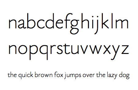
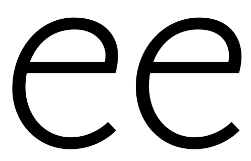
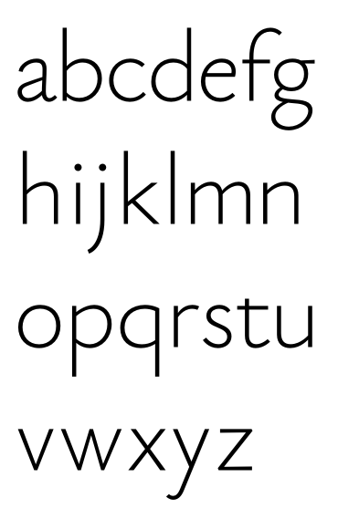
For a test drive, I made a few letters in stroked path mode in FontForge. I quite like the looks of it. I've added a shot of EB Garamond below it for direct comparison:


What do you think? Is it worth pursuing?

If so, I suppose it's unhealthy to stick with the stroked-path mode, and I should switch over to outline mode as soon as possible. However, I'm having trouble with the "Expand Path" functionality of FontForge; it invariably causes the application to crash. That would considerably increase the amount of work it would cost me to achieve a nice consistent stroke strength. Do you know of any easy solutions to that problem?

Cheers

Now, that seems like a pretty obvious thing to do, and I expected to find a number of fonts online that had pursued exactly that design concept. However, with my very limited overview of the font world, I didn't find any.

There are at least three: Claude Sans, Marian 1554, and Aragon Sans. That doesn’t mean there isn’t room for other interpretations, of course. You would also want to steer clear of Today Sans and Cronos, but if you haven’t seen those maybe it’s best not to look at all so you won’t be in danger of being subconsciously influenced. I think your concept of following the structure of Garamond is a good one. Just don’t trace the model too strictly — use your own ideas to make it work as a sans.

The category of 'humanist' sans generally go in this direction by basing their lower case on the oval, rather than the circle. One of the earlier ones, inspired by Jenson rather than Garamond, is Legacy sans.

I think that one can't capture the whole look of Garamond in a sans. It's impossible first because chopping off serifs doesn't work—you have to change relative widths of characters to get a good rhythm. But the other thing is that most sans are more monoline, and old style serifs have a lot of thick-thin contrast. Particularly with old style, this means that the curves in the interior are different from the exterior. Here you have followed mainly exterior curves, though not exactly. And that means that the whole has a different feel. For example, the o and d are quite different in Garamond and your sans.

None of this is to say you can't come up with something great. It's just that you will have to decide what you want to capture of Garamond, and what you are willing to give up. And then you as you progress you will find that to have integrity and coherence in your design, it will start dictating its own rules, independently from Garamond.

I think you already have a challenge along the line of coherence in that your o is rather geometric, and the circular part of the d is not. Also your a has inevitably changed the relationship of the spaces within the bottom and top parts of the letter, and now looks a bit awkward.

Worry about how it would be useful more than how to derive it.

FWIW the first such font was Syntax.

hhp

Thanks for the replies, everyone. I don't think I'll make this my main project at the moment, but I'll keep it around in case more inspiration (or boredom) strikes.

@ Stephen: I had a look anyway, and I'm glad I did. ;o) Pretty much all of those fonts seem to take a notably different route. They generally have a certain "calligraphic" feel to me due to their modulated strokes (except for Marian, which is really more of a slab serif than a sans). Also, from what I can tell they make a lot of concessions to the common wisdom of sans design — large x-heights, for example. My impression is that a simple, truly monolinear (or at least optically so) sans that sticks to the proportions of the original Garamond is still an unfilled niche, though whether anyone has a use for that is another question entirely...

@ William: Very good points, thanks. I'm aware that I can't fully reproduce Garamond in this medium, but I'd at least like to provoke a sense of recognition — "hey, that's Garamond!" — at first sight. As for the overall curve philosophy; true, I'd have to make a decision about that soon. My gut feeling is to go for a slightly diagonalized |o| rather than a circularized |d|. It's true that I've mostly followed outer curves so far; that came from the fact that I wanted the letters to retain their original "girth". The Garamond |G| looks quite wide, and tracing its spine resulted in a narrower look (I tried it). I'm not quite sure what you mean about the |a|; its bowl is also smaller than the space above it in the original... and I rather like its current shape.

@ Hrant: The main use I envision would be for display in large sizes, or maybe for short passages at medium sizes. I think my monolinear and conservative approach would break down at heavy weights (perhaps even at Regular), so I might only produce Light and Hairline versions. Whether or not there's a market for that, I have no idea. Think there is?

@ Eliason: Thanks for the link. I especially like the Nota font mentioned in that thread. I'll put in on my list of fonts to buy once I start to make money with my own (still waiting on MyFonts to get back to me!), but its tittles feel a bit misaligned to me, so it's probably not going to end up on the top.

Also, any suggestions on how to convert a path into an outline in FontForge, without crashing the application?

Try installing the FontLab plug in. ;-)

Whether or not there's a market for that, I have no idea. Think there is?

You don't have to do it just for the market - you could do it for culture too. What I'm personally not a fan of is doing it for kicks.

hhp

I figured out the problem with FontForge: I wasn't using the latest version... that's what you get when you offer Mac users the choice between a pre-compiled old version and a newer version that you have to compile yourself. ;o)

I've finished the lowercase letters now, just to give myself an overview of where this would be going. In all cases, I've tweaked the curves of the sans such as to give me as close an optical match to EB Garamond as I could get, rather than just tracing the inner, outer, or median curves.

I quite like the results for some letters (especially |t f a e g|), while others are downright ugly (e.g., |x|). The overall appearance is not very cohesive, though.


I'd say the results are interesting enough to pursue.

Alright, I finished a first version (including language support and ligatures) in three weights. I'd have to adjust the spacing of some accent marks in the Bold face if this were getting serious (it's just stroke expansion for now), but for the standard characters it works. No kerning yet.

Yousa like?

Alright, there was quite a bit of cleaning up to do. FontForge had a maddening propensity to screwing up one or two random curves in the character set when I tried to add extrema to the expanded paths. For now, I've just generated the fonts without 100% accurate extrema (the points as they come out of the expanding routine seem close enough) and without rounding to integer values (since that makes the lighter weights all wobbly). They seem to work well in PowerPoint.

I've settled on five weights so far: Hairline (5), Light (10), Regular (20), Medium (30), Bold (40). The numbers refer to stroke thickness, where 1000 is the font's total height.

I'm thinking of calling the font Eau de Garamond, since it is the spirit of Garamond distilled down to its pure, unembellished, æthereal essence. What do you think?

I don't think the rounded ends of the strokes work for this. Shear them off into straight lines. The e still looks a bit akward. I do see potential here though.

I see what you mean. It's going to take a lot of manual work, though. I can use the square cap / miter bend expansion method as a starting point, but then I'll have to clean up countless intersections and clip extreme points. Ah well, I guess it's still much less work that one would normally have for a non-monolinear font. Maybe I should try to clean up the Bold and Hairline weights first and see whether the others will interpolate...?

I've made the eye of the |e| a bit larger and smoothed the curves a bit; is it less awkward now? I'm afraid a little awkwardness will have to remain if I'm to stay true to the original. I bet |e| wasn't Claude's favorite letter.

I see what you mean. It's going to take a lot of manual work, though. I can use the square cap / miter bend expansion method as a starting point, but then I'll have to clean up countless intersections and clip extreme points.

Welcome to being a type designer. Hey at least you don't have to carve them in steel at actual size.

Also, I wouldn't worry at all about making extra weights until you have one absolutely nailed. Take whatever weight you think is the "normal" or "regular" weight, delete all the rest. Then work on that weight until it's perfect, until there's not one thing you want to change about it. Only after that, start working on the extra weights.

"I've made the eye of the |e| a bit larger and smoothed the curves a bit; is it less awkward now? I'm afraid a little awkwardness will have to remain if I'm to stay true to the original. I bet |e| wasn't Claude's favorite letter."

Yes it looks better, but it's hard to tell as it is a way bigger pic. Can you render out a pic of it at the size it is in your previous pic where you showed all 5 weights?

To me the akwardness isn't in the counter per se, but in the curve in general at about the 1 o'clock position. It just looks a bit sharp, a bit cramped there.

I've renamed the previous "Bold" weight at 40 units to "Regular", which is closer to the truth, and used that as my reference. I have the impression that it shows flaws in the curves most clearly.

How does it look?

ftp://ftp.mpia.de/pub/thalmann/eau/inventory.pdf

Meanwhile, I have a Thin version of the same quality as that Regular. I might not go any lighter than this, unlike my original plan.

ftp://ftp.mpia.de/pub/thalmann/eau/inventory_light.pdf

I'm fine with redoing some characters in all weights if there should be some problems left in there. I just felt like having a second full-fledged weight to toy around with for now.

I really like how that |@| turned out. I might have to make an italic for this font. :)

I seem to have reached a stable state with the letter shapes. Four weights are complete now. I think I'm going to submit them for iKerning soon — I figure any edits I'm going to make from now on will be minor tweaks. I'll also get started on the italics soon.

Character inventories for the four weights:

ftp://ftp.mpia.de/pub/thalmann/eau/

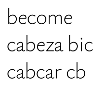
And some running text:

Your overall letter shapes have got some nice asymmetry into them, which is working in mass, but you have some seriously wonky curves and weights that need fixing, in my opinion, before you get to kerning. For example (I am looking at regular only) the shoulder of your 'n' is thinner than the join, the opposite of normal, and I don't think looks good big. Your 'e' has some awkward flattening between 12 and 1:30, and the vertical stem is thinner than the top horizontal, which again I question. In general you are not following normal latin stress—thick vertical, thin horizontal—or old style, which is thinner in circular curves at 4:30 and 10:30, and thicker at 1:30 and 7:30. In a sans reducing these stresses is normal, but if you are going to reverse them it needs to be systematically and with a specific goal in mind, which I'm not feeling here.

Particularly as your weights get heavier, you need more generous letterspacing.

@ William: Thanks for catching that! I was actually going for true monolinear, but it seems FontForge is not being very exact about it. If I'm going to have to hand-tune all letters to have consistent weights, I might as well add in some optical correction as well (particularly at the joins, as you mention). That's going to be a lot of extra work — and yeah, I know it's part of type design, but I was hoping for a quick and easy job here. I'm also wondering whether this is simply growing over my head in terms of skill, since I barely see these flaws that stick out to you. Perhaps I should leave the subtleties of the sans to the experts and return to making flashy display fonts.

The thickness variability seems to be less of a problem to me in the light weights — perhaps I should just focus on finishing and releasing those? I do think that's where the font concept works best (see below for a demo of the Thin weight). I guess I'll still have to work on the curves though, as in the |e| that you pointed out.

@ Eliason: Yes, that's right. I was hoping I could get that done as part of the iKern process, but I might as well do some preparatory work myself.

This is starting to look very nice. You still need to break fully away from the 'strokiness' by which i mean it still looks very rigidly monoline.

And again I think you are putting the cart way before the horse by even thinking about multiple weights at this point.

Christian, quick and easy aren't adjectives associated with type design! I think you will regret releasing this prematurely, as it does have some things going for it, and it's not going to look professional if you push it out the door prematurely.

It took me two years working on type constantly before my eyes learned to see what was wrong. That something was wrong I could sense from the beginning, but I couldn't see what and how to correct it, and had to just keep trying variations until I hit on something. Then one day I woke up and went down to the computer and looked at the screen, and it hit me: hey, I know how to do this! Then I could *see* what was wrong and how to correct it. I came with no art background, so it might have taken me longer than for someone with more of a background, or someone with more raw talent. But there is definitely a learning curve for the eye and brain, which ramps up pattern recognition as you keep working on it, until you get 'type eyes'.

Once you get over that hump, things are a lot faster, and some type designers are astonishingly quick. But I think Matthew Carter said that watching him design type would be like watching ice freeze in the refrigerator.

I came with no art background

Not a bug, a feature.

hhp

Thanks for your support, this is really helpful. Eau should be pure and essential, so sloppy strokes and stunted curves have no place in it. I'll keep distilling it until it lives up to its name.

@ William: I don't have any full-time years to dedicate to this — my day job is pretty demanding, and I don't have any art background either. So I'll have to learn quickly or pick another hobby with a shorter reward cycle... However, I feel I've learnt a lot in the past few months already, thanks to the extremely helpful advice and feedback on this forum, so while that trend continues, I'll stick with it and see how far it will take me.

However, I have to make a few decisions before I invest more work:

- What range of weights do I need in the end? I know I'm supposed to perfect one weight first, but the choice of that weight is tricky. Currently, I'm leaning towards focusing on very light weights, maybe even just up to the "Regular" I've shown above. So maybe I should pick the Light or even the Thin as my work weight. I don't suppose this will ever become a workhorse sans, but if it should go even halfways in that direction, it will need a few much heavier weights, and that will require completely rethinking all letter shapes as space gets crowded, which I'm currently not planning to do. Do you think there's a market for a font like this with light weights only? It seems to work for Miso at least...

- Contrast: I agree that the letters should not have counter-intuitive stroke stresses. However, how much contrast is actually needed? Is it OK to aim for monolinear and just lighten up the junctions a bit for optical correction, or am I required to some contrast even in unbroken curves, such as the |o|?

In the meantime, I'll focus my efforts on the |e| and maybe also the |a| of the Regular and try to tune them to "professional" quality. Hopefully that will teach me enough to do the same thing to the other letters.

Why rush a "hobby"?

I know I'm supposed to perfect one weight first

I don't see it that way - the various weight inform each other.

Number of weights: I like four.

hhp

double post

On polishing this. First, I would read the short monograph The Stroke, by Gerrit Noordzij, which is originally in Dutch (I see you are Dutch), about the history of scripts. And then try doing Garamond with a broad marker. It's impossible, because type departs from natural strokes, but trying will give you the idea of the basis of old style letters, and what the eye expects. It will give you an idea of how type typically departs also. When you design something, you are playing against that expectation of broad pen 'rules'. Eg if you don't follow the bolder down-stroke, lighter up-stroke rule, and make them all uniform parts of the W will look fat. You will see where the joins are automatically thinned and thick, etc. You can break the rules, but if you do it should be systematically, for a purpose.

A second thing is to familiarize yourself with the optical illusions that are always at play in type design. A good summary is here, but you need to nagivate to type design/basics/illusions.

These two will only take a few hours, and will up your game very quickly. The second thing is, to get an idea of professional quality curves, compare your glyphs to those of say Frutiger's self-named face or his Avenir. He is a real master, and remember you are competing with him! When I say compare, I mean paste one over the other and visa versa in Fontlab.

Hrant is right that different weights will inform one another. But if you are eager to get a first version out, then I would suggest just getting the regular very polished. You can always do a 2.0 version later...

ps I don't know about Font Forge, but I suspect it is an obstacle. If you try one of the other font editors out there, it may help.

I don't seem to recall anybody suggesting you make your strokes sloppy, lol. They should be more varied however. Check out Avant Garde, a monoline font done right. At first glance one thinks, "yes this is all monoline, all the strokes on everypart of it are the same width exactly." But then, as one looks deeper, you find this is not really the case. Also, check out Caspari, which throws its weight around deliciously.

Perhaps I should leave the subtleties of the sans to the experts and return to making flashy display fonts.

If you're really serious about that, I'd be glad to continue this on for you. I can't promise you'll love the results as taste is an individual thing. I also can't promise you it will be done in a short amount of time. But that said, if you're serious, I'd love to tear my teeth into this thing.

@ Ryan: "I don't seem to recall anybody suggesting you make your strokes sloppy, lol." — Misunderstanding here. My current lines are sloppy, so they clash with the font's concept. I'm all for adding some stroke modulation to clean things up.

I've never liked Avant Garde, but more from an overall shape perspective. It sure does look extremely monolinear. Caspari is very pretty, looks like the next evolutionary step from Thesis. (Actually, on second thought, its |a| is too narrow. Pity.)

@ William: Thanks for your suggestions! I'll look around for The Stroke. I'm actually Swiss, only temporarily living in the Netherlands, so I'll go for a translation... As for understanding the old-style stress pattern, I think I do have that one down; after all, I made a sort-of oldstyle font from scratch (Octant). It's just that I didn't think Eau would want to have any stress to begin with.

I'm aware of that "illusions" website. It's very illuminating, though it mostly concerns itself with serif fonts. For instance, do caps still need to be heavier than lowercase in this case? Do you still need overshoot for round bottoms on the base line if your stems don't have any serifs (and therefore look rather flimsy themselves)? Looking at my Eau example above, I tend to think yes, my |o| is slightly too small.

@ Ryan again: "If you're really serious about that, I'd be glad to continue this on for you." —
Good to know! I'll keep that in mind. I'll give it a try myself first, though. I don't yet know where my skill ceiling is. I'd certainly prefer to finish this under my own power if possible.

Yes, all of the illusions apply to sans serif fonts. When I first saw this section of Briem, I was skeptical. Now when I look it's all crashingly obvious that it's correct. That's what I mean by the eyes learning, which I experienced. What you will experience before your eyes are tuned to seeing the o as too small etc. is that when you do what he says the font will seem more polished and 'right'.

As far as stress, yes if you want it to look monoline, and that means not actually being monoline, because of the illusions at joins, that verticals seem lighter than horizontals the same thickness, etc.

One of the things about type design that still blows me away is that everything has to be different by mathematical measurement than the way it looks to the eye. *Every* character is affected. For example, I couldn't believe I had to spend time 'tuning' the plus sign so that the horizontal and vertical look even, the same.

Personally, I hate avant garde. The caps used with all the ligatures can work well, but the lower case is just ugly, with its too-wide c and e. But I know when it comes to 'ugly' it's a matter of taste.

Catharsis, I would tend to agree that the 'caps must be heavier than lowercase' ideal is a bit overstated, certainly when it comes to a pure monoline font. Why go through all that trouble to make all the strokes in the lowercase 'appear' to be all the same weight, and then distract away from that effect with a thicker upper case?

However, you definitely need overshoot in pretty much every font, regardless of if it's a sans or a serif. The only exception I can think to this rule would be fonts based on old quartz displays. Think of the "fonts" that were built into VCRs and digital watches. However this is probably mostly a technological restraint, they would have had to use more crystals to do any kind of overshoot.

Caps being heavier than lower case is a complicated subject. Partly, you just need to make them a little heavier because they have bigger internal spaces. So to at least match the 'color' (grey density) of the lower case, they need to be a little heavier. Old style fonts had caps a lot heavier, and with more space between them and the lower case than between lower case characters.

But whether to really overweight them is a design decision, not one of basic craft. The argument for that is that the caps are a different alphabet, and they are used as markers of beginning of sentences, etc., so having them heavy they serve more as markers. On the other hand, they disrupt the color and flow of the text more. In sans, the tendency these days seems to be to make the cap height relatively low, and keep the weight of them more matching. Personally I'm not crazy about this, but it's really arguable either way, and depends on the design.

I've tried tuning my |n o e| for a start. My letters have grown a bit larger (and thus lighter) due to overshoot, and I noticed smoothing out the curves tended to regularize them a bit too much, so I had to put the |e|'s characteristic rightward trend back in afterwards... I like the effect overall, though it still feels extremely subtle to me at this point.

According to Briem, I'm supposed to make the |o| heavier than the stems of the |n|, but I couldn't really do that without hurting my eyes. My impression is that only makes sense when you have a high-contrast |o| where the stroke really tapers away from the middle instantly, which is not the case in a sans like this.

Is this going in the right direction, and how far do I still have to go on these letters...? Just to get an idea of the magnitude of the work ahead of me.

Big/small:

No, curves do have to be thicker than straights to look equal. Your "o" there is clearly lighter (partly because it's so wide - which I think is actually good for readability).

hhp

It sure does look extremely monolinear.

Ahhh, but you see, that is the whole point! It only "looks" monolinear!


AvantGarde Book. All units in em.

It's still a horrid excuse of a font.

hhp

@ Hrant: It doesn't look "clearly lighter" to me at all... sure, there's a big counter, but as far as the lines go, I just don't see it. I might just have hit my skill ceiling.

Then again:

@ Ryan: Nice example! I particularly find it interesting that the curves in |g| are not heavier (in fact, they're lighter on the left side!) than the bars in |t|... is that just because |g| is a dense letter, or does the same thing happen in |o|?

"horrid excuse of a font." :)

But the caps, when used with the alternates can work together. I forget who said that the only place Avant Garde ever looked good was in the nameplate on the magazine. The font was expanded from that. Jeremy Mickel did an impressive and clever job of creating Avant Garde style alternates in huge variety, so that every three letter monogram could be constructed with overlapping letters, like in the original name plate of the magazine. It's called Sobriquet He actually improved the horrid C and G by having everything thin and carrying the strokes less far. It still only works with overlaps.

I definitely disagree on Christian's latest o above. It's too wide. The o an n should have interior counters of about equal area. Otherwise you get uneven color. Christian, look at the *counters* in Garamond. It's those more than the exterior outline that give it its look. The problems with your earlier e didn't relate to its asymmetrical shape, which was good. It was the bumpy interior border of the arch at the top, and having the vertical arch thinner than the horizontal arch.

About thickening the vertical arch of the o compared to the horizontal arch. Classically, the vertical arch is fatter than the vertical on the n. But that's really a design decision. However, I think you're just wrong about it working only in a high-contrast font. Look at Myriad. I just checked the o. Vertical arch 89, horizontal arch 66. The vertical is 35% fatter, but it doesn't look high contrast!

Also *always* look at your letters in context of other letters in your font, if you don't already.

It's still a horrid excuse of a font.

Ludicrous.

Ryan, hatred for Avant Garde is pretty widespread among designers. It's not just Hrant and me. I know a lot of people love it. But they tend to be young and, er-um, inexperienced. It doesn't wear well.

The o an n should have interior counters of about equal area. Otherwise you get uneven color.

Which is the wellspring of readability. :-) The equality you speak of I considering valid only in the realm of display type.

On the other hand if this is supposed to be based on Garamond then that's a strong design constraint too.

hhp

This is the o, Catharsis:

Ryan, hatred for Avant Garde is pretty widespread among designers.

Typedesigners maybe. Avant Garde Bold is being used in advertising everywhere right now, everywhere. It's like the current Helvetica, which I'm sure almost all typedesigners hate too, but they would be short sighted for that.

Catharsis, this looks very interesting. Keep working on it!

The only thing I will like to add, is that all the weights are still a little bit light.
For a quick reference, this are the stem weights that I use (more or less) as guidelines:
Light: About 40 or 50 units
Regular: About 70 or 80 units
Bold: About 120 or 130 units

The need to compensate the rounded stems is not so apparent on the lighter weights, like the ones you are working on right now. But they will become much more evident as your font gets bolder.

Partly, you just need to make them a little heavier because they have bigger internal spaces.

Well said.

@ Hrant, Ryan: The |o| of Garamond does look wide to me. It might have to do with the suprisingly generous spacing. Here's a comparison of Eau and EB Garamond. I seem to have increased the ratio of intra-letter to inter-letter space, but the |o| doesn't strike me as out of place. As Hrant mentioned, faithful recreation of Garamond's character is my main objective.

@ Pablo: I know my weights are very light. The reason is that I don't see this concept working anymore once the lines get so bold they have to squeeze to fit into the x-height. I didn't intend this as a book font. I wouldn't mind being proven wrong, though.

I don't really have any major issues with your o. Only thing I might do is stretch it out vertically a bit, the bottom of the e looks a lot lower than the bottom of the o doesn't it?

either that or make the e less tall

Note the *counter,* the interior space on the n and o. In your version of Garamond the o counter seems even smaller than the n. Again, counters count!

@ Ryan: The |e| and |o| were exactly the same size. I suppose they might look different due to their different proportions, but from what I can tell other fonts (like EB Garamond) also use the same overshoot for |e o| even if the letters have diverging proportions.

@ William: I've made the |o|, along with |b d p q|, a bit narrower, and I agree it looks rather good. They're probably still a bit wider than the |n|, though.

I've completed a first round of revising the lowercase letters. How does this look?

I've had some trouble optically correcting |v w y| without making the strokes look wobbly. However, I've had some rather eye-opening aha! moments with |b d p q|, which look a lot better with tapered joins and smooth curves.

PDF version for free scaling: ftp://ftp.mpia.de/pub/thalmann/eau/rev1.pdf

a long way to go still

Because the join of the n and the top of the b are at about the same angle, they should have the same thinning for the consistency of your design. My guess is that the right weight to look monotone, if you want that, is in between the two, but you decide. I think consistency is more imperative for a well-crafted face.

Check out Rosario by Hector Gatti
http://www.google.com/webfonts/specimen/Rosario

Somebody should respace that.

hhp

Hrant,
The Rosario fonts where in use during a lot of years at the Cosgaya Chair in the UBA for all their printed materials and they where also used in print for a few books before being released at Google Webfonts this year.
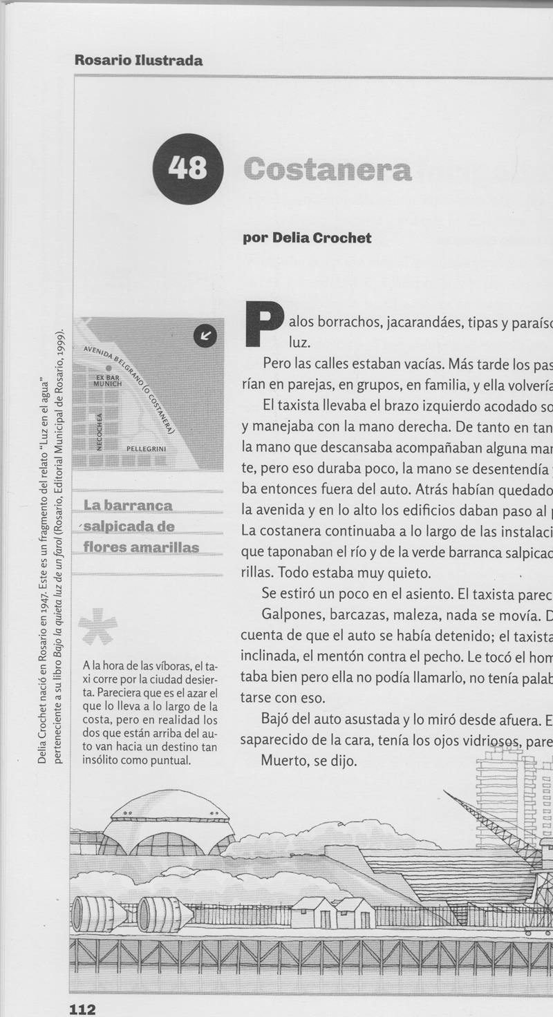
I'm now flipping through a book set in Rosario, and I don't see any spacing problem (Scan attached).

Look right there in the first word (of the GF link). Please don't tell me "rum" is balanced. In your (arguably too low-res) print sample, look at "estiró" (at the beginning of the fourth paragraph).

I wonder, how many hours did Gatti spend on spacing? Just for reference, I'm currently finishing a spacing commissions: limited character set, two weights (with very close Italics) = about 15 hours. Zero automation BTW.

hhp

I agree on "rum" but not sure about "estiró".
Also, worth saying that this kind of things usually happen to "print-world fonts" when used on the web. Web browsers do all kind of strange things to space and kern. Some sizes work better than other, may be due to rounding errors, hinting, and 'who knows what' other rendering variables that come into play.... Testing it in print may be a good idea. I know this font was highly prized/admired among the Argentinian type-scene, so I'm very happy that it's now available for everyone to use it.

> I wonder, how many hours did Gatti spend on spacing? Just for reference
I don't know. Ask Hector, or maybe Pablo Cosgaya.

Even better, since the font is now libre and the source code is available, you (or anyone) can also help to improve it.

not sure about "estiró".

You don't see how "tir" is much tighter than the rest of the word, especially the "ró"?

Web browsers do all kind of strange things

Granted, but frankly that's clearly an excuse here. Rosario is poorly spaced, plain and simple. And Google should have gotten (read: paid for) better spacing.

Please don't invent excuses just because a font saves some people money. In fact if saving money is relevant to some people (users) why would it be irrelevant to others (makers)?

this font was highly prized/admired among the Argentinian type-scene

I don't doubt that. Just like Mrs. Eaves was (and still is) so heavily used, even though the spacing is -also- strictly amateur.

you (or anyone) can also help to improve it.

The way that works is I wait for somebody to pay me to fix it. Unless there's some big sociocultural contribution involved. But Rosario is just another cutesy sans.

hhp

a long way to go still

Alright, this is clearly beyond me. I'll focus my energies on my display font projects, where such things are more acceptable as "quirkiness".

@ Ryan: If you're still interested in taking the lead on this, let's talk terms. E-mail is probably best. I'd certainly want to remain a co-author of the font and learn a thing or two from the experience.

Don't give up, I think this has promise!

Whatever the opinion of an amateur such as myself is worth, here are some of my immediate impressions...

It looks quite 'casual' at a glance, as if it's meant to evoke neat-ish hand printing with a pencil. If that's what you're going for then it's pretty nice. On the other hand, that doesn't really mesh with 'faithful evocation of Garamond' in my mind. On closer examination, I think it's only a few elements that create that casual effect.

  • The tail of the /a: It extends too much for a 'serious' looking sans in my opinion. It's reminiscent of the 'monkey tails' in this type of child's manuscript model.

    I realize it's a faithful interpretation of the Garamond /a's tail, but I think you're being a bit too literal. Surely it's the spirit of Garamond you want to capture more than the rigid shapes. If it helps, imagine that the tapering end of Garamond-a's tail is a serif rather than a base stroke. You dropped the serif from the top of the /a, the bottom should balance out in similar fashion. (Or so it seems to me.)

  • The upper-right curvature of /e seems to point a bit too much upward and to the right. I think you've focused on matching the top curve of the Garamond /e at the expense of losing the characteristic shape of the eye's outside-right.
  • The tail of /g just doesn't seem harmonious with the rest of the font. I think it comes across as too 'pointy' on the right, which feels slightly disruptive.

Otherwise, I think you've got something with definite potential here. Besides the elements I mentioned, i quite like the overall shape and feel.

@ altsan: I'm not giving up at all. To the contrary, I think teaming up with a pro to do this idea justice is the opposite of giving up.

As a matter of fact, the letters |a| and |e| that you criticize are the ones that carry the most "Garamond" spirit as I see it. The |a| is my favorite character of Garamond (at least of the prettier realizations of Garamond), and it is also my favorite character of Eau. Clipping its monkey-tail would undo a lot of the font's character and bring it closer to being "just another cutesy sans", as Hrant might put it. As for the |e|'s eye, I was following the Garamond shape more closely in an earlier version (with a soft corner on the bottom right of the eye), but didn't like the looks of it.

I agree the |g| could stand a bit of rounding. I already smoothed out the shape of the connecting stem between the two stories, which had much more tension in Garamond. Let's see how much smoothing it will stand before it loses touch with the source. I'd rather break some sans conventions than give up the premise.

As for evoking a hand-written feel, isn't that what humanist fonts are all about? ;o) Some glyphs in my draft does give me a somewhat clumsy hand-written vibe, but they're different ones that the ones you mention. What I don't like is |v x y|. They look like they're built from toothpicks next to the more alive- and grounded-looking other glyphs. Don't know what to do about that, though. The teeny weeny tip the |y|'s tail is particularly oogly, I think I'll have to take some liberties there. Maybe treat the tip as a serif, as you suggested for |a|...

A couple weeks ago, Catharsis and I entered into discussion and came to an agreement regarding Eau (temporary working name). I will now be handling the polishing and completing of the font, while continuing to incorporate Catharsis's opinions on the various proofs.

When we both agree it is finished, we will be co-releasing it, and sharing all revenue 50/50%. I imagine in the end I will have put in a lot more hours of work than Catharsis, but without the spark and initial work of Catharsis, Eau would simply never have existed. I count myself as very lucky to be part of this project, and will always view mine and Catharsis's contributions as equal.

I hope this thread will continue to get the quality of suggestions it has previously. While perhaps I am slightly more skilled than Catharis, I am certainly no master yet, and can use all the help I can get.

The first thing I did was to thicken the weight slightly, and take ever so slightly away from the monolinearity of Eau, in order to give it a more (hopefully) elegant sense of "body."

The spacing is not 100% where I would like it, but I want to get the UC, LC, and figure glyphs down before I attempt to perfect the spacing. No kerning or ligatures have been created at all yet.

As Hrant has suggested elsewhere, and as perhaps I have never fully understood until now, the lowercase g has been an ungodly pain, it has required vastly more work than any of the other glyphs, and it still has a ways to go. I have included it at a large size at the bottom of this proof for closer inspection.

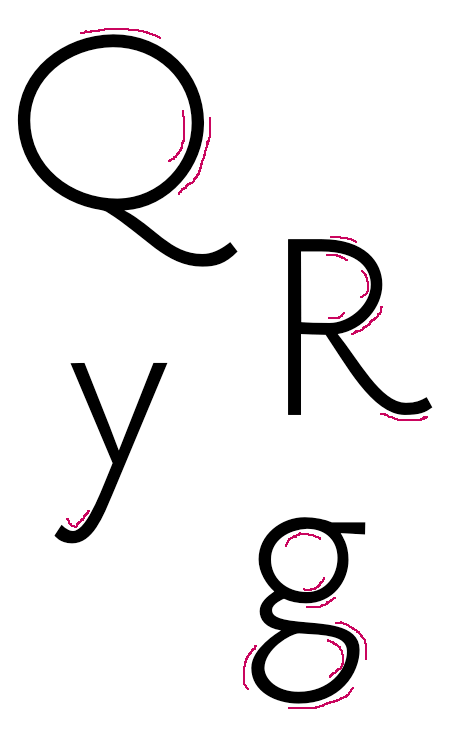
I have also included at large size other glyphs that I feel need to have kind of "swashy tails." The tails of the y, the Q, and the R are intended to be the points of highest contrast at the joins in this monolinear design. They look OK to me but I would appreciate comments.

I will not be posting any pdfs or otherwise vector-based samples here. However, I hope by rendering out some large bitmaps it will provide enough to offer accurate opinion on. Also, if anyone would like to see a particular glyph or word at extra large size, I would be quite happy to create a sample and post it.

Thanks, all.

Is the wobbliness of the curves intentional?

hhp

No it's not intentional. Still ironing things out.

Could you be more specific?

That all you're going to say, Hrant?

I'm not sure how to help. If you can't see it you can't see it. Maybe it's a blessing!

But OK, here's the first one: can you see how the left half of the "Q" is "pinched"?

hhp

It does appear narrower on the left side than the right (even though technically they are both the same thickness, yes I measured, lol). But I'm attempting to give this a slight horizontal stress. If I release the "pinch" there it would look just as thick at 3 o'clock and 9'oclock as it is at 12 o'clock. OK, so then I could thicken it at 12 o'clock and 6 o'clock, but then the glyph would be too thick there compared to the other glyphs. Can you explain how you might try to fix it?

I have my own fonts to make! :-)

BTW by "pinched" I didn't mean about the thickness - I mean about the curvature.

hhp

Hmmm, do you mean it's not a perfect circle? Because that is true, its more of a horizontally wide oval on the left side, and closer to a perfect circle on the right. It's more "elongated," you could say, on the left hand side. If that's what you mean then, yes, that was intentional. It matches the deformation of the Garamond O we are basing it on.

I want to keep some of the imperfectness of the Garamond here. I'm not looking to turn this into a perfect geometrical version, to me, that wouldn't be a garamond anymore. IDK, perhaps I just misinterpreted the use of the world "wobbly?" I mean, just as a quick example, this is what I think of when I think of "wobbly."

I guess that hrant is talking of 'wobbliness' as something more like "geometric continuity".
There are a few tools that can help you improve your outlines, like the RMX Harmoniser (1) or Yanone Speedpunk (2). Using these tools you will also learn to see the 'wobbliness', by comparing the before and after results.
(1) http://remix-tools.com/harmonizer
(2) http://www.yanone.de/typedesign/code/speedpunk/

Where do you see the wobble, Pablo?

In those places:

This is all very educational, keep going. :)

So by wobbliness you mean a discontinuity in curvature? But then, is it really possible to achieve a non-wobbly transition between a straight segment and a line with Bézier curves?

I also didn't know you couldn't make a circle with Bézier curves. They sure look circular to me.

I wish Speed Punk was available for PC.

If I got rid of all those whatever-they-ares, would the design actually be better? Maybe it would only be more bland?

Only one way to know: Fix a few letters and compare both version.

For example: You can fix /h/a/m/b/u/r/g/e/f/o/n/s/t/i/v, generate a new font, and quickly compare both versions using the drag-and-drop testing page at http://www.impallari.com/testing/

Crappy curves are not what you want to give your typeface interest.

Hmmm, perhaps it's time to take this over to TTF. Quadratic curves to the rescue!

Craig, I wish that were true. :-/ We've been seeing so many wannabe-fauve fonts become so popular lately.* But they're intentionally so, and that's key; Ryan, you need to know what's going on. If you can't even see how/where it's dorky, I can't see this working out. I mean, some parts might be non-dorky hence out-of-character, and you wouldn't even realize it!

* http://typophile.com/node/99070

hhp

Let me add to Craig and Hrant. This is the blind leading the blind. You guys (Christian and Ryan) need to study what Briem says, and follow it, for a start. Those strokes are hideous.

Lol, hideous, he says. Hey don't hold back on our account, William, tell us what you really think.

Ryan has stepped back from the job for now (and from the forum in general, as I understand).

Does anyone of you pros feel like picking up the torch? The baseline offer is 50% of the net earnings after MyFonts' cut, but we can negotiate.

Hi, I did not comment before since there have been several interesting attempts in producing an almost monolinear "sans" version of Garamond models.
I think it would be good to check out how things have been approached by:

- Alan Meeks - Claude Sans (1988): http://www.myfonts.com/fonts/itc/claude-sans/
(it’s rounded, but it doesn’t matter: it is well drawn).

- Yasuhiro Yamaoka - Practica (1991-2002): http://yoworks.blogspot.it/2009/02/yofonts-practica-at-beginning-in-1991...
(forms are based on the proportions of Apple Garamond).

- Frantisek Storm: Jannon Sans (2011): http://www.stormtype.com/family-jannon-sans.html
(not Garamond, and pretty modulated, but may give some useful ideas).

@ Piccic: I'm aware of Claude Sans; it's been mentioned before in this thread. Personally, I think it's butt-ugly, so I can't feel threatened by it. :P Practica doesn't strike me as particularly Garamondesque; probably due to the condensed proportions of the Apple Garamond it's inspired by (I think "based upon" would be saying too much). Likewise, Jannon Sans suffers from being based on a particularly uncouth version of Garamond — I honestly don't understand why people took Jannon seriously in the olden days, much less why they still do these days. It's just plain malformed. Just look at that sad, beer-bellied |a|! ;o)

Anyway, the offer stands.

Claude Sans is well drawn, not so much usable, but well drawn (not a surprise since it’s from Alan Meeks).
Practica is really well done if you consider Yasuhiro did not have any formal type design education, and went on drawing and redrawing, which is the only way to get the forms right. Considering Apple Garamond as the starting point, I think he managed to keep the essential characteristics of the forms while designing it.
I have always liked Jannons, so it doesn’t make much sense for me to comment about those: clearly they aren’t "proper Garamonds", but saying "malformed" doesn’t make sense.

Considering Apple Garamond as the starting point

I guess that was the problem. :-)

I wouldn't call Jannon "malformed", but I don't like it either. That "a" does need to be flogged in a Parisian square.

hhp

I did not like Apple Garamond so much myself, but Practica is good.
I mentioned it because you can always look at the solutions he adopted and apply them to an original Garamond.

I'm not that impressed with the other attempts to get sans from Garamond, which Claudio posted. That tells me that it's quite a challenge, which is what I suspected.

I commented here because I thought there was something in the letter shapes that was good. But I also felt that the proportions needed to be harmonized, and the strokes and curves needed some serious work. Christian, what merits this has so far came from you. And the weaknesses. If you have someone 'take it from here', it is sufficiently incomplete that my feeling is that it will will inevitably change and probably lose what good it has. If you had a polished a-z, or even hamburgerfonts, someone else could develop it, but at this point I think it's your baby. Unlike a real baby, you also put it aside and come back to it with fresh eyes later. —I think that's pretty common amongst designers.

Hi William,
to be honest, to me it doesn’t even make sense the basic idea of having “a sans” out of a typeface.
Serifs are not something attached, and if that was born that way, it means serifs were part of the designs.

I mentioned those because are well done, but clearly any attempt is a departure from the original (especially Claude).

In the attempt of Catharsis I just see an attempt to get at the "skeleton" of Garamond, which is not, strictly speaking, designing a linear version.

it doesn’t even make sense the basic idea of having “a sans” out of a typeface.
Serifs are not something attached

With that I totally agree.

hhp

Claudio, I agree that sans are a different animal. You can be 'inspired by' a serif font, and I don't see anything wrong with that. But I agree it is inevitably going to be very different if it is any good. The designer is going to have to have design ideas different from the serif. It's going to be a creative process on its own, which stands or falls on its own merits. I tried to argue something like that early in this thread.

Hi William, I did not read your previous comment, as I was mostly looking at how Catharsis approached the work. I see you pretty much already focused on the problems.
To be clear, I am not saying you can’t try to capture the essential qualities of an original text face, but I think it needs more to start than just identifying its "skeletal" forms, so to speak, and I think it’s hard to produce a book-aimed typeface. But again, maybe it wasn’t Catharsis intention.
That’s why I mentioned those three: Claude Sans is clearly a titling face, decorative and not meant for long text, but it evokes Garamond-like features.

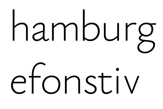
@ William: That's an interesting proposition. Just looking at those other sanses inspired by Garamond, I can see there's a lot of different approaches to this theme, which are all notably different from what I have in mind. It makes sense, then, for me to establish a solid definition of what I'm trying to achieve before I pass it to someone else. I'll try to put together a polished hamburgefonstiv as a first step (though I'm sure I'll need a lot of help on the way*). I'll worry about completion and polishing if and when I get there.

@ I agree that Practica is a nice font, it just doesn't strike me as very Garamond-y. As for the intentions behind Eau, I'm certainly not aiming at a book font. I see its niche more along the lines of, say, Gill Sans Light — an airy display font capable of carrying short texts.

*I think I understand the concept of a "wobbly" curve now... but as for Briem's illusions, I think I'll simply have to follow the recommendations blindly. I don't see those things yet. Actually, I see the heavier strokes of the Claude Sans capitals as almost comically out of place among the lowercase letters — and that font has been quoted as being particularly well-drawn... :P

I'm wondering whether returning to a lighter work weight might make that process easier or harder... If I only ever complete one weight, I'd want it to be a light one.

@Catharsis: Now that I see you are aiming at display/titling, why don’t you concentrate just on the lighter weight? Marian by Paul Barnes individuates the skeletons of the forms (of many lead types, or "models"), while you could try to get more into Garamond’s essence by adding some modulation or stroke treatment.
This could prove interesting, and less abstract. Something like what Storm did with Jannon, but simpler and with attention to the lead Garamonds.

Re: Claude Sans. I was speaking strictly of drawings, not of how the overall typeface works.
But I do think it works (I have used it and of course not for text): I think Meeks followed something in the lines of the Imprimerie Nationale Garamond or the like, where there is a pretty different treatment of uppercase and lowercase, and where the Italics have a markedly different angle between the two.

Alright, I've gone over hamburgefonstiv of my rather light "Regular" weight and implemented Briem's recommendations for countering optical illusions. I've used the same weight ratio for horizontal vs vertical and straight vs round stems as does Gill Sans Light, since our fonts are pretty similar. That didn't change much, since I had already been close to those weight distributions after my first try. I regularized the thickness of tapered-down connections, though, and gave round strokes an ever so slight stress along the forward diagonal.

I've also tried to make the resulting curves smooth and pretty. It sure helps to know what it is I'm trying to avoid! Not sure how well it worked, though.


Better?

BTW, I've just installed the demo version of Glyphs, and quite like the handling. The above was done in Glyphs. I suppose I'm going to buy it soon, though first I'd like to figure out whether I can import my other fonts into Glyphs (Glamour & Glory failed last time I tried).

Looks better, but I think you should cut most of the terminals (at least those of f and t) in a way which feels less “automatic”: it’s those subtleties which improve the overall design, besides the harmony of curves.

Not quite sure what you mean... can you elaborate? Are you talking about the spurs to the left of the stems in |f t|, or the curved terminals?

Hmm… no, I was talking of the terminations: the upper right one in the [f] and the lower right one on the [t], and then any other ending which looks too much “cut by default" by the software and not by design choice.

I still don't know what you mean. Those terminals do look pretty natural to me. Garamond does not have any angled serifs in either of these places, so why shouldn't the stroke just end there? Do you think I should try vertical cuts instead?

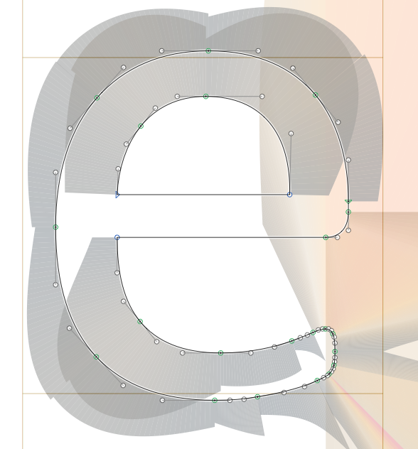
By the way, I've just tried out SpeedPunk, and I find it quite insightful. Here's the |e| before and after tuning with SpeedPunk. I can't really tell the difference side-by-side (can you?), but when I toggle between the old and new version in Glyphs, I find the new one notably nicer. I'll do the same to the rest of the hamburgefonstiv.

I also checked Gill Sans Light with SpeedPunk, and find it has some surprising discontinuities of curvature here and there. Is it considered a badly drawn typeface, or is there a certain leeway in discontinuity that's considered acceptable?

The one on the right is definitely smoother, but it's too thin at 7 o'clock and 11 o'clock.

hhp

I see what you mean at 11; not so much at 7 (but I suppose it could use a hint of diagonal stress there?). Hmm, I'll have to take care not to use SpeedPunk blindly — I basically have three free parameters available for each discontinuity.

What's the least invasive way of mending a bump? Shifting the curve point without moving the anchors?

So what's the standard level of smoothness among popular commercial fonts? Is Gill Sans typical, or a bad example?

At the top end, unless bumpiness is intentional (which would be very carefully controlled however) everything tends to be super smooth. But you can still sell a font to many people even if some people will complain. :-)

Gill Sans is a bad example because -like pretty much any originally metal font- it's gone through a lot of... convulsions before reaching us.

hhp

I've tried a few other examples with SpeedPunk — Arial, Calibri, Ubuntu, Anivers — and found non-continuous curvatures everywhere. What's a good (and if possible, free or pre-installed on a Mac) example of a super-smooth font?

Meanwhile, here's my lowercase after SpeedPunk-based tuning:

If SpeedPunk doesn't like Calibri, then SpeedPunk has a problem.

hhp

This is what SpeedPunk thinks about Calibri's |e|:

For instance, there's a bit of a curvature jump at the apex of the eye. I take it from your comment that this sort of thing is no problem...?

For the record, I love Calibri.

So, any "hideous" strokes left in my lowercase?

@Catharsis: No, you understood, that’s what I meant: maybe not vertical cuts (rather unnatural, in this case, but a midway solution). I believe the more you work on detail, the more it will look natural. Looks already pretty good, although the eye of the [g] still looks strange. Maybe would not be bad to make it more regular, although it may follow less the original form?

I tried to check Glyphs (can’t find a link to download a demo of SpeedPunk) but the interface hinders me.

Why would the cuts be anything but either orthogonal or vertical? Those strokes in Garamond end in drop-shaped or tapering terminals; that doesn't suggest any particular cut angle. An orthogonal cut, as I have it now, feels the most natural to me. And Myriad seems to be doing just fine with its orthogonal cuts...

I like the "special" shape of the |g|'s eye. It looks like that in Garamond too. Could it be seen as a feature rather than a bug? I'm not aiming at "yet another conformist sans" after all. :)

SpeedPunk does not have a demo. I got the commercial version, which works with the demo of Glyphs (which I'm also going to buy soon; it rocks).

However, I still can't open my Glamour & Glory fonts with Glyphs; no idea why. :(

The problems I have had with the strokes didn't relate primarily to curves of outlines, though these need improving. You can have smooth or bent curves if they make sense with the overall stroke. Lucas de Groot likes to draw his letters by hand first to get an organic feeling. Then to preserve that in the digital font he has those intermediate nodes (between extremes).

Doing the stuff by hand first is certainly not the only way to do it, but it's one way to make the strokes look logical and organic to start with.

My problem primary problem with your strokes was that they got thick and thin without any systematic visual logic. You can design stuff anyway you want but without a lot of consistency a design of an alphabet just doesn't hold together. As I wrote earlier in the thread, what the eye expects is pen rules, modified. Absolute consistency is not required, but when you depart from, say stems being the same width, you should have a good reason for it. For example the M strokes are often shrunk a little bit because it is so busy and compact compared to most upper case letters. And you can make the l fatter because it is all alone with space on both sides. If you like Calibri, study it, pasting characters over one another and see what I mean by consistency with exceptions.

Generally, as I said you are working against expectations of pen logic, with modifications. As far as curves, you need to get to were your stroke is thick to where it's thin in a graceful way. And where the stress is—thicks and thins— has to have some consistency. This is true even when you have a low contrast sans.

As far as cuts on the ends of strokes, I don't see a problem with that. I also like the asymmetry in your g, but it still needs some work to iron out some awkwardness. Same with the top of the loop in the a—even though I think your a is already better than those in the Garamond "sans" efforts referenced above.

You also have problems with widths. Your b looks too wide compared to your c, for example. You really need to put these into familiar words and play with them until they click as far as width and spacing, if they are going to end up being really good. Also usually the bottom left of the b and top right of the q are usually handled similarly, as the q is sort of a rotated b, so there being different here is a question. But there are a lot of problems of consistency, I think.

what the eye expects is pen rules, modified

Cut the cord, my friend. That's not your mom anyway.

hhp

@ William: In my above sample, I've regularized the widths of my vertical, horizontal, and tapering stems, and tried to add some subtle diagonal contrast to some letters, including the |n| class and the |o| class. Is that not enough contrast, or it it just not consistent enough? Can you give me a concrete example of what needs fixing, and how? I don't know where to start.

What kind of "work" is needed on |a| and |g|? Contrast, or guiding the curves differently?

I'll look into the character widths more. I've tried to model them on Garamond, but as you pointed out, I should probably compare counter area rather than overall glyph widths. I'll play around a bit.

As for |b| vs |q|: I thought they were quite differently handled in Garamond, but looking back at them that's not true. I guess I'll add a stem stump to the |q|, then.

@ Hrant: This is confusing enough for me without someone talking in code. ;o)

I was referring to the persistent, cloying, warm & fuzzy illusion that chirography plays the -or even a- core role in type. Sadly typography is like a 40-something guy still living with his mom, calligraphy and his dad, lettering.

hhp

Never figured calligraphy and lettering were married. And I do live with my parents. :)

@Catharsis: To me, the fact that the letters are modulated in a certain way (calligraphy had and has its influence, anyway) suggests a cut that is neither vertical nor at 45 degrees, but rather midway, but do as you are pleased with: I just thought the plain cut you have suggests too much a computer-generated inheritance, without interventions on detail, I mean not a deliberate drawing choice but rather something "automatic" if you see what I mean.

I find Glyphs' interface a little bit too schematic, but maybe you have used it extensively. So far, I just used Fontstudio and then FontLab. It took me forever to get into Fontlab, so I feel Glyphs' interface pretty "alien".
Where did you buy the SpeedPunk license? On the Yanone website there seems to be no indication that it is already released.

Addendum @ William: "You also have problems with widths. Your b looks too wide compared to your c, for example. You really need to put these into familiar words and play with them until they click as far as width and spacing, if they are going to end up being really good."

I think I'll leave the commission the spacing from a pro when I'm done... as for the widths, I can't see the imbalance you mention between |b| and |c|. This looks fine to me, apart from the spacing issues:

Are those imbalances keeping Eau from being a good font in general, or just from being a replacement for Myriad (which is not my intent)?

Well, in my opinion, and it's not only mine by any means, you can't separate spacing from design of the characters, particularly their widths. I think to get them right you have to put them into words and tune the width and spacing until they are as polished as yes, Myriad—or Frutiger. As Mario Feliciano said to me once: you want beautiful words, not beautiful letters. You can only do that by testing on words. The words need to knit into a unit, and then they need to be able to disappear when you read them in extended reading.

Am I sure about the b and c? No you have to test and adjust, test and adjust. A way many do is to start with the n and o, and get on, no, noon to work, and then build from there.

I think it’s pretty good, in general.
You should not consider spacing a separate matter: it is part of the design, no matter the destination you have thought for the typeface (es. display sizes).
Personally, I do not feel my typeface is truly designed until I add good overall spacing. Little kerning is generally needed if you try to work out spacing.

Widths of the letters do not look bad, at the point you have reached I think it is mostly a matter of adjusting spacing to your best. The problem is that with an almost monotonal type like the one you have obtained, and with very light stroke witth, too, spacing defects tend to be magnified: you need to space it even better than if it was a Garamond! :-)

Quick status update: I've found a pro interested in producing Eau. Stay tuned. :)

I'd be really interested to hear what happened to this, as it's a very nice design. For anyone interested, Classiq by Yamaoka Yasuhiro is a libre sans-serif take on Garamond that seems to have not attracted the attention it deserves considering its quality: tons of weights and three alternative styles. No automatic ligature substitution, annoyingly, but that's hardly a deal-breaker.

Update: I notice it's been mentioned in this thread already under its previous name Practica.

Pretty cool actually – I agree it deserves more fame.

BTW it's not actually libre (no modification allowed) but simply free.

hhp

Classiq’s caps are far too heavy for the lowercase.

True, in the darker weights especially. The good news is that splicing together different interpolations could make for a quick fix.

hhp

I'd be really interested to hear what happened to this

It's currently on ice. I'm glad I stopped working on it when I did: Looking back on it now, I see I clearly lacked the skill to pull off a good sans.

I'm working on a high-contrast serif Garamond now (see the "Paramond" thread), which teaches me a lot about Garamonds in general. I might revisit the sans after that.

I'm actually thinking of stealing the name "Eau de Garamond" for my serif face, and going with "Air de Garamond" for the the sans if I ever get round to it.

As for Classiq, I'm rather unimpressed by it. It does look like a Garamond at first sight, but I find its execution rather harsh upon closer inspection, especially in the italics. Looking at the posters on the website, I also suspect the spacing needs more work.

Captured from web.archive.org on 5 Nov 2017. view this capture