
The inconsistent diacritics may have been lettered in afterwards, but the rest looks inkspread-typey enough, though not very 1950s in style. Any suggestions? This is from the 1950s Swedish children's book Petter och hans fyra getter.
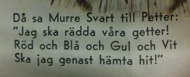
The inconsistent diacritics may have been lettered in afterwards, but the rest looks inkspread-typey enough, though not very 1950s in style. Any suggestions? This is from the 1950s Swedish children's book Petter och hans fyra getter.

Close similar: Lionel Text Genuine/Steam by Font Diner
It features a single story |a| though + some more differences
-----------------------------------------------
I found it using Find my Font - http://www.findmyfont.com

Well, lookee here:

From a 1946 guide to lettering. Remarkable match. The rest of the book has pretty close lettered renditions of other typefaces so it must be something that was around at the time.

Don't try that with Find my Font! :-)
hhp

That would be Vogue, an Intertype face originally made in 1930 for Vogue magazine. VF Sans has a lot things in common with it, but I don't think there is a digital version of Vogue per se.
Ahh, I knew it was something I knew once but forgot I knew it. Thanks, Mark.
Thanks Mark, you really do know your vintage type.
I'm surprised it hasn't been digitized yet. I thought about doing it myself at one time.
Sounds like a fair idea what with the current market towards weird-looking geometrics. Would it make sense to iron out some of the "errors", or would it better serve the reigning fashion to leave them as is? :)
Captured from web.archive.org on 11 Jul 2014. view this capture