Hello all!
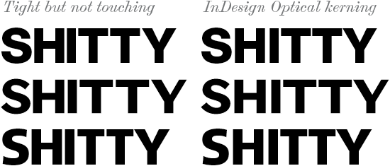
I'm a graphic designer, and have decided after reading so much on the subject to finally roll up my sleeves and start dabbling with type design myself. I've chosen a simple, upper-case, sans serif display face meant for poster work to start with in order to get myself acclimatized with the process. The results so far have been plenty satisfactory, and I've had a blast fleshing out my type with punctuation, numerals, and accents.
I'm wondering at this stage if you guys might have any advice on how to approach designing bolder weights. I recall coming across a handy article or two that gave some practical pointers, though those links elude me. I've got a general idea on how to proceed, filling in counters and such, but in practise, some letters like the S are a bit of a pickle to boldify.
Any help would be most appreciated.
Nathaniel