Hello Everyone,
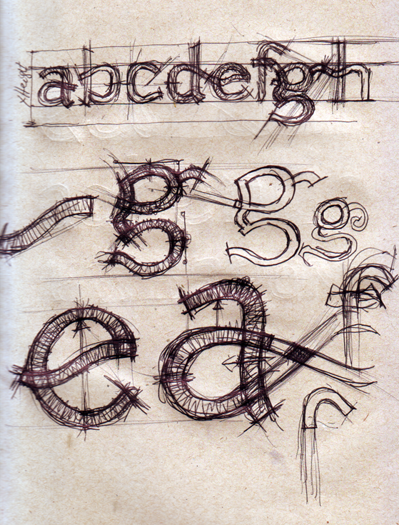
I am working on a Latin type face design to be used in Non Latin text to write a word ,Paragraph and Phrases , In writing systems such as Hebrew, Armenian, Ethiopic and Farsi etc… .
I am trying to make the X height as big as possible and open the bowls as much as I can . (It will be used on low resolution devices).
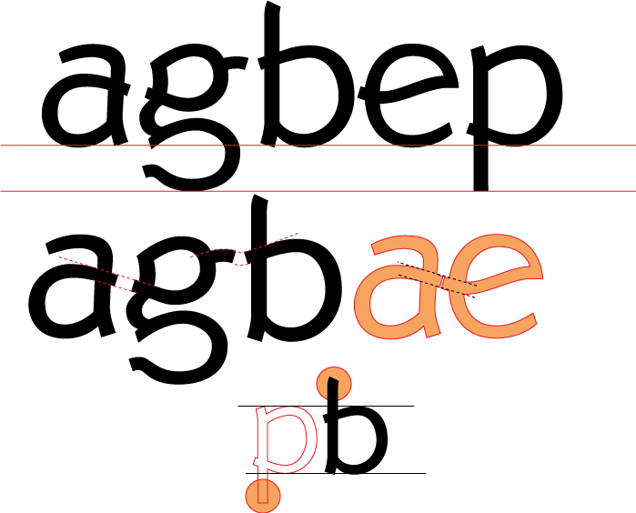
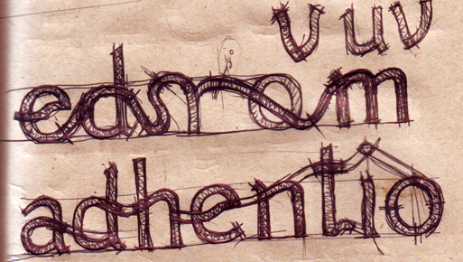
I also want one Glyph to invite the reader to the next Glyph by Imaginary line (Please see 2nd Image)for faster and pleasant reading. (Hard to do but will try my best).
Most of all I am trying to find the beauty, Proportion and balance of each individual Glyph ignoring the overall style where is needed.
My question is : 1.Is it acceptable to have different forms with one individual Latin font style ?
For example on the second Image P and b has different tips .
2. I know the form of a,e,g are deciding factors on the rest form of Latin characters. What do you think about my a,e,g ?
I am particularly interested to hear about my g (Which I like most among Latin characters).
All suggestions are very much appreciated.
Thanks ,
Aleme