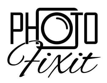
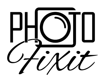
Looking for some feedback on this logo I designed for a photo restoration business I am starting. I wanted something with a retro/vintage feel, without being too kitschy. I think I have succeeded at that here, but I am looking for some outside opinion. Thanks.
| Attachment | Size |
|---|---|
| mod_pf_logo.png | 16.7 KB |