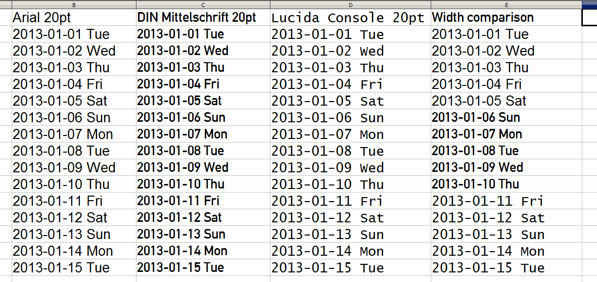
I am in the process of designing a wall calendar, with one page per week. (I am using CorelDRAW, if you must know.) I am using the fonts DIN Engschrift and DIN Mittelschrift, mainly the latter.
It being a calendar, numerals are the most important characters. I am going for function rather than beauty, but still, I don't want an ugly calendar. This is why I chose a road sign font: I want to be able to read the date from across the room without my eyeglasses! Also, monospaced figures are a must.
I really do not like the way that the days of the week look like they are going to turn out, though. Please see the picture. It is a screenshot of me testing several fonts in a spreadsheet program. No wonder Wednesday is nicknamed "hump day"!
Personally, I do not think that monospaced fonts get enough credit. The community here seems to view monospaced fonts the same way early 20th-Century America viewed trousers on women: in poor taste, except when required by work.
Also, I don't understand the design of the digits in Arial/Helvetica, and even more, why it is default for spreadsheets. If a 6 or a 9 is too curly, you get what looks like an 8. A 5 with an almost-closed bottom loop looks like a 6.
Another reason I like the DIN digits is that they are not too wide: this way, they don't gobble up the space I intend to use for writing appointment times. This is why I don't move to a monospaced font for everything. Maybe MS Gothic would work, but I don't really like it: it seems like more of a font for use of a rough draft than on a finished product. Besides, its strokes are kind of thin.