
I am not really into typography, I would really appreciate some font sugestion for a dietetics/fitnes logo. The website is in white and green, very clean style.. The inscription on the logo will be Dietetika.
Any help would be apprecciated :)
I am not really into typography, I would really appreciate some font sugestion for a dietetics/fitnes logo. The website is in white and green, very clean style.. The inscription on the logo will be Dietetika.
Any help would be apprecciated :)

The really smart thing would be to get a local designer to do it for you. But if you're too much like me, try Ralf Hoffmeister's superficial. It's a contemporary sans-serif.

Could you tell us more about what kind of customers they have, and what kind they would like?
Ralf Hoffmeister's superficial
Try to avoid free fonts - you usually end up paying in other ways...
Case in point: among other problems, Superficial is very poorly spaced, which means you either have to spend a lot of time fixing it, or it will look like your client's customers are very clumsy people. :-)
Also, I'm getting a nagging feeling that it's a swipe-n-hack job, meaning it was based on somebody else's -possibly commercial- font. Looking at Hoffmeister's only other font* my suspicions are doubled. Please don't support theft.
* http://26plus-zeichen.de/fonts/winheim/
hhp

Given the letter sequence, a sans italic with happy e's might work nicely…
Thank you for your suggestions.. The site is a magazine, regarding nutrition, health and physical activity, but is not in english.. I am still working on it, but will try today to put some dummy content and link it. I tried some fonts, but not really satisfied.. Thanks hrent, I understant that.. I tried the superficial font, just to see how it looks like.. The headers on the site are Open Sans Condensed in uppercase, the same green color as the fonts..
Any comment is apprecciated :)
Thanks :)
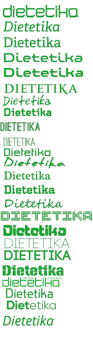
Predictably, the last stab works for me: those are two happy e’s, and there is a non-insistent elegance—along with a soupçon of forward motion, implying progress toward a goal—to the obliqued form
Captured from web.archive.org on 20 Aug 2013. view this capture