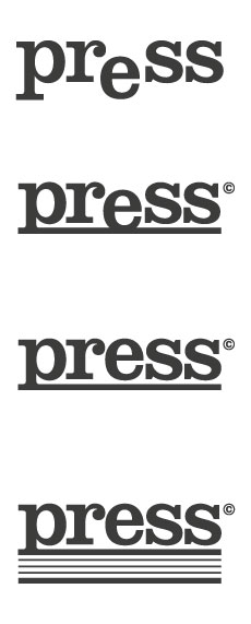
Hi folks,
Working on a pitch for 3 print companies that have merged into one under new ownership. I am trying to create a fresh, new identity with a big bold presence under the name 'press'.
Ranging from large format to business cards, they literally cover everything so firstly I would like to get opinions on the name itself (if that falls under Typophile jurisdiction - after all, the meaning behind the words are what influence the visual execution) and secondly, I was keen to get some initial feedback \ fine-tuning before I develop colours, etc and go on to pitch.
I would consider myself a bit of a novice, but always keen to improve, so any and all feedback is welcomed (however scathing it may be).
Thanks,
Ross
| Attachment | Size |
|---|---|
| press-critique.jpg | 19.74 KB |