Hello,
this is my first post in this interesting forum. I am now writing my PhD thesis and I would like to ask you for some suggestions regarding the typography of the document. Being a Physicist the natural tool for me for writing the thesis is LaTeX, unfortunately the set of default styles is limited and you see them everywhere. For instance some of the possibilities are inspired by "The Elements of Typographic Style" of Robert Bringhurst, that is great, but nowadays they are used by everybody. I would like something more original.
It is not that I pretend to create something as good as that style, I would like something simple but with a personality.
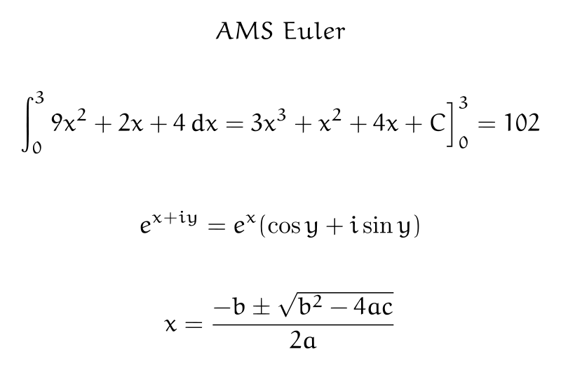
I would like to use a font like Amerigo for the body fo the document, but I am not sure if it is good for printing. The only problem with that is that it looks like that there is not a SmallCaps variant of it http://www.myfonts.com/fonts/bitstream/amerigo/ and I would like to use it. My choice for a math font is Euler that I have see coupled with Palatino and Garamond, but I am not sure if it could work with Amerigo.
What do you think of the combination Amerigo + Copperplate Gothic?
Thank you!
| Attachment | Size |
|---|---|
| 800px-AMS_Euler_sample_math.svg_.png | 21.78 KB |