Typophile

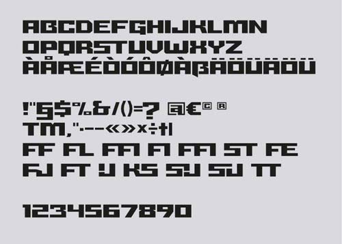
Größe Font (the extra squared geometric font)

Lev Lev

Hi guys,

This is my first post, I'm a designer and for several years I am interested in typedesign, I'm not a typedesigner but I try.

Größe is my first real project, and is a project that I'm working on for some years.
Größe (Grosse) in german means "big-large". The design of the font is inspired by the northern european architecture, with its clean lines, modula, simple and squared.

Link to Grosse

Whene I started designing it I thought of something that could be used on posters and at wide boy, the geometric shapes and the solid structure makes it a very good choice to make posters.

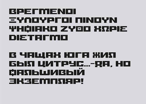
The goal is to to make it compatible with many languages ​​as possible, also cyrillic and if it's possibile chinese, the Chinese could be useful?

Thank you all.
Critics are welcome!

If you want to help my project
http://www.indiegogo.com/grossefont?a=1622516

AttachmentSize
Schermata 2012-10-17 a 14.30.32.jpg35.3 KB

The wide boys will love it!

If this is your first project I'd steer clear of Chinese otherwise it'll be your ONLY project ever - It will take your whole lifetime. I'd stick to European if I were you.

Yes, I know it's quite!
In fact, it will be the last thing I do, if I can.

No Chinese, but all european languages.
I'm Closer to the final version.


What do you think? Critics and suggestions are welcome!

Thank you.

Looks pretty badass, especially in Greek and Cyrillic!

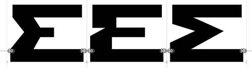
Though I'd make {Σ} a bit more distinct from {E}, they currently look very much alike.

Also, Größe is a noun meaning "size; greatness", not an adjective.

Thank you Catharsis,

There are three versions, I still prefer the second.
Because the type has less oblique lines as possible.


Have you more suggestions?

About the name you're right, I used the term in an evocative way.

Leo

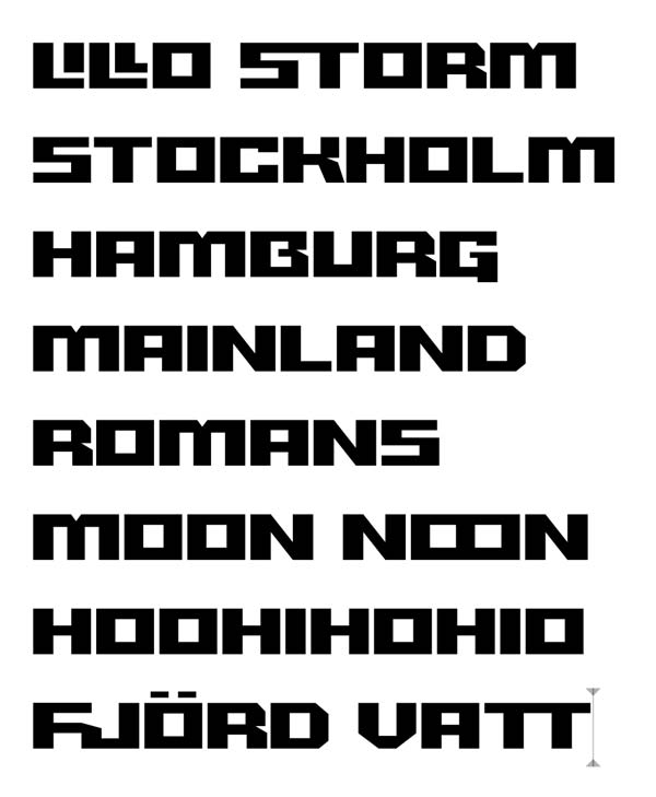
New tests

Captured from web.archive.org on 17 Mar 2015. view this capture