
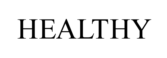
Please let me know what you'd change here in terms of letterspacing:
hhp
Please let me know what you'd change here in terms of letterspacing:
hhp

I might move T and H a smidgeon closer to one another, for a display setting like this.
But if this is the way the font is spaced by default, it’s fine.

Grab LTHY and move them closer to A. Grab HY and move it closer to T.
Thanks. I'm working with tracking increments of ±25 but if I decide to go finer I'll tighten the "TH".
BTW as you can see it's Times, and at least the version on my system needs a good deal of help when set in all-caps.
hhp
Ahhh, Times New Roman, the most neutral face of our times..

What is the final size and application?
If it is 24pt or less I would be inclined to open it slightly, using EAL as the basis. On my screen it appears at 18mm cap height at that size I would tighten TH by a gnat’s as Nick suggested and possibly EA by two gnat’s.
Tim

A gnat more space between H and E?
Is a gnat more or less than a hair? :-)
Seriously: It sounds like I'll have to move down to increments of 10.
hhp

While it appears superficially that the T and H should be closer, my initial impression was that everything was right. So I'd be hesitant to pit a judgment focusing on the appearance of an individual combination instead of the font as a whole.
Of course, in any case, correct letterspacing is much more critical in the lowercase.
Captured from web.archive.org on 18 Jan 2013. view this capture