

A modest and simple design, not much flair. Minimalistic. One of the most toned down faces I have done recently. As always all criticism welcome.

The bottom-right of the "a" holds promise.
hhp
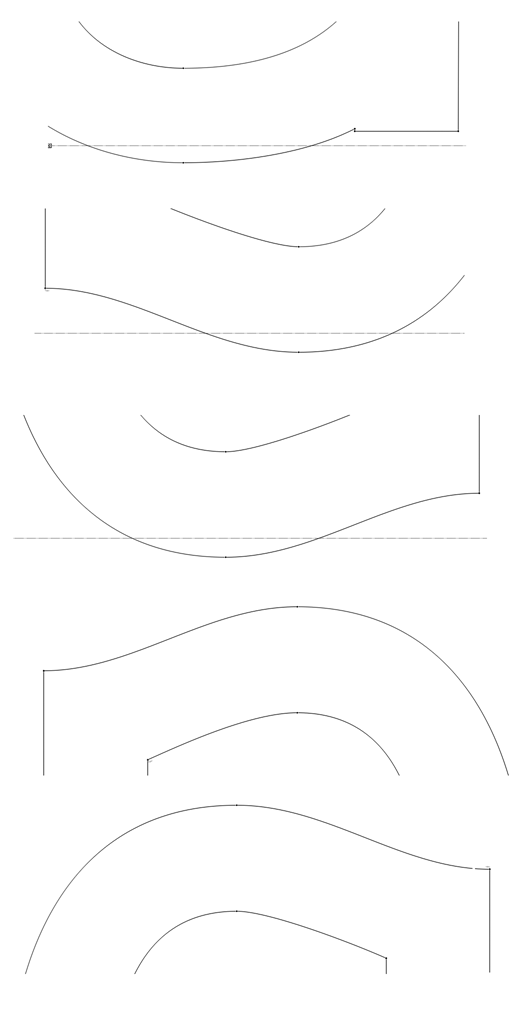
Yes, there is something there, isn't there? The bottom of the element is raised off the baseline, same with the b and d, and the corresponding element on the p and q are set below x height. I didn't know if it could really work, but then someone posted about Serif Gothic and I noticed that it did it as well.

I wouldn't call it BASEsans http://www.emigre.com/EF.php?fid=79

Top right of |s| is too long.
Thanks eliason, I'll have to find another name.
Thanks, ricardO, you're right about that s.
***
I'm thinking about switching to circular tittles, thoughts?
Is this*
http://behance.vo.llnwd.net/profiles18/1228291/projects/4160315/1403dc9d...
where you got the idea of the funny tail on the "a"?
* http://typophile.com/node/97318
hhp
No, I only came across that yesterday. I was trying to figure out someway to suggest an element there without really having one. You can see my other experiments with this in the b, d, p and q. I think actually I may make the a look more like the d. I'll post some close up pics later.
I think I may make the a like the other curves pictured here.
Captured from web.archive.org on 14 Apr 2015. view this capture
