Hi,
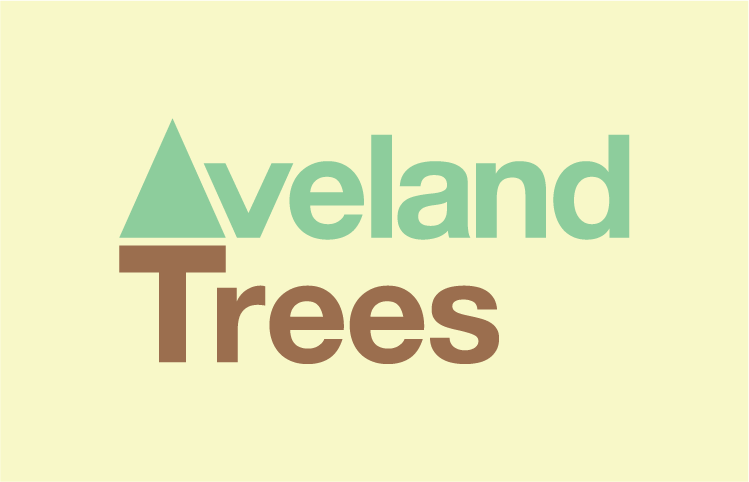
I've made a new logo for a tree company, keeping it simplistic with helvetica and and a simple tree icon. Just looking for any feedback on it please especially in terms of the kerning, I'm a kerning newbie so I'm never fully sure if its ok or not. In particular with the T and r. Also if there any other suggestions for improvements. Cheers
| Attachment | Size |
|---|---|
| a.gif | 8.84 KB |