Hello all,
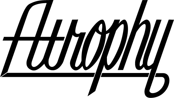
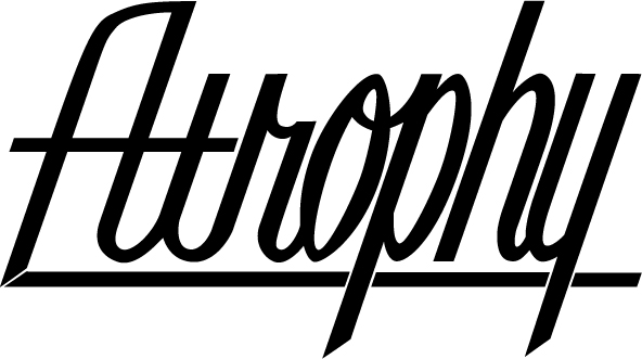
As you can tell I am new here but have been a lurker for quite some time. Trying to gather tips and any other helpful info that will help me with my design work. I am self taught and I'm still working on a lot of things, one of which is lettering. I am here to ask for some assistance with a current design I am working on, whether that assistance be constructive criticism, hate or even a simple "I like it". any thoughts, ideas or opinions will prove helpful at this point. As of now I've got two separate ideas that are very similar but have one distinct difference so any help with which looks best would also be greatly appreciated. with that said, here it is...
| Attachment | Size |
|---|---|
| Atrophy-Script-1.jpg | 56.97 KB |
| Atrophy-Script-2.jpg | 54.55 KB |