Hi everybody,
looking for a font combination for a web editorial project I'm working on (a magazine focused mainly on stories and opinion but also with short news, let's say in a 70/30% proportion). A sidenote: I'm not the graphic designer, guess I'm the "creator".
Since I spend most of my days reading, print and on screen, I really like looking at good typograpghy and even if I'm waaaaay far from being an expert, I'd like to choose a bunch of typefaces myself and then discuss with the graphic designer.
Anyway, I'd like to use a sans for titles/headlines and a serif for long text. The layout is clean, with colors and composition vaguely inspired to the 60-70s italian and european magazines, but It looks like a website, so It's not "old" or "vintage".
The ideal combo for me would be Founders Grotesk (Klim) or Akkurat (Lineto) for headlines and Tiempos (Klim) or Publico (Commercial Type) for text. But sadly Founders, Tiempos and Akkurat are not available for web use, and Commercial Type has not live preview.
Wich fonts are valid alternatives for web use? That's the question.
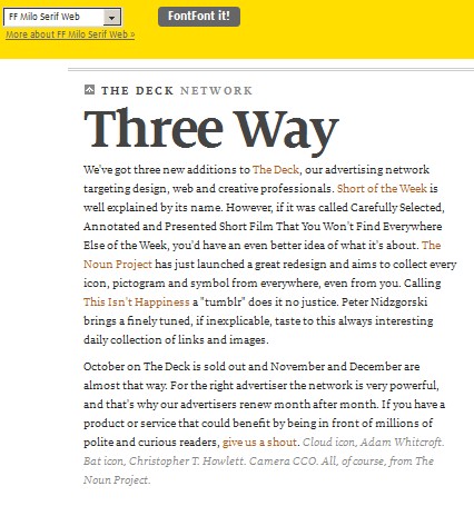
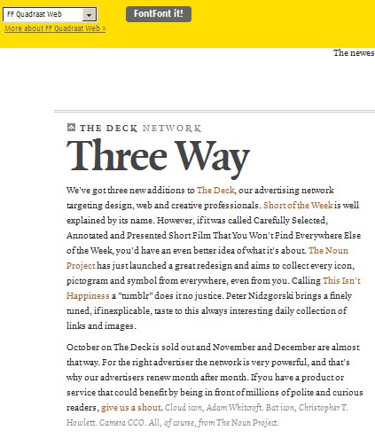
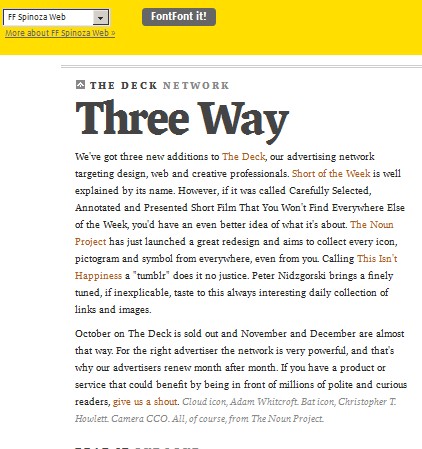
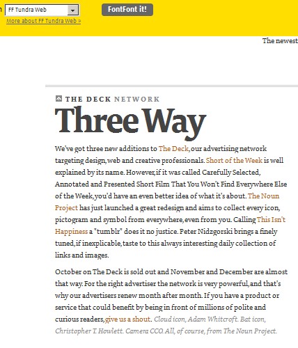
I narrowed to FF Bau (and as last choice FF Dagny, wich is good but too "impersonal") for headlines + FF Milo, FF Spinoza, FF Tundra or FF Qadraat for text ( I do not work for FF: it's only they have a pricing policy I can afford and let you test webfonts live).
Here comes the question for you wonderful people:
How would you combine them?
Would you suggest other grotesk (or halfway between grotesk and more cold typefaces, like Akkurat) and other serif wich have a good (and I mean it: it has to be legible even with XP) web version, don't look too informal but still have personality?
Thanks, a lot. (And sorry for language mistakes)