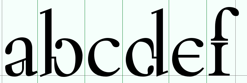
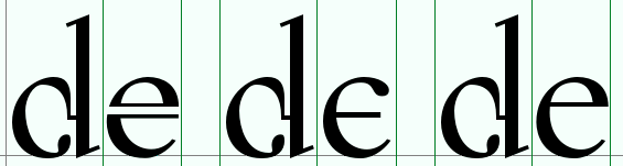
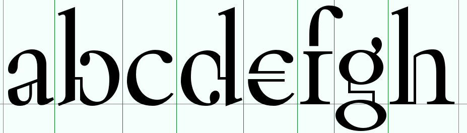
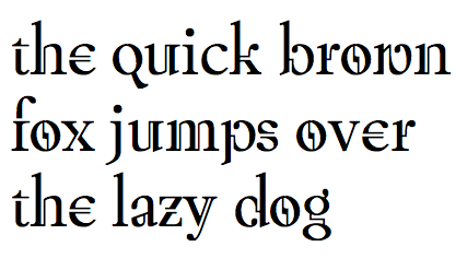
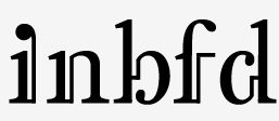
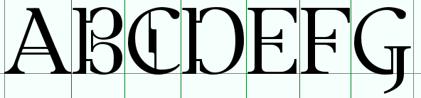
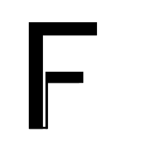
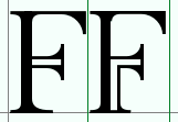
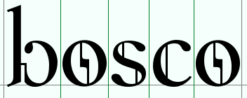
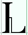
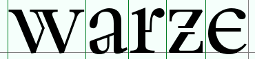
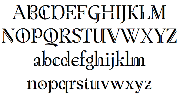
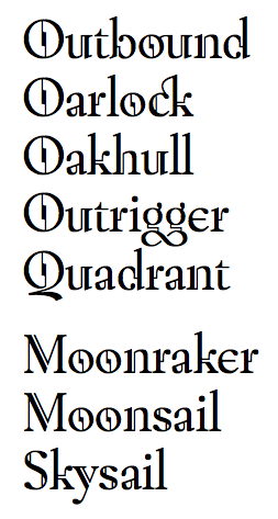
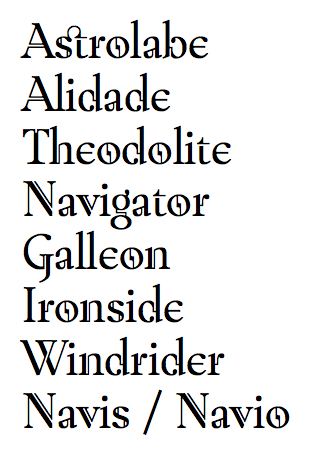
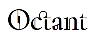
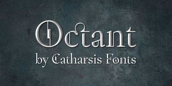
Here are a few sketches of a font idea that's been harrying me for a while now. I might have to sit down and make it at some point.
It basically started with that a and expanded from there. I see it as an implementation of fraktur-like concepts on a Garalde basis.
The name Aurichalcum is Latin for “brass”, and aims to capture that feeling of “Victorian-style wood-and-brass science fiction engineering” I'm getting from it.
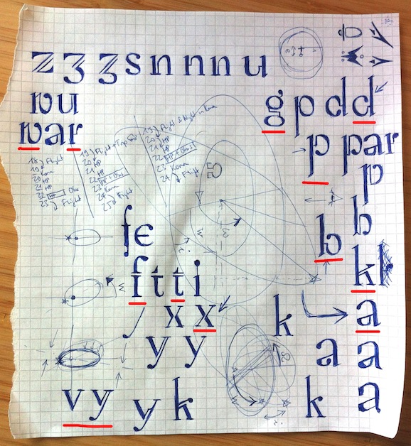
Do you think it has promise? One of the main things that are keeping me from starting the making process is the daunting prospect of kerning that thing once it's done. Is there a good automatic kerning process available? I'm assuming the one included in FontForge doesn't quite cut it...?