Hi,
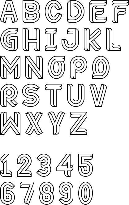
after playing around on Illustrator for a while, I seem to have fallen into creating my first typeface. Initially based around impossible shapes inspired by Escher etc the typeface soon evolved rather naturally to what you see now. Built up by a strict grid all characters are the same width except for the m w and i and the numbers are slightly thinner.
I am looking to open up fontlab for the first time and hopefully cement this as a working font. If you guys could provide me with your thoughts that would be great, I feel like this is a whole new world I have uncovered!
Also so far I have created just letters and numbers, how many other characters would you advise designing for a display font?
Many thanks
| Attachment | Size |
|---|---|
| Riley.gif | 25.43 KB |