Typophile

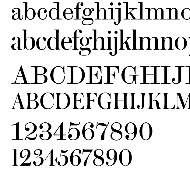
Question about Austin (Paul Barnes)

Etah Chen

Hello.
I am near the end of my graphic design program at school. For my portfolio,
I have chosen to use the typeface Austin. I wanted my book to have a fashionable feel
to it. I like how it looks as a display and for titles. but what do you guys think about it being used for text? The book is mostly graphic design with short explanations. I feel like this is a similar situation to using Didot for text. The thins don't help for reading.

Maybe look at one of Richard Austin’s faces? Bell for example.

If it looks great in display, it can't be great for text.

hhp

I might add that your portfolio is another opportunity to show your skill at font pairing to prospective employers.

I’ve always liked the Scotch Modern for text, and optically scaled my version.

Scotch looks like it's closer to 'egyptian/slab', which doesn't seem to go with something like Austin. But at 10pt or 9pt, most people probably can't tell what kind of serif it is anyway...

@Nick Shinn
Hmmm......actually this might work.

The Scotch story is rather convoluted.
At any rate, the Austin type is related to the Carter types Miller and Georgia:
http://typefoundry.blogspot.ca/2007/02/scotch-roman.html

Really, you could use anything that has an early 19th century provenance, but not Bodoni or Didot.
Richard Austin’s types were a reaction to that kind of cool neo-classicism, as in his foundry statement:
http://typefoundry.blogspot.ca/2007/02/richard-austins-address-to-printe...

Ohkay. Thank you Nick. I learned something today.

Captured from web.archive.org on 19 Apr 2015. view this capture