Typophile

Sunday's Drivel

Neil Caldwell

Hopefully each week I'll post up something fresh of typography and all things that have anything to do letters and word expressions in general. I hope you'll going me and post up something fresh of type and typography in general :)

So... I'll start off with my freshest of fresh...

n.

I have a title for you: "Recess at a K-12 school".

hhp

Jeez: how many dirty words do YOU see?

I'm a type designer. I can't read.

hhp

Thanks for the title suggestion hrant. Gives me an idea, I could play a recording of actual play ground noises as a backing track to the static image, interesting juxtaposition of the static bold graphic with a raw natural audio track ... hmm.

Nick which ones you see ... ;)

n.

@5star:

1. Can you please provide a source for this image?

2. Is there a question or commentary, or are you simply sharing a picture you found?

If you wish to initiate dialogue, some background, thoughts, opinions, &c may help get things started.

(and in your original post, I think you mean “I hope you’ll JOIN me”)

Thanks for the comments Chris. It seems even with spell checker I still manage to show off how inept I really am with words.

To your points...

1. That's a composition I created here on Sunday in my studio. Photographed with my point and shoot. I think I'm getting better at using my camera set on Manual. But, hopefully I'll be picking up a T4i soon enough although I haven't fully committed to Canon or a Nikon. Either way I'm more than ready to graduate to a dslr with greater capabilities.

2. Just sharing my comp. I think it's typography and then some.

I like those ready made letter shapes. I'll be using them again soon in some signage :)

Hopefully other people will post their creative stuff too :)

n.

Did you compose the letters, or just throw them down? Be honest now…

Thanks again for remark(s) Chris. I picked those up over at the dollar store ...I got two large and six small complete alphabets (number set included), for something like 4 dollars! They're made of foam. That gives them durability :)

Think of me purchasing those alphabets as a lot like purchasing a font license.

And no, I didn't just throw them down to create that composition. I composed them in the same manner as you would with any other type. To me, the piece is of a broader definition of typography...

http://dictionary.reference.com/browse/typography?s=t

...typographic expression if you will. The whole composition is primarily one of working with and arranging type.

n.

I got two large and six small complete alphabets (number set included), for something like 4 dollars!

Wow! In London you would be looking at something like £5 for one set and that is if you could find them. Maybe I am just not looking hard enough or in the right places.

I am not sure how I feel about your composition Neil but it keeps making me think of the Peter Gabriel Sledgehammer video, a still from something that would otherwise be in motion.

You might consider titling the Thread “Sunday’s Devil”

See: http://www.answers.com/topic/printer-s-devil

That would make it a double entendre.

Thanks for the flashback Karl! I remember when that video scooped up a ton of awards for it's crazy cool visuals...

Peter Gabriel - Sledgehammer (1986)
http://www.youtube.com/watch?v=N1tTN-b5KHg

Chris, that's a great idea!! And thanks for pointing me to that article ... I see a lot of famous people served as printers' devils. Mixing ink and fetching type (etc.) must have taken a certain kind personality to withstand all the abuse I imagine a printers' devil would encourage ...er, I mean endure ;)

n.

The title of your image might be "Letters you never heard from"

Nice! Sort of scruffy feel to it - or is that just me :)

n.

Hows about, the FU choir... I dunno., Is it an accident those are the two most prominent letters?

Hrant, I have a title for you: "Recess at a K-12 school".
Make that primary school with some secondary colours... er, students

That's awesome Russell, the FU choir sounds like a great title! Sunday service I would attend :)

Pastored by Larry Flynt.

Is it an accident those are the two most prominent letters?

Nope :)

n.

Step to the mic.

So awhile ago now I had the great honor of receiving an email from an EMI hip hop/rapper recording artist. He wanted to get one my graphic designs inked on his arm.

This request blew me away for a ton of reasons.

Of course I said yes and asked for him to send over a photo of the piece ...and he did!! along with the request of me sending over to him and his crew anything I thought he would enjoy. So ever since then (this all happened a couple of years ago) I've been bombin' his personal email with most everything I've been doing!! He actually takes the time to respond to my work. Not all of it, but most all of it. Very cool stuff indeed.

So I sent over the image frontin' this thread ... and he absolutely loved it!!! Here is what he sent me today...

"And by the way that pic you sent me with the mic hanging over all the letters is super cool i posted it on instagram everyone's loving it, even my rapper friends that arn't so "artsey" think its sick!! lol It is now my official background for my iphone."

He went on to request prints of my other work to hang all around his recording studio ...!

...thought I'd share.

n.

Just like you did with the Muslim pizza boy, I hope you'll check to see if you agree with his sociopolitical stance before working with him.

hhp

So who's the mystery rapper? Kevin Federline?

Just like you did with the Muslim pizza boy, I hope you'll check to see if you agree with his sociopolitical stance before working with him.

Thanks for the thought hrant.
He's edgy. Raw edgy in a urban Us vs Them sort of way but for the most part his lyrics aren't anything too 'damaging' for me to be associated with.

So who's the mystery rapper? Kevin Federline?

He's black loud and proud ...sorry that's not much to go on but I'm not going to pimp his rep.

My only true concern is the quality of my work ...especially if I've had to think over it for awhile. I want to get better with every piece I do. And I've come to realize that thinking and rethinking dummies down the energy of a piece of work. But there are times, and they're coming more often than not these days, when I seem to be able to nail a subject. And that gives me hope for survival.

If people dig what I do ...then that's awesome!!! but that's not going improve my work. I guess, in a way, I'm seeking some sort of truth in my own ability using type/typography as a means of expression.

Sorry to have babbled on ...and on ...and on.

n.

Oh, Neil—

Enough of the false modesty, already: a coup is a coup. Just make sure that your copyright notice is included in any and all iterations…

Oldnick, not all of us are lost to vanity.

Get a grip ...k?

n.

n.

Swords to ploughshares?

Is it an O or an S?

Tim

I hope it's a zero.

hhp

Oldnick, not all of us are lost to vanity.

Really? My mistake. Sorry.

What a maroon…

Is this another instalment? If so…

@5star:

1. Can you please provide a source for this image?

2. Is there a question or commentary, or are you simply sharing a picture you found?

If you wish to initiate dialogue, some background, thoughts, opinions, &c may help get things started.

(and in your original post, I think you mean “I hope you’ll JOIN me”)

;)

Chris, this isn't Yukon University.

hhp

Thats’s not to say it can’t be meaningful though. No context = fine art. I’ve got a little over a decade of art college under my belt, so I’m going to go with traditional MFA studio crit:

“I really like the socio-political commentary about the rift between modernist and post-modernist schools of thought, framed in within our current pedagogical paradigm of course.. Then something about being comfortable in my own skin. Also, it exists “in and of itself.” Oh, don’t forget feminism…”

Great work. A+

Rhetorical question: What’s the difference between doing something by design as opposed to by accident, or simply intuiting your way through the process?

Oh, and something something hinting.

What are we talking about again?

#DevilsAdvocate

'“I really like the socio-political commentary about the rift between modernist and post-modernist schools of thought, framed in within our current pedagogical paradigm of course.."

LMAO!!!

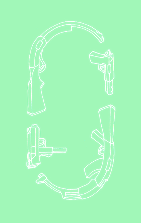
What goes around comes around. Thought I'd do something for gun love ...and for those who like to shoot blanks and bullets.

Composed in the shape of a zero.

zero gun love.

Oldnick ...no need to apologize.

n.

n.

MAC did a bunch of makeup with a typography theme a few years ago. Sadly, I lost my collection.

"Cycle of Violence"

Just an update to the gun love series...

...t-shirts coming soon.

n.

I'm about to create some stuffs that's really awesome! I mean some really really sick sh*t. But, they aren't done yet :(
Hopefully I'll have one of them done later on today, first tho I have to get comfortable with the idea I might burn down my studio in the process of creating awesome.

In the meantime here's a graphic featuring the asterisk...

...sunday drivel.

n.

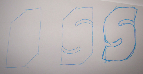
Drawing a Modern S, counters first.

Suddenly, you're on a better track than almost all type designers.

hhp

That might be going a bit far. I do think that the counters are the most important part of today's S's, much more important than the overall outside shape.

The counters are part of the overall shape. If they do not become one then they are counter-productive.

Nice!

Inspires me to do something with the S that's been lying around in my work shop.

n.

S stands for Smile :)

n.

This will become a sculpture, not necessarily in U.S.A. patriotness but more global urbanness and I was thinking of having the text rotate on the tip of the finger ...

n.

O in bondage ...forevermore ...unless I free it!

I found this circuit board somewhere and shot it ...that type in actual size is no more than 1mm in height.

n.

Have you thought about starting a different thread for each image, like a weekly post, instead of one long thread? You could simply title them “Sunday’s drivel: 25.11.12”

Or since nobody's bothered to comment on the last three bits of drivel, why not move it over to your blog?

Kind of puzzled why a mod would advise that. Wouldn't that clutter up the place? Just asking.

Are those your own Sunday Drivel contributions???

A little bit abstract but ...nice!

It's all good!

n.

I sort of envisioned a “weekly instalment” type thing, with discussion about each. With one long post, it may eventually become difficult to separate one instalment from the next, as well as the comments that go with each. Regardless, new content is good content.

Except spam.

And Justin Bieber.

Looking through some old sketch books from the late 1990's, I came across this. Made before I even knew what lettering was. Interesting.

Dancing Helvetica
http://raphaeljs.com/helvetica.html

also interesting

Made before I even knew what lettering was.

Good times, innocent times ...nice stuff!

n.

Even to this day Piet Zwart's work can be seen to have a significant impact ...Greg Lamarche's stuff to name but one.

n.

Lou Dorfsman ... hahaha.

n.

And speaking of eyeball terminals... my latest Sunday drivel.

Sinister undertones...

:)

n.

Shadowy monogram concept...

n.

These Christmas balls will be suspended midair. But right now they are laid down slaves to the grid. I used the font PIXymbols Newsdot as my starting point. I'd like to work in a skull somewhere and sometime do a suspended ampersand with completely different objects now that I've come this far.

Whilst hungover, I'll try to get this one finished up sometime tomorrow.

n.

I'd remove the one with the two orthogonal adjacencies.

hhp

...orthogonal what? This one ...

...?

n.

No, the one above the one you removed.

hhp

Ah OK, hows about this one...

Or perhaps this one...

...?

n.

Yes, the bottom one is even better.

Now make a 3D one that looks like an ampersand from 90° off. ;-)
From my alma mater:
http://www.boston-baden.com/hazel/Pix/2004/w/wed094.jpg
http://1.bp.blogspot.com/-c9_ZHKrbYWE/T3wI827MDwI/AAAAAAAAAHU/kyAPndkfyp...

hhp

I'll catch up with the xmas one later on ...but for now I have created an AWESOME ampersand of my stuff...

...coolio concept for sure!!!

Later on I'll suspend the stuff in midair using clear thread. A gallery installation would be awesome using stuff too!!! I can see this concept going corporate/commercial in a heart beat.

n.

Love the needle-nose vice-grips. And if thats not it, what is that tool in the bottom right corner?

1. A compass given to me by my grandfather.
2. My second most favorite skull of all times, which has been featured in many a graphic.
3. A crazy bird I found inside a chocolate egg.
4. A star I use a lot in stenciling.
5. A rock from a gold mine in Kirkland Lake Ont. Canada. Gold in natural form is awesome!
6. Homage to the great graphic designer Milton Glaser! ...and to typography in general.
7. A gold ring with the diamond cut out ...'nuff said about that.
8. A silver Haida Indian Thunder Bird pendant.
9. Copper sheet folded into a paper airplane form.
10. Mini Cessna airplane representing a life sized one I learned to fly back in the day.
11. Pawn chess piece, I play a lot of chess ...and we are all pawns. No?
12. An eraser I never got the nerve to use cause it's awesome and glows in sunlight!
13. My homage to Big Daddy Roth and all custom builders in general.
14. My windup toy robot I'm using in a short film called STOP WAR.
15. A stick of graphite I commonly use to draw/sketch anything and everything & a moldable eraser sitting on it.
16. My guitar capo ...it gots a funky looking profile!

n.

Funkiest capo I ever saw... by a light-year-wide margin.

After a doing google quicky I see they still sell strong.

Kyser KG6W White Capo

The shape of it reminds me of Prince's Cloud guitar...

n.

The same Prince that I saw live at a private stage-side VIP table⸮

Yeppers you lucky dawg you!!

n.

You need far more objects, especially in the 7, 8, 9 area, otherwise it is too much of a dot-to-dot. And the capo might work better if it was flipped.

Tim

Thanks for the crit! Since reading your post I've been looking around at all my other stuffs and I think I can work in a thing or two :)

n.

Typographic Tilley!

I just submitted this entry to The New Yorker's 6th annual Tilley comp.

The graphic is composed entirely of type used from The New Yorker typeface. It's not too hideous of a Tilley, I could have done better but I only heard of the Tilley comp at noon on Jan.7th ...sigh. I'll keep you posted if I get into the top 12.

The New Yorker says in the entrance guidelines that Jan.7th is the cut off ...I sure hope they're using PST as the drop dead time, because I hit the submit button at 12:00AM Jan.8th here in the EST ...lol!!

n.

Sunday Drivel, Sunday Drivel, time for more Sunday Drivel...

LUCKY 777

Any thoughts as to why fonts that look like they were hand-drawn in jr. high scribblers with sketchy 3D seem to be so trendy lately?

Beats me bro.

Perhaps because the expression of the gestural qualities is that much more amplified/exaggerated than the sketchy 2D hand-drawn letter shapes? And that in turn adds depth to the typography?

Mati by Ale & son Matias (or perhaps more accurately Matias & father Ale :)) was the first hand-drawn sketchy 3D digital font that I saw (but I don't get out that much) upped here on typophile back in '07 http://www.typophile.com/node/35365

What's your take on the trend?

I know that there is a growing trend towards the appreciation of things authentic and and-made as opposed to mechanical. For example, calligraphy and hand drawn scripts are becoming popular, eating local, hipster-farmers &c. This hand-writing thing is another manifestation of it, and the 3D scribbler aesthetic is simply a clever bit of retro-vernacular. How an 11 year old beat them to the punch by six years is blowing my mind!

Good point(s)! I would never have connected hipster farmers and bespoke hand-drawn lettering.

Hand Job: A Catalog of Type by Michael Perry

Published Aug 1 also of '07 may be of interest to you too. It's a well curated collection of works by graphic designers and typographers who were already well published using the bespoke hand-drawn letter shapes.

Give me enough time and I can work hipster-bashing into almost anything. For example, you know how its possible to go to a Halloween party and dress up in a costume like someone from the 80’s or 90’s? Well in a few years, if not now, you could dress up like a hipster c 2005-10. Poor hipsters. What will they do next? Prediction: It sure an isht won’t be farming.

Re the afore hand drawn 3D letters, I seem to be seeing them in a lot of newer movie credits as of late. Pseudo-indi comedies. Can’t name specifics atm. Nothing against the letters personally, I actually did a lot of that in jr. high myself (before it was cool of course).

Next up: liquid-paper letters on jeans (I also did that before it was cool). -1 to any hipster who who never actually used liquid-paper as a student. -10 if they haven’t even heard of “liquid-paper.”

... feels like a human touch when things are sloppy, and a human touch is such a novelty.

Used to be that humans took pride in quality craftsmanship as well.

>>Any thoughts as to why fonts that look like they were hand-drawn in jr. high scribblers with sketchy 3D seem to be so trendy lately?

It may have something to do with the trend favoring "the 80s," which is cycling into "the 90s." My older kids are now memorizing Ice Ice Baby and insisting that it's the coolest thing ever, for instance. But I like your explanation too. Same thing kind of.

My teen hasn't moved beyond the 80s yet. The other day I caught him watching that classic Borg vs. McEnroe match. When I asked him why, he said: "The hair."

hhp

Banana parentheses...

...my Sunday humble ode to Andy Warhol.

Larger version here.

HYPE is of laser cut acrylic mirror ...and part of my upcoming HYPE series.

Captured from web.archive.org on 20 Aug 2013. view this capture