Typophile

New release – Epruveta

tourdeforce

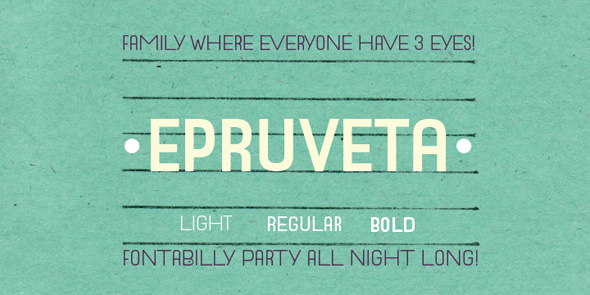
Introducing our latest release called "Epruveta".

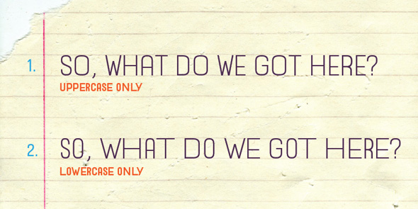
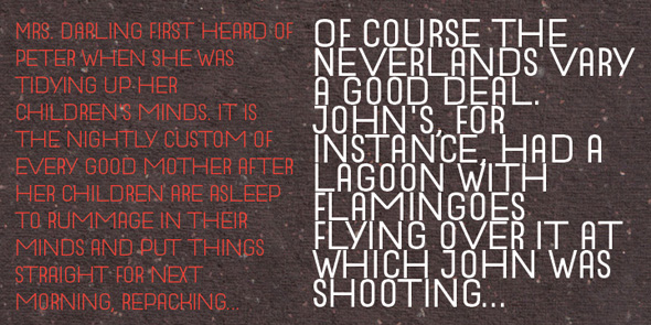
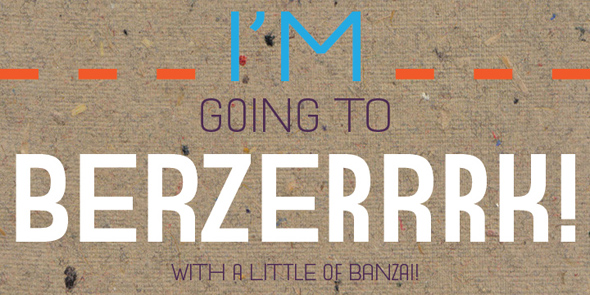
Imagined as combination of different proportions in each weight, where uppercase letters have equalized and standard proportion, while lowercase letters are made as combination of condensed and extended proportions.

Available as:
Light, Regular, Bold.

Find out more:
http://www.tourdefonts.com/font-catalog/epruveta/


Available at:

Ascender Corp.
Fonts.com
FontDeck
FontSpring
ITC Fonts
Linotype
Luth Norway
MyFonts
Type.co.uk

Very interesting design and great samples!

Thanks Karl!

Doesn't looks like it's available anywhere???

http://www.fontspring.com/fonts/tour-de-force/epruveta

New fonts take some time to be published by distributors.

That's the only critic I'd give to mostly all distributors. Sometimes it really knows to take too long to be published. But I believe that's too complex thing to be discussed about, especially when you must pay attention that somebody might upload something else (like spams). But on the other hand, I don't think there's any designer who would like to wait until all distributors publish font first (cause it is unspecific time period) and then go with announcement. So, we just wait for few of them do that and go in public.

BTW, so far it is available on FontSpring and MyFonts.

I'm happy to announce that we started WebSpecimen section and "Epruveta" is the one that breaks the ice:
http://webspecimen.tourdefonts.com/epruveta/

Very nice design! Congratulations )

Captured from web.archive.org on 16 Apr 2015. view this capture