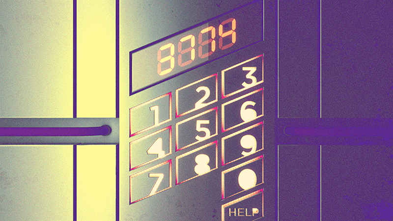
Well, technically number spacing. I'm working on a project that involves the design of a very post-modern elevator panel, which, as you can see, has been set in Gotham (with counters filled) on a diagonal grid. Within each cell, the idea is that the letters are right-aligned and intersect with the bottom edge:

The problem is the 1/4/7 column. Every other number has a relatively even, boxy shape that was easy to center. But my original plan was to align the right edge of 1, 4, 7 with each other vertically, then raise them to the same vertical height as the midpoint of the other numbers in their respective rows. My thinking is illustrated here:
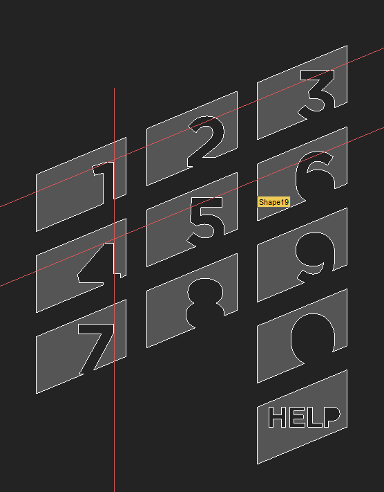
While this makes some sense logically, the result (as seen in the first image) clearly doesn't look right. The 7 in particular has an awkward amount of negative space that isn't being addressed at all. To rectify this, I've created a new layout that moves the 1 and the 4 up a bit higher and pushes the 7 back to compensate for all the space:

At this point though, I don't trust my eyes and am just looking for some fresh-eyed feedback. Any input you might have on the fixed version of the layout would be great.
Thanks!