
Hmmmm?
Hmmmm?

Who's asking?
hhp

*blink* *blink* I think this is the first time I've heard of such a call. Hitherto we've just used 'kr.' and felt that was good enough. Wonder if the Central Bank Director thinks it's past time he got deified...


Hastily drawn :) (And oh so horrible!) The snail should probably protrude from the r …

I like the idea though and it could also work as a very dramatic swash!

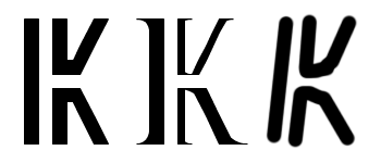
Question: Is it case-sensitive? Can the "r" be UC?
hhp
Not in Norwegian :) I don’t know about Icelandic. Kroner is always "kr" in lowercase, without the period.
Can we get a list of Kr(suffix)-using countries and their case preferences? Also: Would it be good to use the same symbol for all of them, or different symbols [for some]?
BTW, I still don't know who the client is... But what the hey.
hhp

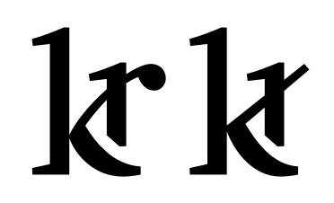

Yeah, I've seen both 'kr' and 'kr.' in text, but I think the latter is a bit closer to the grammar rules.
@frode – That trunked-kr reminded me of the now-defunct Reykjavík Co-Op's (KRON) signage.
@hrant – The current international designation for this currency is ISK, but I think it was IKR at one time.
Wow: some cool stuff so far.
At present, there is no "client'; however, the idea is being floated in some circles to make the Icelandic kronur the Universal Internet Currency, which makes sense because Iceland has an incredibly awesome internet infrastructure, and blazing fast access speeds.
Plus, through a proposed "pay-ahead" subscription plan, currency conversion charges would be minimal—typically, 1%. Which is to say: if you anticipate your internet purchases and pony up the money first to draw against later, in essence you have a virtual ATM card and, therefore, lower transaction fees overall.
Anyhow, websafe (at bookmark size and up) ought to be a consideration, too.

Riccardo, you read my mind! Because for one thing this thing does need to be tall and narrow. But the "K" needs to be there more.
BTW Frode: too many "strokes".
hhp
I was thinking something more like this:
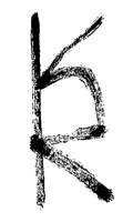
hhp
But the "K" needs to be there more.
I thought that the reference to this kind of not-very-common-by-now-but-still-accepted-and-recognisable construction of |k| would put enough "k-ness" in the design:
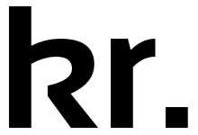
BTW Frode: too many "strokes".
I don’t know about that, but I do know that neither of your sketches read as (real-life) Nordic or Norwegian to me. The too obvious Norse connection makes me think of this article on stereotypical typography: “Is your font Racist?”
According to Wikipedia, only the Danish kroner is written with a period. Norwegian, Swedish, Icelandic all write "kr". (Not counting Estonian, Austro-Hungarian, Yugoslav or Fiume krone, nor Czech or Slovak koruna.) The Pharoe Island and Greenland use the Danish kroner. FIY, "krone" translates to "crown" — and that’s already in the chess section of Unicode!
By the way, I think a new symbol makes sense only if it's tied to a single national currency, regardless the fact that it could share its name with other ones.
Frode, I only had one sketch. And I actually wasn't trying to make it look like a rune. But I don't mind if it does - in fact I tend to like that idea. Westerners tend to brandish the term "racism" way too enthusiastically - I see that in the US daily. Something obvious might be boring (and I personally wouldn't want a currency to ignite passions anyway*) but that does not equate to insult. Runes aren't something to be embarrassed about.
* For example the old Dutch notes were beautiful. But is the idea of currency beautiful? For one thing it was invented (in Smyrna) purely as a way to reduce bartering and facilitate taxation.
Riccardo, agreed. Except for sets of countries that actually want their currencies to share a symbol, each one should be different. BTW when I said that the "K" isn't there enough it's because when I look at it I see the "R" first, which is a problem (but maybe mine has the same problem).
hhp
Much simpler (and thus much better) than my previous:
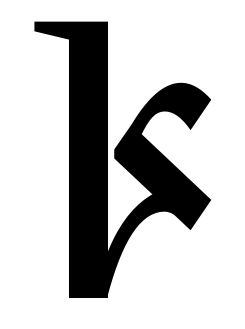
Craig, I like very much the "flow" of your latest!
I have some difficulty to envision it in a sans serif style, though.
I have some difficulty to envision it in a sans serif style, though.
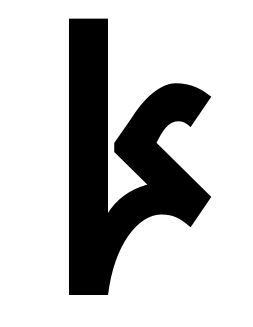
Iceland has some pretty imaginative currency design…
http://coinedformoney.blogspot.com/2012/04/2003-iceland-krona.html
https://store.nwtmint.com/product_details/3209/2000_Leif_Ericson_Silver_...
http://www.24carat.co.uk/frame.php?url=iceland.html

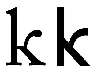
And for the sake of completion, slab too:
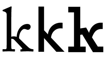
You might find it interesting, @oldnick, that the five- and ten-crown pieces have all four guardians tails while heads are a pair of dolphins on the five-crown piece and a small group of capelin on the ten-crown piece.


/me groans...

I think eliason would win with the simplification by daverowland.
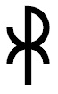
Here is my suggestion for what it is worth (See image DKchiRhoJPEG). I regret not seeing this post earlier, as once again I seem like the nail in the coffin of another forum topic.
It is a simple bindrune, appropriate I would expect to the culture.
It reminds me of a Chi-Rho monogram, but not quite like any I have seen.
If the lines be made straight, the rune would be one that I have seen to do with mystical runes called by a name that sounds a bit like Armenian [cryptic crossword-style clue].
Captured from web.archive.org on 18 Aug 2013. view this capture