
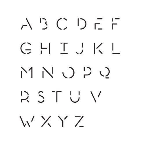
I've been working on this typeface for a while now, and am looking for some feedback regarding the proportions. I'd particularly like to get the widths of the characters right. It isn't optically balanced yet (the verticals and horizontals are equal) and the line ends are the default semi circles for the time being. I'm not sure what else to really say about it; I suppose part of the aim is to experiment with spacing and texture, though I'm treating it as a formal exercise for the time being as I'm new to type design.
Any feedback would be much appreciated.
| Attachment | Size |
|---|---|
| stencil.pdf | 235.19 KB |

