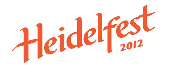
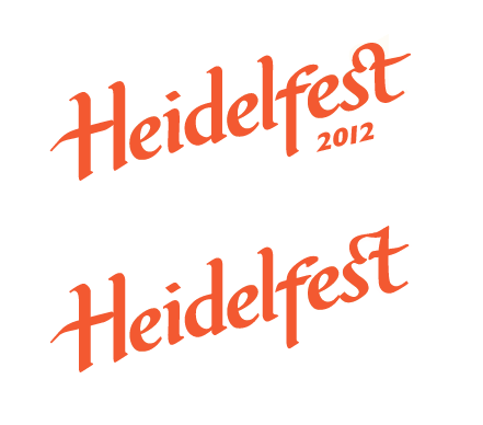
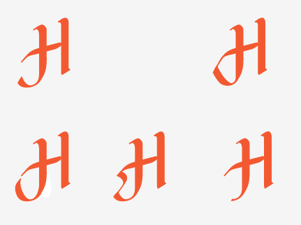
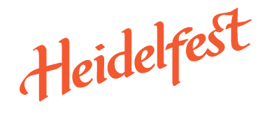
I would love your input on a logo I'm working on.
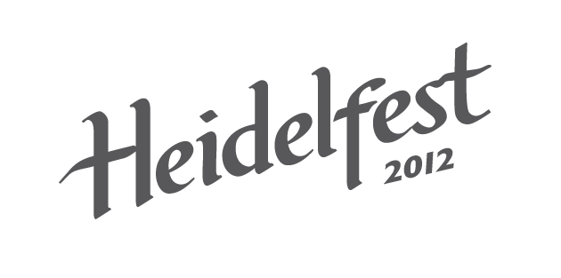
It's for a fall festival, and I was shooting for something reminiscent of beer and the wheat harvest, with some feeling of history and handcrafted but orderly. I iterated a bunch in ink on paper, and then chose the one I liked best, and have been trying to work out the details on the computer. I would love your feedback on shapes, counters, terminals, letter-spacing, etc. Thanks in advance,
Peter