
It is inspired by a mix of Limelight and Bodoni. Just started, but would like to get some feedback.
I am calling it Pavilion.
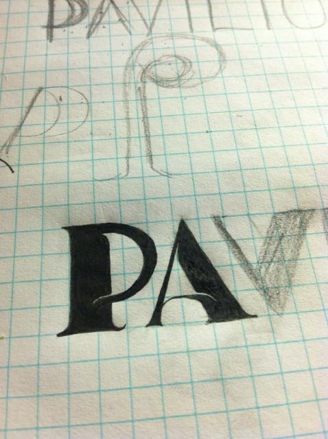
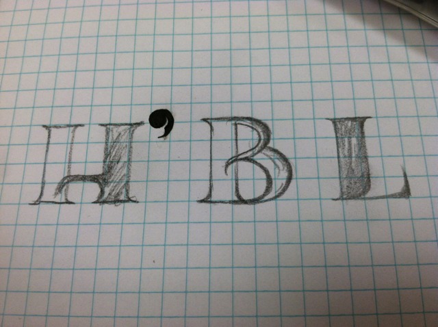
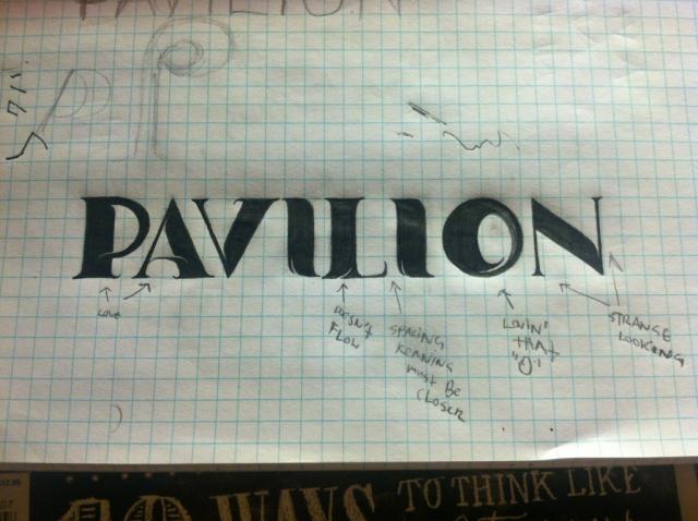
It is inspired by a mix of Limelight and Bodoni. Just started, but would like to get some feedback.
I am calling it Pavilion.

It's fun, I'm looking forward to seeing more. My only comment at this point is that the serifs at the end of the thin strokes on L and N look too insubstantial to balance the thick strokes. I don't feel that way about the A and the V, maybe because the serifs have a little more heft, or maybe because the thin stroke isn't quite as thin (and on the A, it gets thicker toward the serif).
You are right, the N looks fragile. I will give the serif some more heft. You gave me an idea for the L as well.

I like it.
hhp

Yea this has tons of potential.
Captured from web.archive.org on 16 Apr 2015. view this capture