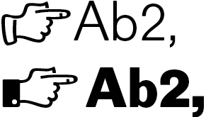
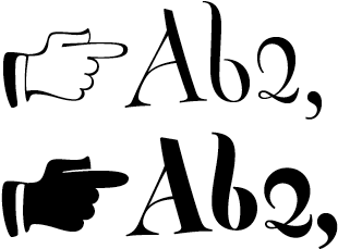
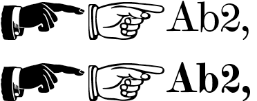
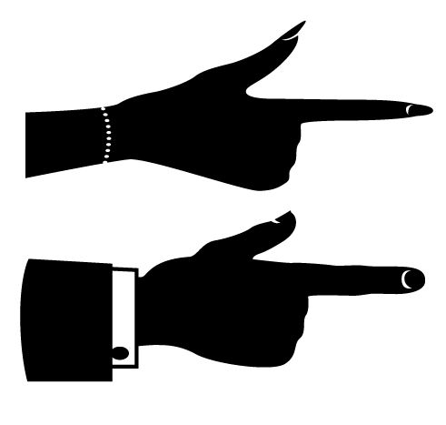
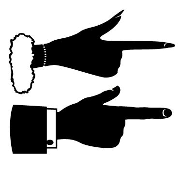
I've been experimenting with ways of adding weight to manicule glyphs, by simulating more shade on the hand as the font moves from light to bold. It doesn't fit with the font I'm working on at the moment so I'm ditching them for that, but I thought it was quite a nice way of doing it (rather than just making the outline thicker), so I thought I'd share it: